Lab 7: One-Way ANOVA

Fabio Setti

PSYC 6802 - Introduction to Psychology Statistics

Today’s Packages and Data 🤗

Install Packages Code
# run for packages that you have not installed yet
install.packages("emmeans")
library(tidyverse)
library(emmeans)
# I am setting a theme for all the plots
theme_set(theme_classic(base_size = 16, accent = "#7a0b80",
                        base_family = 'serif'))

The emmeans package (Lenth et al., 2025) is a great package for exploring the results of many linear, generalized linear, and mixed models. it also helps compute mean contrasts, trends, and comparisons of slopes. I discover some new functionality every time I look at this package!

Data

Today we will work with some data from NYC public schools. Namely, we will focus on the average SAT scores by school across the different boroughs.

dat <- rio::import("https://fabio-setti.netlify.app/data/NYC_SAT_data.csv")

One-Way ANOVA

In undergrad courses, you may have learned that ANOVA is used when your DV is continuous and your IV is categorical. Let’s say that our DV is average SAT Math score across schools, SAT_Math. We think that the school’s borough, borough, will have some impact on SAT_Math. In other words, we think that the means of SAT_Math (DV), will be change depedning on borough (IV). To put it simply (and probably too simply):

one-way ANOVA is used to test whether there are any mean differences in a DV across levels of a categorical IV.


In the case SAT_Math, if there are mean differences depedning on borough, we conclude that borough is associated with SAT_Math.

Starting from the Top

ANOVA stands for analysis of variance. The whole idea of ANOVA goes back to the idea of variance explained that we discussed in lab 6.

We have our dependent variable, SAT_Math, which is the average SAT math score across all New York public schools. (kinda skewed!)

As we talked about in the Lab 6, if we were trying to predict SAT_Math for any NYC public school and this plot on the right is all the information we have, our best guess would be the mean of SAT_Math.

Plot Code
ggplot(dat, aes(x = SAT_Math)) +
  geom_density() +
  geom_vline(xintercept = mean(dat$SAT_Math, na.rm = TRUE), lty = 3) +
  annotate("text", x = 510, y = 0.007, label = paste(mean(dat$SAT_Math, na.rm = TRUE), ", the mean of \n the SAT_Math variable"), size = 7) +
    scale_y_continuous(expand = c(0,0))  +
  theme(
    axis.title.y = element_blank(),
    axis.text.y  = element_blank(),
    axis.ticks.y = element_blank(),
    axis.line.y  = element_blank())

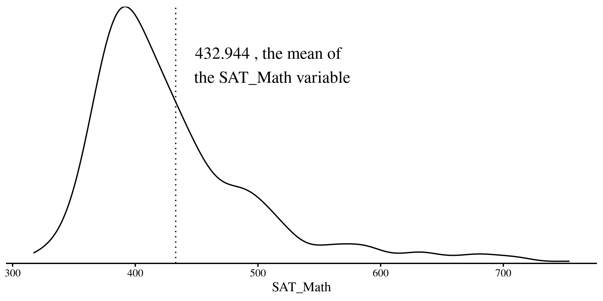
Residual Variance with only one Mean

Here I plot the residuals for the SAT_Math variable if all we know is the mean of SAT_Math.

The residual variance is just the variance of the the SAT_Math variable:

var(dat$SAT_Math, na.rm = TRUE)
[1] 5177.144

na.rm = TRUE?

Function like mean(), sd() and so on have this argument called na.rm =. The argument is used when you have missing data in the column you want to run functions on. na.rm = TRUE tells the function to run the function on complete cases only. Why? Because you should tell software what to do when missing values are encountered.

Plot Code
# some arbitrary monotonically increasing values to plot the residuals

dat$mono_incr <- 1:nrow(dat)

ggplot(dat, aes(x = mono_incr, y = SAT_Math)) +
  geom_point() +
  geom_hline(yintercept = mean(dat$SAT_Math, na.rm = TRUE), col = "#7a0b80") +
  # geom_segment(y = 0, yend = dat$SAT_Math - mean(dat$SAT_Math, na.rm = TRUE), lty = 3, col = "red") +
    theme(
    axis.title.x = element_blank(),
    axis.text.x  = element_blank(),
    axis.ticks.x = element_blank(),
    axis.line.x  = element_blank())
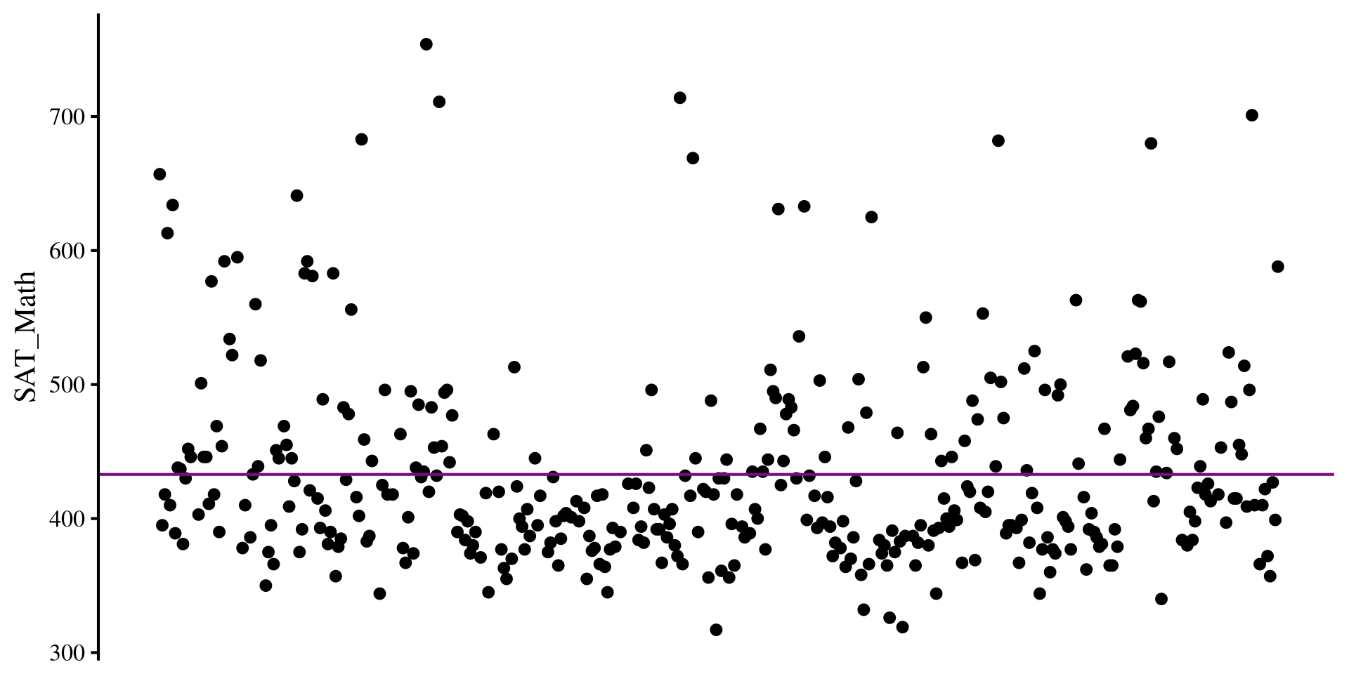
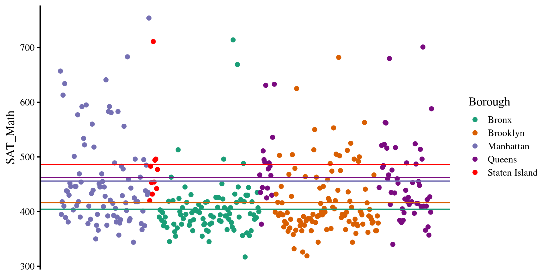
Multiple Means

However, we think that there are going to be differences in SAT_Math scores across different New York boroughs, the Borough variable in the data.

Instead of the mean of SAT_Math as our best guess, we use the mean of SAT_Math by each of the Borough of New York!

dat %>% 
  group_by(Borough) %>% 
   summarise(mean = mean(SAT_Math, na.rm = TRUE))
# A tibble: 5 × 2
  Borough        mean
  <chr>         <dbl>
1 Bronx          404.
2 Brooklyn       416.
3 Manhattan      456.
4 Queens         462.
5 Staten Island  486.
Plot Code
sum_mean <- dat %>% 
  group_by(Borough) %>% 
   summarise(mean = mean(SAT_Math, na.rm = TRUE))

ggplot(dat, aes(x = mono_incr, y = SAT_Math, color = Borough)) +
  geom_point() +
  # queens
  geom_hline(yintercept = as.numeric(sum_mean[4,2]), col = "#7a0b80") +
  # Brooklyn
  geom_hline(yintercept = as.numeric(sum_mean[2,2]), col = "#d95f02") +
  # Bronx
  geom_hline(yintercept = as.numeric(sum_mean[1,2]), col = "#1b9e77") +
  # Manhattan
  geom_hline(yintercept = as.numeric(sum_mean[3,2]), col = "#7570b3") +
  # queens
  geom_hline(yintercept = as.numeric(sum_mean[5,2]), col = "red") +
  scale_color_manual(values = c(
    "#1b9e77", # green
    "#d95f02", # orange
    "#7570b3", # purple
    "#7a0b80", # dark purple
    "red"  # olive/green
  )) +
  theme(
    axis.title.x = element_blank(),
    axis.text.x  = element_blank(),
    axis.ticks.x = element_blank(),
    axis.line.x  = element_blank()
  )

Residual variance Now

If instead of the mean of SAT_Math alone we use the mean of SAT_Math by each Borough for our prediction, we cen reduce the residual variance:

# I'll filter out missing values on SAT_Math for simplicity
dat <- dat %>% filter(!is.na(SAT_Math)) %>% 
  group_by(Borough) %>% 
   mutate(SAT_Math_Borough = mean(SAT_Math)) %>% 
    ungroup()

# residual variance if we use the means of the boroughs
var(dat$SAT_Math - dat$SAT_Math_Borough)
[1] 4522.506

So our residual variance is now \(4522.506\), whereas before it was \(5177.144\). The \(R^2\) is

\[1 - \frac{4522.506}{5177.144} = .126\]


We can use the lm() function to confirm our hand calculations:

reg <- lm(SAT_Math ~ Borough, data = dat)
summary(reg)$r.square
[1] 0.1264477

This all to say that after we use the means SAT math score of each borough, our predictions improve by roughly \(12.6\%\). In the case of ANOVA, checking improvement in predictions is equivalent to testing whether there are mean differences. Why? If there are no meaningful mean differences, predictions will not improve.

Turning Borough into a factor

As I hinted at in Lab 3, when working with categorical variables, it is good practice to turn them into factors. Let’s turn Borough into a factor variable before we do anything else:

dat$Borough <- factor(dat$Borough)

Here I skipped the levels = and labels = arguments because the Borough column was already labeled. By default, factor will order the levels alphabetically. levels() will show the order of the factors.

levels(dat$Borough)
[1] "Bronx"         "Brooklyn"      "Manhattan"     "Queens"       
[5] "Staten Island"

Knowing the order of the factors will be needed to set up contrasts later.

An here are the number of schools in each Borough that we have in our data:

t(dat %>% group_by(Borough) %>% 
   summarise(count = n()))
        [,1]    [,2]       [,3]        [,4]     [,5]           
Borough "Bronx" "Brooklyn" "Manhattan" "Queens" "Staten Island"
count   " 98"   "109"      " 89"       " 69"    " 10"          


What do you think of the number of schools in each borough?

ANOVA in R

Whenever running ANOVAs in R, we can start with running a regression with lm(). In fact, ANOVAs are regressions, but the regression information is presented in slightly different ways to focus more on the variance explained by each DV.

reg <- lm(SAT_Math ~ Borough, data = dat)
anova(reg)
Analysis of Variance Table

Response: SAT_Math
           Df  Sum Sq Mean Sq F value    Pr(>F)    
Borough     4  244835   61209  13.389 3.355e-10 ***
Residuals 370 1691417    4571                      
---
Signif. codes:  0 '***' 0.001 '**' 0.01 '*' 0.05 '.' 0.1 ' ' 1

After we have created a regression with lm(). Then, we pass the results to the anova() function, which prints the classic ANOVA table.

The \(F\)-statistic, tests the null hypohesis that all group means of SAT_Math by Borough are equal. The idea is that if we somehow improve predictions of SAT_Math by using the means by Borough, then there must be some mean differences.

Because the \(p\)-value associated with the \(F\)-statistic is \(< .05\), we conclude that there are mean difference in SAT_Math across Borough, \(F(4, 370) = 13.39\), \(p < .001\).

Equivalence with R2

If you scroll down in the regression output, you will see that the \(R^2\) in the regression output has the exact same \(F\)-statistic, degrees of freedom, and p-value that we got from the ANOVA output.

ANOVA Output
anova(reg)
Analysis of Variance Table

Response: SAT_Math
           Df  Sum Sq Mean Sq F value    Pr(>F)    
Borough     4  244835   61209  13.389 3.355e-10 ***
Residuals 370 1691417    4571                      
---
Signif. codes:  0 '***' 0.001 '**' 0.01 '*' 0.05 '.' 0.1 ' ' 1

So what the ANOVA is doing is equivalent to testing \(R^2 \neq 0\). See here if you want to know a bit more.

Regression Output
summary(reg)

Call:
lm(formula = SAT_Math ~ Borough, data = dat)

Residuals:
    Min      1Q  Median      3Q     Max 
-122.36  -39.38  -16.89   21.14  309.64 

Coefficients:
                     Estimate Std. Error t value Pr(>|t|)    
(Intercept)           404.357      6.830  59.204  < 2e-16 ***
BoroughBrooklyn        12.047      9.412   1.280 0.201380    
BoroughManhattan       51.530      9.900   5.205 3.22e-07 ***
BoroughQueens          58.005     10.625   5.459 8.79e-08 ***
BoroughStaten Island   81.843     22.445   3.646 0.000304 ***
---
Signif. codes:  0 '***' 0.001 '**' 0.01 '*' 0.05 '.' 0.1 ' ' 1

Residual standard error: 67.61 on 370 degrees of freedom
Multiple R-squared:  0.1264,    Adjusted R-squared:  0.117 
F-statistic: 13.39 on 4 and 370 DF,  p-value: 3.355e-10

Effect Sizes for ANOVA: \(\eta^2\)

\(\eta^2\) (\(\eta\) is greek letter eta) is the simplest effect size measure for ANOVA. \(\eta^2\) is the same as \(R^2\), but for some reason people decided they wanted to used different names to confuse everyone else 🤷

To calculate \(\eta^2\) we use the eta_squared() function from the effectsize() package:

effectsize::eta_squared(reg)
# Effect Size for ANOVA

Parameter | Eta2 |       95% CI
-------------------------------
Borough   | 0.13 | [0.07, 1.00]

- One-sided CIs: upper bound fixed at [1.00].

We can confirm that it is equivalent to \(R^2\)

round(summary(reg)$r.squared, 2)
[1] 0.13

I did not mention it in the last lab, but a small issue with \(R^2\), and of course \(\eta^2\) as well, is that their values are usually biased, meaning that they are larger than they should actually be (definition of bias in statistics).

Depending on your sample, this bias may be small. However, it is more straightforward to compute an additional effect size measure that corrects for this bias, \(\omega^2\).

Effect Sizes for ANOVA: \(\omega^2\)

\(\omega^2\) (\(\omega\) is greek letter omega) applies an adjustment to \(\eta^2\). \(\omega^2\) is always smaller than \(\eta^2\) , although the difference may be minimal in practice.

To calculate \(\omega^2\) we use the omega_saqaured() function from the effectsize() package:

effectsize::omega_squared(reg)
# Effect Size for ANOVA

Parameter | Omega2 |       95% CI
---------------------------------
Borough   |   0.12 | [0.06, 1.00]

- One-sided CIs: upper bound fixed at [1.00].

Which is almost the same as adjusted \(R^2\):

round(summary(reg)$adj.r.squared, 2)
[1] 0.12

\(\omega^2\) is verys similar to adjusted \(R^2\), although not quite the same. See Kroes & Finley (2025) for a good discussion on ANOVA effect sizes aimed at applied researchers.


In general, \(\omega^2\) is what you want to report. The interpretation is the same as \(R^2\): The Borough variable explained \(12\%\) of the variance in SAT_Math.

Multiple Comparisons (Post Hoc Tests)

So, we found out that there should be some mean differences in SAT_Math by Borough. Now we want to compare the means of every Borough and see where those differences are. We will need the emmeans package for this:

First we create a new object with the emmeans() function. We also need to specify the IV that we want the compariosons by with the specs = argument.

# this is ALWAYS the first step
em_res <- emmeans(reg, specs = "Borough")

Our only IV is Borough, and the specs = argument wants the variable name within quotations.

Then we use the pairs() function to compare every mean pair:

# 'estimate' column is the mean difference (notice the P value adjustment message)
pairs(em_res)
 contrast                  estimate    SE  df t.ratio p.value
 Bronx - Brooklyn            -12.05  9.41 370  -1.280  0.7038
 Bronx - Manhattan           -51.53  9.90 370  -5.205  <.0001
 Bronx - Queens              -58.01 10.60 370  -5.459  <.0001
 Bronx - Staten Island       -81.84 22.40 370  -3.646  0.0028
 Brooklyn - Manhattan        -39.48  9.66 370  -4.088  0.0005
 Brooklyn - Queens           -45.96 10.40 370  -4.418  0.0001
 Brooklyn - Staten Island    -69.80 22.30 370  -3.124  0.0164
 Manhattan - Queens           -6.47 10.80 370  -0.597  0.9755
 Manhattan - Staten Island   -30.31 22.60 370  -1.344  0.6637
 Queens - Staten Island      -23.84 22.90 370  -1.042  0.8357

P value adjustment: tukey method for comparing a family of 5 estimates 

Cohen’s \(d\) for Mean differences

We found that there were significant differences in SAT_Math between many Boroughs. We can calculate Cohen’s \(d\) for all the differences and get a better sense of the magnitude of the differences.

emmeans::eff_size(em_res,
         sigma = sigma(reg),
         edf = df.residual(reg))
 contrast                  effect.size    SE  df lower.CL upper.CL
 Bronx - Brooklyn              -0.1782 0.139 370   -0.452   0.0959
 Bronx - Manhattan             -0.7621 0.149 370   -1.055  -0.4690
 Bronx - Queens                -0.8579 0.160 370   -1.173  -0.5427
 Bronx - Staten Island         -1.2105 0.335 370   -1.869  -0.5519
 Brooklyn - Manhattan          -0.5840 0.144 370   -0.868  -0.2999
 Brooklyn - Queens             -0.6797 0.156 370   -0.986  -0.3733
 Brooklyn - Staten Island      -1.0323 0.333 370   -1.686  -0.3783
 Manhattan - Queens            -0.0958 0.160 370   -0.411   0.2197
 Manhattan - Staten Island     -0.4483 0.334 370   -1.105   0.2083
 Queens - Staten Island        -0.3526 0.339 370   -1.018   0.3133

sigma used for effect sizes: 67.61 
Confidence level used: 0.95 

The sigma = argument wants the residual variance of the regression, which is given by running the sigma() function on any lm() output.

the edf = argument wants the residual degrees of freedom of the regression, which is given by running the df.residual() function on any lm() output.

This may seem a tad bit contrived (and it is), but the reason is that the appropriate value of sigma = and edf = may be different depending on the situation.

Contrasts: Bronx VS Other Boroughs

Let’s say we are not happy with simple mean comparisons and we want something more sophisticated.

Maybe we want to test whether the SAT_Math scores of the Bronx are significantly diffeernt from the average of the other boroughs. We need to define a contrast vector. First we need to look at the levels of our factor variable:

levels(dat$Borough)
[1] "Bronx"         "Brooklyn"      "Manhattan"     "Queens"       
[5] "Staten Island"

One appropriate contrast vector is the following:

# must always sum to 0 
cont_Bronx <- c(4, -1, -1, -1, -1)

What’s happening here? 🤔

Because there are 4 other Boroughs, for the comparison to be fair, the mean of Bronx must be proportional to the number of things it’s getting compared to. Our means are:

sum_mean$mean
[1] 404.3571 416.4037 455.8876 462.3623 486.2000

We then multiply them by the contrast vector:

cont_Bronx*sum_mean$mean
[1] 1617.4286 -416.4037 -455.8876 -462.3623 -486.2000

and then we add everything up to give us the mean difference:

sum(cont_Bronx*sum_mean$mean)
[1] -203.4251

Significance of Contrast

We use the contrast() function (not contrasts(), careful!). We need to provide the emmeans object and then give a list() with all the contrasts we want to run to the method = argument.

# the 'Bronx_VS_Others ='  is just the name of the contrast, you can change it to whatever you want.
emmeans::contrast(em_res, 
         method = list(Bronx_VS_Others = cont_Bronx))
 contrast        estimate   SE  df t.ratio p.value
 Bronx_VS_Others     -203 36.9 370  -5.510  <.0001


# exact same t-value, so exactly the same as above
emmeans::contrast(em_res, 
         method = list(Same_as_before = c(-200, 50, 50, 50, 50)))
 contrast       estimate   SE  df t.ratio p.value
 Same_as_before    10171 1850 370   5.510  <.0001

The contrast vector is just a mathematical trick to guarantee that you are doing an appropriate average. As long as it sums to 0 and and the negative numbers and positive numbers are assigned proportionally to the right levels of the factor, any contrast vector works.

As I hinted at in the last slides, there are an infinite number of contrast vectors that will test the same contrast. For example, the contrast vector c(-200, 50, 50, 50, 50) would test the exact same hypothesis.

Regardless, we conclude that the average SAT_Math score in the Bronx is significantly different from that of other boroughs.

More Contrast Examples

Because contrasts can be a bit coutnterintuitive, let’s look at a couple more examples:

  • contrast for the mean of Staten Island against the means of Manhattan and Queens:
SI_vs_M_Q <- c(0, 0, 0.5, 0.5, -1)
  • contrast for the mean of Manhattan against the means of Brooklyn and Queens:
M_vs_Bk_Q <- c(0, -1, 2, -1, 0)

We can get the results of both contrasts at once:

emmeans::contrast(em_res, 
         method = list(cont_1 = SI_vs_M_Q,
                       cont_2 = M_vs_Bk_Q))
 contrast estimate   SE  df t.ratio p.value
 cont_1      -27.1 22.1 370  -1.227  0.2204
 cont_2       33.0 17.7 370   1.864  0.0631

The \(p\)-value for both contrasts is \(> .05\). Thus, we conclude that there are no significant differences between (1) the SAT_Math mean of Staten Island against the means of Manhattan and Queens, and no significant differences between (2) the SAT_Math mean of Manhattan against the means of Brooklyn and Queens.


Because we are working with p-values (😑) and we just ran a lot of hypotheses tests, we should apply some adjustments for type I error rates. All these adjustments usually involve increasing p-values related to hypotheses based on the number of hypotheses we tested.

Type I error Rate Adjustments

For any single hypothesis test, the type I error rate is \(\alpha = .05\) (the significance threshold), meaning that we would falsely reject a null hypothesis 1 times out of 20 (i.e., 1 time out of 20 we conclude that an effect exist where there actually is not effect). If we run more than 1 test and do nothing about the p-value, type I error rate is no longer \(.05\).

Most functions from emmeans also have an adjust = argument that lets you specify a p-value correction.

There are a lot of asdustments. There are some “guidelines” on when to use each, and for more information see the P-value adjustments section at the bottom of this page.

# previous contrasts
emmeans::contrast(em_res, 
         method = list(Bronx_VS_Others = cont_Bronx,
                       cont_1 = SI_vs_M_Q,
                       cont_2 = M_vs_Bk_Q),
          adjust = "bonferroni")
 contrast        estimate   SE  df t.ratio p.value
 Bronx_VS_Others   -203.4 36.9 370  -5.510  <.0001
 cont_1             -27.1 22.1 370  -1.227  0.6613
 cont_2              33.0 17.7 370   1.864  0.1894

P value adjustment: bonferroni method for 3 tests 

We can se that the p-values are now larger. Note that type I error rate exists only the moment we decide to make a YES/NO decision based on a p-value.

Assumptions: Residuals Once again?

Because ANOVA is a regression, it has one main assumption, which is that the residuals are normally distributed as in this Lab 6 slide 🧐

The catch is that our “regression lines” are now the individual group means, and the residuals are the distance of every school SAT_Math score from their group mean.

This is equivalent to saying that we want the groups to be normally distributed around their group mean 😀 Plotting a distribution by Borough is equivalent to checking that the residuls are normally distributed 🤯

Plot Code
ggplot(dat, aes(x = SAT_Math)) +
  geom_density()+
   facet_wrap(~Borough, scales = "free")

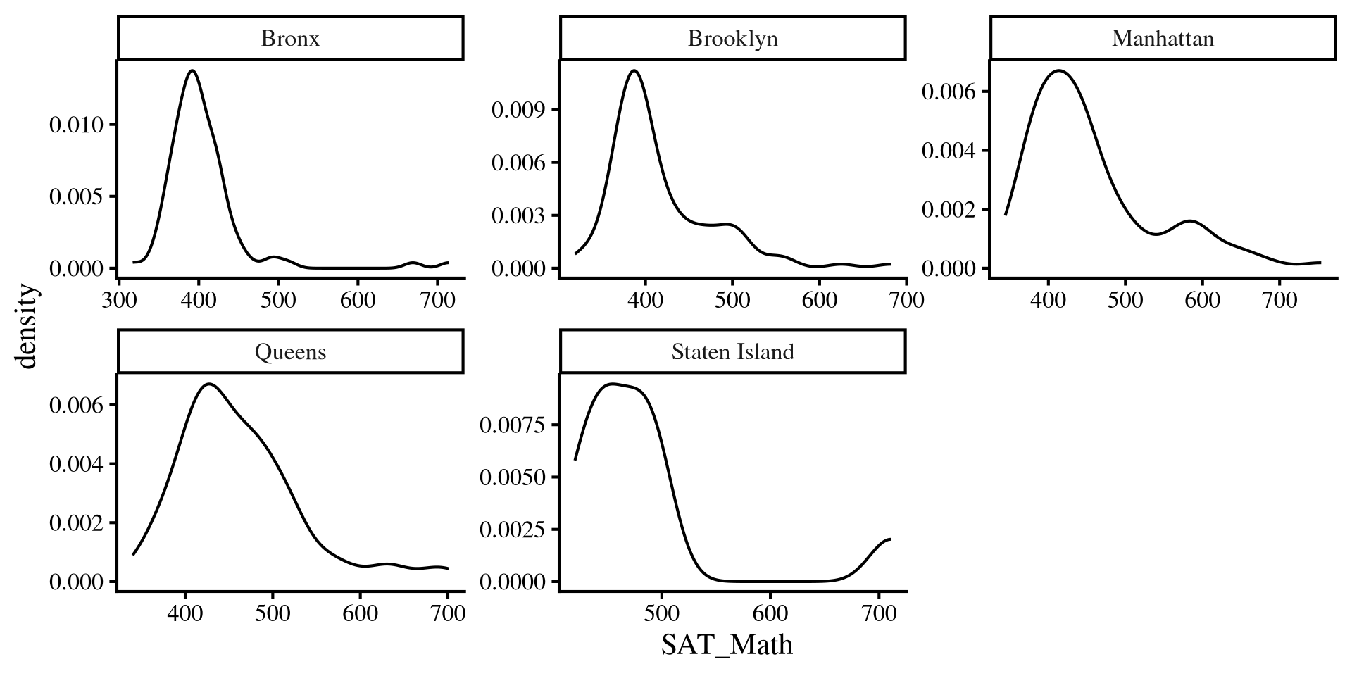
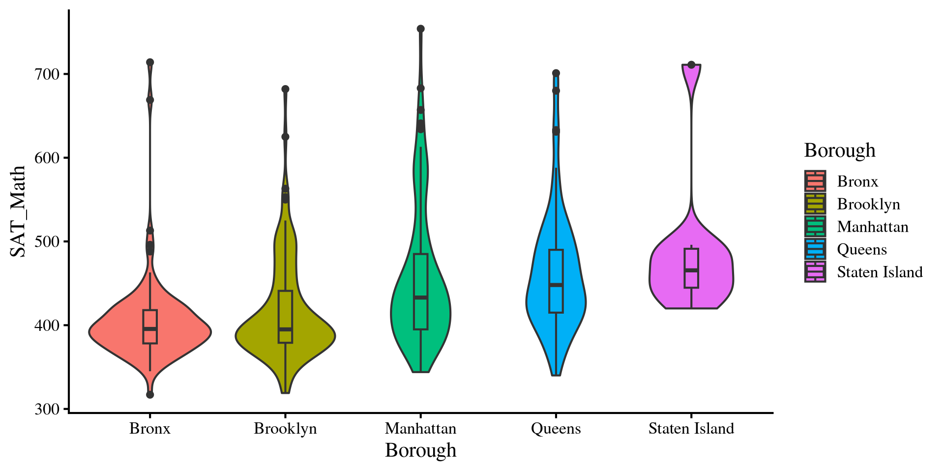
Normality Assumption: Violin Plots

ggplot(dat, aes(y = SAT_Math, 
                x = Borough, 
                fill = Borough)) +
  geom_violin() +
  # this will create a boxplot inside the violins
  geom_boxplot(width = 0.1)

Violin plots are very helpful visualizations because they can provide a lot of information:

  • For each borough, the outside part is a density plot and shows the variable distribution (it’s mirrored)
  • For each borough, we have a boxplot inside the density, which shows median, IQR, and outliers.

So, we get A LOT of information about the group distributions in a single plot. Notably, we can see that we have some outliers that skew our distributions. These are schools that score very high on SAT_Math

Equal variances Assumptions: Violin Plots

normal ANOVAs also assume that the variance is equal across groups. Just like the t-test, the assumption of equal variances rarely holds in practice.

We can see that the desnities have different shapes, suggesting differences in group variances. We can also look at the range of the histograms and see that the height of the rectagnle is different across groups.

We will look at some adjustments to the ANOVA results when assumptions are violated. However, note that we will only look at adjustments to the ANOVA itself, not to all the other analyses such as mean comparisons and contrasts.

Weighted Least Squares

When variances are not equal, groups with larger variances will have more influence on the results. A way to adjust for that is to use weighted least squares (WLS) estimation.

Why this works is way beyond the scope of this course. What we do is assign each school a weight, which is going to be \(\frac{1}{\mathrm{Var(Group)}}\). This downweights schools from groups with large variances. We need to create a new column that represents this weight.


Then, we rerun the regression. However, we make sure to specify that we want to use the WLS_weights variable as weights by passing it to the weights = argument. Here the results are very similar to before 🤷

# we can use gropup_by to create a new variable that represents the weights
dat <- dat %>% 
        group_by(Borough) %>%
          mutate(WLS_weights = 1 / var(SAT_Math))


reg_w <- lm(SAT_Math ~ Borough, weights = WLS_weights,  data = dat)
anova(reg_w)
Analysis of Variance Table

Response: SAT_Math
           Df Sum Sq Mean Sq F value    Pr(>F)    
Borough     4  53.66  13.414  13.414 3.218e-10 ***
Residuals 370 370.00   1.000                      
---
Signif. codes:  0 '***' 0.001 '**' 0.01 '*' 0.05 '.' 0.1 ' ' 1

White’s Adjustment

Once again, What White’s adjustment does is way beyond the scope of this course.

To apply White’s adjustment we use the Anova() function from the car package.

car::Anova(reg, white.adjust = TRUE)
Analysis of Deviance Table (Type II tests)

Response: SAT_Math
           Df      F    Pr(>F)    
Borough     4 13.132 5.181e-10 ***
Residuals 370                     
---
Signif. codes:  0 '***' 0.001 '**' 0.01 '*' 0.05 '.' 0.1 ' ' 1

Results are similar without the adjustment:

anova(reg)
Analysis of Variance Table

Response: SAT_Math
           Df  Sum Sq Mean Sq F value    Pr(>F)    
Borough     4  244835   61209  13.389 3.355e-10 ***
Residuals 370 1691417    4571                      
---
Signif. codes:  0 '***' 0.001 '**' 0.01 '*' 0.05 '.' 0.1 ' ' 1

The WLS adjustment also gives more or less the same results:

anova(reg_w)
Analysis of Variance Table

Response: SAT_Math
           Df Sum Sq Mean Sq F value    Pr(>F)    
Borough     4  53.66  13.414  13.414 3.218e-10 ***
Residuals 370 370.00   1.000                      
---
Signif. codes:  0 '***' 0.001 '**' 0.01 '*' 0.05 '.' 0.1 ' ' 1

In our case, the F-statistic is really similar with and without adjustments, meaning that the results are more or less equivalent with or without adjustments.

References

Kroes, A. D. A., & Finley, J. R. (2025). Demystifying omega squared: Practical guidance for effect size in common analysis of variance designs. Psychological Methods, 30(4), 866–887. https://doi.org/10.1037/met0000581
Lenth, R. V., Banfai, B., Bolker, B., Buerkner, P., Giné-Vázquez, I., Herve, M., Jung, M., Love, J., Miguez, F., Piaskowski, J., Riebl, H., & Singmann, H. (2025). Emmeans: Estimated Marginal Means, aka Least-Squares Means.

Appendix: More About ANOVA Math

Sums of Squares

ANOVA works with sums of squares:

  • \(SS_{\mathrm{total}} = \sum_i \sum_j (x_{ij} - \bar{x})^2\)
  • \(SS_{\mathrm{between}} = \sum_j n_j \times (\bar{x}_j - \bar{x})^2\)
  • \(SS_{\mathrm{within}} = \sum_i \sum_j (x_{ij} - \bar{x}_j)^2\)
  • \(i\) is the observation, individual schools in our case, and \(j\) is the group, borough in our case. \(n_j\) is the sample size of each group.
  • \(x_{ij}\): school \(i\) in borough \(j\).
  • \(\bar{x}_j\): the mean of SAT_Math for borough \(j\).
  • \(\bar{x}\): the mean of SAT_Math, ignoring the borough variable. This is also known as the grand mean.

It may seem that these equations come a bit out of nowhere, but if notice they are very similar to the numerator for the formula of the variance! In fact, these formulas all calculate variances (variances of residuals technically) based on different criteria.

What Do These sums of squares mean?

The 3 sums of squares have a very precise interpretation and help us test the hypothesis of whether there are meaningful group mean differences in our DV.

\(SS_{\mathrm{total}} = \sum_i \sum_j (x_{ij} - \bar{x})^2\)

The \(SS_{\mathrm{total}}\) is equivalent to the variance of the original variable, SAT_Math. This quantifies how well we would be able too predict SAT_Math with its mean alone.

grand_mean <- mean(dat$SAT_Math)

SS_tot <- sum((dat$SAT_Math - grand_mean)^2)
[1] 1936252

note that:

\[SS_{\mathrm{total}} = SS_{\mathrm{between}} + SS_{\mathrm{within}}\]

\(SS_{\mathrm{between}} = \sum_j n_j \times (\bar{x}_j - \bar{x})^2\)

The \(SS_{\mathrm{between}}\) quantifies how much group means differ from the grand mean, as well as the improvement in prediction after using the group means.

# summary with group means and group size
group_means <- dat %>% 
  group_by(Borough) %>% 
   summarise(Mean = mean(SAT_Math),
             Group_size = n()) 

SS_betw <-sum(group_means$Group_size*(group_means$Mean - grand_mean)^2)
[1] 244834.7
\(SS_{\mathrm{within}} = \sum_i \sum_j (x_{ij} - \bar{x}_j)^2\)

The \(SS_{\mathrm{within}}\) is the difference from each school compared to the mean SAT_Math in their borough (i.e., residul variance after using group means to predict SAT_Math).

# we calculated something very similar a few slides ago

SS_with <- sum((dat$SAT_Math - dat$SAT_Math_Borough)^2)
[1] 1691417

Mean Square Error and \(F\)-Statistic

now that we have our sums of squares, we need to turn them into variances, which are the mean squared errors. Normally, you divide by \(n - 1\) to get a variance from sums of squares, but there is a caveat for ANOVA. For statistic reasons, the appropriate denominator to run the others into variances is \(k - 1\) for \(SS_{\mathrm{between}}\) and \(n - k\) for \(SS_{\mathrm{between}}\).

One-way ANOVA Table
Source SS df MS F
Between Groups \(\sum_j n_j \times (\bar{x}_j - \bar{x})^2\) \(k - 1\) \(\frac{SS_{\mathrm{between}}}{k - 1}\) \(\frac{MS_{\mathrm{between}}}{MS_{\mathrm{within}}}\)
Within (Error) \(\sum_i \sum_j (x_{ij} - \bar{x}_j)^2\) \(n - k\) \(\frac{SS_{\mathrm{within}}}{n - k}\)
Total \(\sum_i \sum_j (x_{ij} - \bar{x})^2\) \(n - 1\)


MSB <- SS_betw/(5 - 1)
[1] 61208.67
MSW <- SS_with/(nrow(dat) - 5)
[1] 4571.398

The \(F\)-statistic, \(F = \frac{61208.67}{4571.398} = 13.389\) is thus a ratio of two variances. Namely, the \(F\)-ratio quantifies how much the group mean change (variability of group means) in comparison to the individuals within the groups (within group variability). The more variability of group means, the larger the \(F\)-statistic.