Lab 2: Descriptive Statistics, Data Manipulation, and Plotting

Fabio Setti

PSYC 6802 - Introduction to Psychology Statistics

Today’s Packages and Data 🤗

Install Packages Code
# run for packages that you have not installed yet
install.packages("tidyverse")
install.packages("rio")
install.packages("e1071")
library(tidyverse)
library(rio)
library(e1071)


The tidyverse package (Wickham & RStudio, 2023) loads a suite of packages that help with data manipulation and visualization. You can find the full package list here. Among others, tidyverse loads both dplyr and ggplot2.

The dplyr package (Wickham et al., 2023) of·fers a set of intuitive functions to work with data. The dplyr functions are great for data manipulation and data cleaning.

The ggplot2 package (Wickham et al., 2024) is the most popular R package for data visualization. There exist other ways to create data visualizations in R, but ggplot2 is usually my choice.

The rio package (Becker et al., 2024) developers describe this package as the Swiss-Army Knife for Data I/O. The import() and export() functions can import/export just about any data type.

The e1071 (Meyer et al., 2024) package contains a bunch of machine learning functions. We will only use it to calculate skewness and kurtosis.

Data

You can open the data without any downloads with the line below. see Here for why and how I do it.

WH_2024 <- import("https://fabio-setti.netlify.app/data/World_happiness_2024.csv")
We’ll use the 2024 world happiness report data again.

Ways Of Taking a Look at the data

Here are two similar ways of taking a general look at our data.

As shown in Lab 1, the base R function is str()

str(WH_2024)
'data.frame':   140 obs. of  9 variables:
 $ Country_name           : chr  "Finland" "Denmark" "Iceland" "Sweden" ...
 $ Region                 : chr  "Western Europe" "Western Europe" "Western Europe" "Western Europe" ...
 $ Happiness_score        : num  7.74 7.58 7.53 7.34 7.34 ...
 $ Log_GDP                : num  1.84 1.91 1.88 1.88 1.8 ...
 $ Social_support         : num  1.57 1.52 1.62 1.5 1.51 ...
 $ Healthy_life_expectancy: num  0.695 0.699 0.718 0.724 0.74 0.706 0.704 0.708 0.747 0.692 ...
 $ Freedom                : num  0.859 0.823 0.819 0.838 0.641 0.725 0.835 0.801 0.759 0.756 ...
 $ Generosity             : num  0.142 0.204 0.258 0.221 0.153 0.247 0.224 0.146 0.173 0.225 ...
 $ Corruption             : num  0.454 0.452 0.818 0.476 0.807 0.628 0.516 0.568 0.502 0.677 ...
# NOTE: `num` and `<dbl>` are the same type of variable

The dplyr function to look at data is glimpse()

glimpse(WH_2024)
Rows: 140
Columns: 9
$ Country_name            <chr> "Finland", "Denmark", "Iceland", "Sweden", "Is…
$ Region                  <chr> "Western Europe", "Western Europe", "Western E…
$ Happiness_score         <dbl> 7.741, 7.583, 7.525, 7.344, 7.341, 7.319, 7.30…
$ Log_GDP                 <dbl> 1.844, 1.908, 1.881, 1.878, 1.803, 1.901, 1.95…
$ Social_support          <dbl> 1.572, 1.520, 1.617, 1.501, 1.513, 1.462, 1.51…
$ Healthy_life_expectancy <dbl> 0.695, 0.699, 0.718, 0.724, 0.740, 0.706, 0.70…
$ Freedom                 <dbl> 0.859, 0.823, 0.819, 0.838, 0.641, 0.725, 0.83…
$ Generosity              <dbl> 0.142, 0.204, 0.258, 0.221, 0.153, 0.247, 0.22…
$ Corruption              <dbl> 0.454, 0.452, 0.818, 0.476, 0.807, 0.628, 0.51…

Personally, I usually just use the built-in RStudio viewer to look at data. You can open it by clicking on the WH_2024 object in the environment or by running View(WH_2024).

Tables and Proportions

We have also seen the table() function in Lab 1. Here we count the number of countries in each Region:

table(WH_2024$Region)

        Africa           Asia      Caribbean Eastern Europe   Middele East 
            40             22              2             23             11 
 North America        Oceania  South America Western Europe 
             8              2             11             21 

What if we want the proportion of countries in each region? We divide by the total number of countries.

# many ways to get the total. Here I just get the rows of the data since every row is an individual country
table(WH_2024$Region)/nrow(WH_2024)

        Africa           Asia      Caribbean Eastern Europe   Middele East 
    0.28571429     0.15714286     0.01428571     0.16428571     0.07857143 
 North America        Oceania  South America Western Europe 
    0.05714286     0.01428571     0.07857143     0.15000000 

Of course we can get percentages by multiplying the proportions by \(100\)

table(WH_2024$Region)/nrow(WH_2024)*100

        Africa           Asia      Caribbean Eastern Europe   Middele East 
     28.571429      15.714286       1.428571      16.428571       7.857143 
 North America        Oceania  South America Western Europe 
      5.714286       1.428571       7.857143      15.000000 

Central Tendency: Mode

The mode is the value that occurs the most in a set of observations. In practice we would calculate the mode only for discrete or ordinal data (e.g., Likert scales).

There is no function that directly calculates the mode, but finding the values that occurs the most in a vector is a very simple task. Here we use which.max():

tab <- table(WH_2024$Region)
# we give the output of table(WH_2024$Region) as the input to which.max()
which.max(tab)
Africa 
     1 

Given a vector of numbers, the which.max() function returns the index of the highest value. Thus Africa is the mode of the Region variable.

Let’s say that at the same time I would like to know how many times the mode occurs. Instead of just printing all the values of our table, much more efficient is:

tab[which.max(tab)]
Africa 
    40 

Here we use the fact that which.max() always gives the index of th highest value (1, the first one, in this case). Then we extract that value from the tab object by using the the [] operator

Central Tendency: Mean and Median

The mean and median are measures of central tendency. We use them to describe values around which data tends to cluster.

  • Mean: \(\bar{x} = \frac{\sum x_i}{n}\), where the numerator is the sum of all the observations and \(n\) is the sample size.
  • Median: The value at the 50th percentile (more about percentiles later)

The mean is by far more popular than the median for mathematical reasons, but is influenced by outliers

In the case on the right, the median better describes the central tendency of the x vector.

mean(WH_2024$Happiness_score)
[1] 5.530893
median(WH_2024$Happiness_score)
[1] 5.8005
# some values with an outlier
x <- c(3,4,5,6,7,8,3,4,5,6,7,90)
mean(x)
[1] 12.33333
median(x)
[1] 5.5

Still, to describe continuous or ordinal variables, we generally use the mean.

Dispersion: Variance and Standard Deviation

The variance and standard deviation (SD) are measures of how “spread out” the data is. Mathematically, they are both measures of how distant observations are from the mean on average.

  • Variance: \(S^2 = \frac{\sum (x_i - \bar{x})^2}{n - 1}\), where the numerator is the sum of all the squared differences between each observation (\(x_i\)) and the mean (\(\bar{x}\)). The denominator simply divides by the total number of observations (\(n\)) minus 1.
  • Standard deviation: \(S = \sqrt{\frac{\sum (x_i - \bar{x})^2}{n - 1}}\), which is simply the square root of the variance.
var(WH_2024$Happiness_score)
[1] 1.395344


# same as `sqrt(var(WH_2024$Happiness_score))`
sd(WH_2024$Happiness_score)
[1] 1.181247

Variance or Standard Deviation? 🤔

Glossing over a ton of mathematical nuances, the SD is the measure of dispersion that you should use. Why? The Variance squares your variable, making it into squared units, which are not very intuitive. By taking the square root of the variance, the SD turns it back into the original units of the variable, making it much easier to understand!

Shape: Skewness and Kurtosis

Skewness and kurtosis are statistics that describe the shape of the distribution of some data.

  • Skewness: describes the degree and direction of asymmetry in a distribution. If it is negative, the distribution will have a left tail. If it is positive, the distribution will have a right tail.
  • Kurtosis: describes the peakedness of a distribution. Negative values mean that the distribution is more flat than a normal distribution, while positive values imply that the distribution is more peaked than a normal distribution.
e1071::skewness(WH_2024$Happiness_score)
[1] -0.5154923


e1071::kurtosis(WH_2024$Happiness_score)
[1] -0.2906174

The :: Operator

The :: operator is used to refer to a specific function from a package. So above, for example, I used the kurtosis() function from the e1071 package. The difference between this and running library(e1071) followed by kurtosis() is that I am no loading the full e1071 package. One of the advantage is that it makes it clear what package the kurtosis() function comes from; the other advantage is that it avoids package conflicts.

Interactive Normal Distribution

Notice how the mean, median, and mode are no longer the same after you add some skewness.

Mode again?

I mentioned that we would not calculate the mode for continuous variables. Indeed, in the case of Happiness_score, no mode exists because all the values are different. However, when talking about a distribution (like the one on the left), the mode is defined as the peak of the distribution.

Percentiles

Given a continuous variable, you can think of percentiles as cut-offs that divide observations into 100 ordered groups. Then, for example, we say that an observation above the 50th percentile is “above 50% of the rest of the observations”.

We use the quantile() function to find the percentile of a variable:

# find the 50th percentile (the median). The first argument is the vector of observations and the second argument is the desired percentile (from 0 to 1)
quantile(WH_2024$Happiness_score, .5)
   50% 
5.8005 

We can also get multiple percentiles at once like so:

# get the 25th, 50th, and 75th percentiles of Happiness_score
quantile(WH_2024$Happiness_score, c(.25, .5, .75))
    25%     50%     75% 
4.63175 5.80050 6.42625 

You may also want to use the interquartile range (IQR) to describe the range between which 50% of the observations fall.

IQR(WH_2024$Happiness_score)
[1] 1.7945

The IQR is just the 75th percentile minus the 25th percentile

# disregard the "75%" that appears above the number
quantile(WH_2024$Happiness_score, .75) - quantile(WH_2024$Happiness_score, .25)
   75% 
1.7945 


Data Manipulation with dplyr

An Overview of dplyr

dplyr offers a host of function to manipulate data in R. You can more or less achieve anything dplyr does with base R functions, but it usually takes more work. Some dplyr functions that we will look at are:

  • select(): Selects a specific set of columns in a data.frame. It can also be used to discard specific columns.

  • mutate(): Modifies or creates columns in a data.frame.

  • filter(): filters row of a data.frame based on one or more conditions.

  • group_by() + summarise(): I almost always end up using these two functions together. group_by() groups the data and summarise() creates summaries for each group (makes more sense once you see it).

Something neat about tidyverse functions such as the ones from dplyr is that they accept the pipe operator, %>%.

Later we will see that the advantage of the pipe operator is that it allows to perform multiple actions (e.g., filter the data, than select a column, then compute some summary statistics) in a single statement!

The select() Function

We can select a subset of columns:

Select_EX1 <- WH_2024 %>% 
                select(Region, Happiness_score)

# check column names of Select_EX1 object
colnames(Select_EX1)
[1] "Region"          "Happiness_score"

We can also remove columns:

Select_EX2 <- WH_2024 %>% 
                select(-Region, -Happiness_score)

colnames(Select_EX2)
[1] "Country_name"            "Log_GDP"                
[3] "Social_support"          "Healthy_life_expectancy"
[5] "Freedom"                 "Generosity"             
[7] "Corruption"             

Notice how the %>% passes the information to its left to the right. Oh, and you do not have to start a new line after %>%, it’s just a convention for neater looking code 🤷

The keyboard shortcut to get the %>% is Ctrl + shift + M (Windows) or Cmd + shift + M (Mac)


select() not Working?

Sometimes your code will be perfectly fine but the select() function may give you problems. There is a package called MASS that is often loaded in the background and also includes a function called select(), that does something completely different. Thus, you may be inadvertently be using the select() function from the MASS package 😱 this “issue” can be resolved by using the :: operator and typing dplyr::select(Region, Happiness_score) in the first example on the left. Just keep this in mind if select() gives you trouble.

The filter() Function

filter_EX1 <- WH_2024 %>% 
                filter(Region == "Africa")
# We are only left with rows where the Region variable has Africa
nrow(filter_EX1)
[1] 40
filter_EX2 <- WH_2024 %>% 
                filter(Region == "Africa" & Happiness_score > 5)
# We filter for 2 condition by using the `&`. We additionally ask for only countries that have `Happiness_score` above 5
nrow(filter_EX2)
[1] 9
filter_EX3 <- WH_2024 %>% 
                filter(Region %in% c("Asia", "Africa"))
# the `%in%` operator is very useful. It selects all the rows where the Region variable has Africa OR Asia! `%in%` means "equal any of"
nrow(filter_EX3)
[1] 62

As you can see on the left, there are many ways in which you can filter data. The catch is that it requires you knowing conditional operators:

Operator Description
== Equal to
!= Not equal to
> Greater than
< Less than
>= Greater than or equal to
<= Less than or equal to
%in% Equal any of
! Logical NOT
& Element-wise logical AND
| Element-wise logical OR

The mutate() Function

mutate_EX1 <- WH_2024 %>% 
               mutate(log_happiness = log(Happiness_score),
                      # here I sum two columns
                      free_gen = Freedom + Generosity)
str(mutate_EX1)
'data.frame':   140 obs. of  11 variables:
 $ Country_name           : chr  "Finland" "Denmark" "Iceland" "Sweden" ...
 $ Region                 : chr  "Western Europe" "Western Europe" "Western Europe" "Western Europe" ...
 $ Happiness_score        : num  7.74 7.58 7.53 7.34 7.34 ...
 $ Log_GDP                : num  1.84 1.91 1.88 1.88 1.8 ...
 $ Social_support         : num  1.57 1.52 1.62 1.5 1.51 ...
 $ Healthy_life_expectancy: num  0.695 0.699 0.718 0.724 0.74 0.706 0.704 0.708 0.747 0.692 ...
 $ Freedom                : num  0.859 0.823 0.819 0.838 0.641 0.725 0.835 0.801 0.759 0.756 ...
 $ Generosity             : num  0.142 0.204 0.258 0.221 0.153 0.247 0.224 0.146 0.173 0.225 ...
 $ Corruption             : num  0.454 0.452 0.818 0.476 0.807 0.628 0.516 0.568 0.502 0.677 ...
 $ log_happiness          : num  2.05 2.03 2.02 1.99 1.99 ...
 $ free_gen               : num  1.001 1.027 1.077 1.059 0.794 ...

The mutate() function works by giving the name of the new variable on the left of the = sign and then the transformation of variables on the right. so, new_var = some_transformation.

On the left I create 2 new variables:

  • log_happiness, which is just a log transformation of the Happiness_score variable with the log() function.

  • free_gen, which is the sum of the Freedom and Generosity variable.

The group_by() and summarise() Functions

As I mentioned, I generally use these functions together. Here is an example:

WH_2024 %>% 
 group_by(Region) %>% 
  summarise(mean_happy = mean(Happiness_score),
            sd_happy = sd(Happiness_score))
# A tibble: 9 × 3
  Region         mean_happy sd_happy
  <chr>               <dbl>    <dbl>
1 Africa               4.40   0.724 
2 Asia                 5.48   0.850 
3 Caribbean            5.83   0.0134
4 Eastern Europe       5.95   0.599 
5 Middele East         4.96   1.84  
6 North America        6.46   0.299 
7 Oceania              7.04   0.0198
8 South America        6.09   0.427 
9 Western Europe       6.75   0.664 

In this case, the summarise() function creates a new object (a tibble, which is essentially a data.frame) that includes the mean (mean()) and SD (sd()) of Happiness_score for each Region.

Just as before with the mutate() function, we need to name the resulting columns by specifying the names before the = sign.

Note that this works because we first group the data by region using group_by(Region) and then pass it to summarise(). This would not be as easy without the %>% operator!

Concatenating dplyr Functions

The %>% shines when needing to perform multiple data manipulations in a row. Here is an example:

# pass the data
WH_2024 %>%
  # select only two columns of interest
  select(Region, Freedom) %>%
    # filter for Asia and Eastern Europe countries only
    filter(Region %in% c("Asia", "Eastern Europe")) %>%
      # Group by Region
      group_by(Region) %>%
        # get the mean and median for the two regions
        summarise(Free_Mean = mean(Freedom),
                  Free_Median = median(Freedom))
# A tibble: 2 × 3
  Region         Free_Mean Free_Median
  <chr>              <dbl>       <dbl>
1 Asia               0.709       0.750
2 Eastern Europe     0.649       0.65 

This is just a random example of how you can be very flexible in how you manipulate data with dplyr!


As always, there are multiple ways of achieving the same outcome in R. When dealing with data.frame objects, I personally like the dplyr functions to manipulate data. Others may prefer base R functions 🤷


Data Visualization with ggplot2

Working With ggplot2

I use ggplot2 a lot, but I can’t say that I would be able to create any plot “off the top of my head”. There are many ggplot2 functions, so learning what all of them do is impossible. When using ggplot2, I recommend that you:

  • Try to understand the logic behind ggplot2’s syntax.
  • Start with a simple plot and progressively build upon it.
  • Read functions documentation (i.e., function help menu) when something does not work as expected.
  • Look things up. Usually I start with some plot code that I find online that produces a similar plot to what I want, and then I modify/build on top of it.

GGplot fact that you did not ask for

ggplot2 is an implementation of Leland Wilkinson’s Grammar of Graphics, a scheme that breaks down data visualization into its components (e.g, lines, axes, layers…)

The Canvas

As mentioned in the box on the last slide, ggplot2 breaks visualizations into small parts and pastes them on top of each other through the + operator.

ggplot() 

Just running ggplot() actually gives output! This is our “canvas”

(You cannot see anything because the output is a white square, but it’s there, I promise 😅)

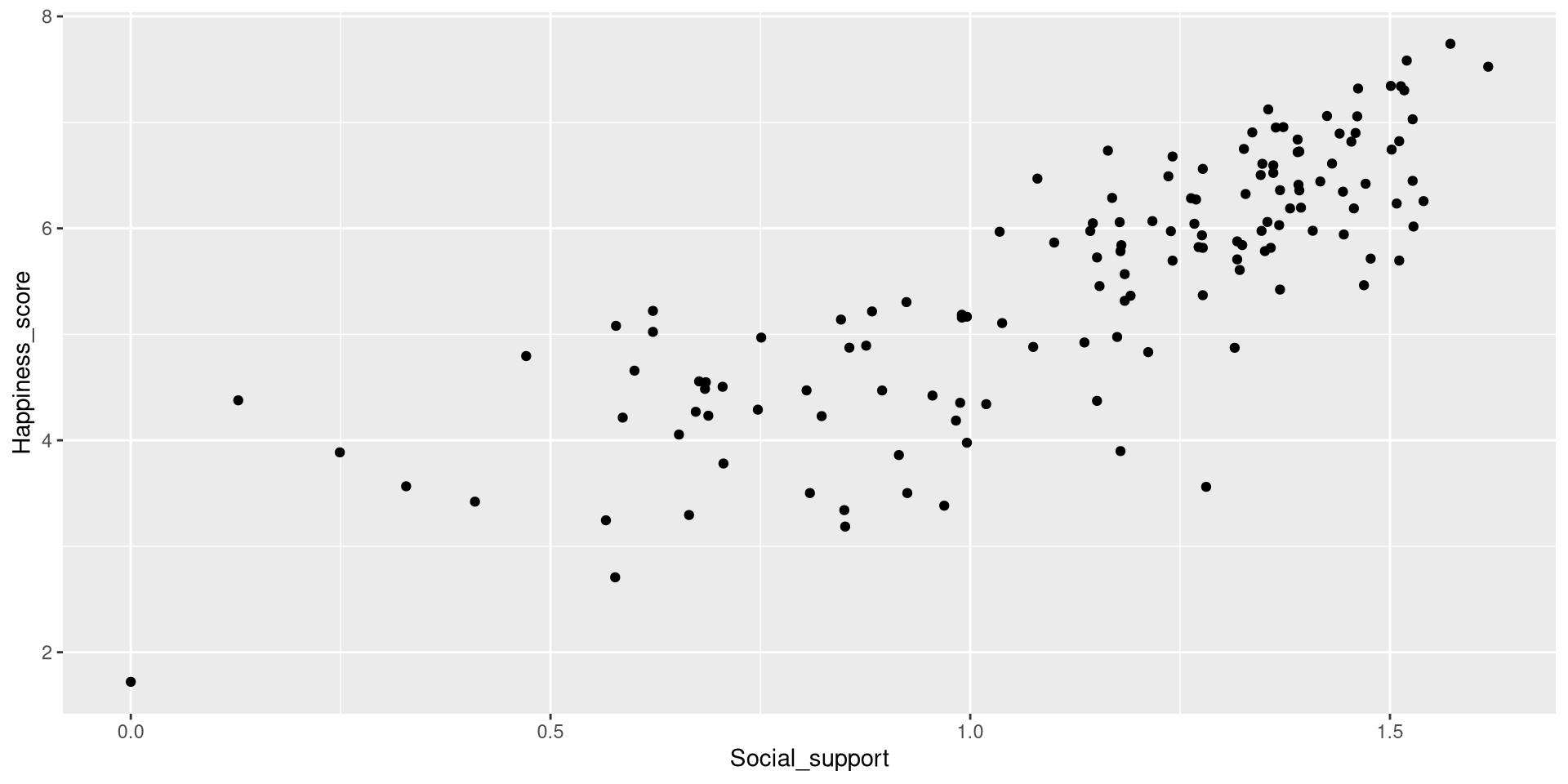
Define Coordinates with aes()

We use the aes() function to defined coordinates. Note that the name of the data object (WH_2024 in our case) is almost always the first argument of the ggplot() function. Let’s define the axes and put Social_support on the x-axis and Happiness_score on the y-axis.

ggplot(WH_2024,  
 aes(x = Social_support, 
     y = Happiness_score)) 

Scatterplot

We use one of the geom_...() functions to add shapes to our plot. This is a the geom_point() function can be use to create scatterplots.

ggplot(WH_2024,  
 aes(x = Social_support, 
     y = Happiness_score))  +
 geom_point()

geom_...()

The geom_...() functions add geometrical elements to a blank plot (see here for a list of all the geom_...() functions). Note that most geom_...() will inherit the X and Y coordinates from the ones given to the aes() function in the ggplot() function.
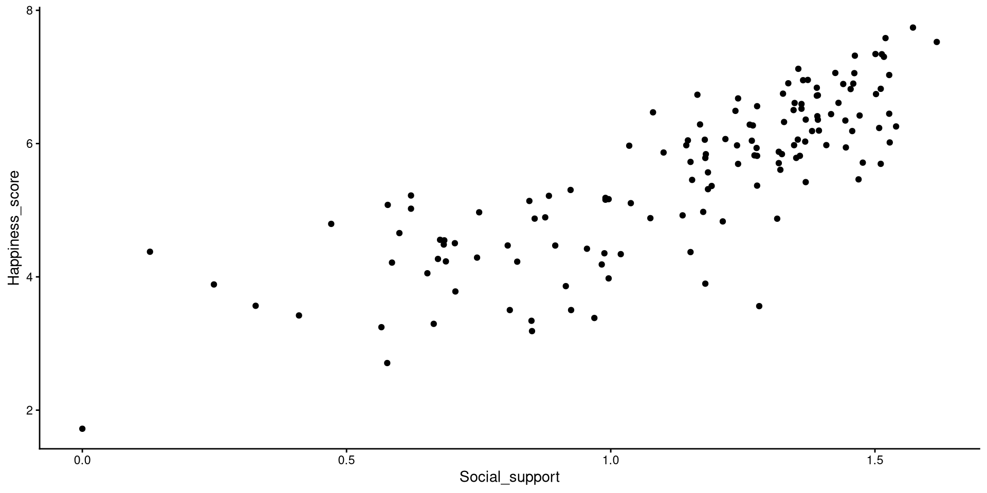
Themes

Sometimes ggplot2’s default theme is not the best (not sure what changed but it should look much worse than what I have on the slides) . There are many themes you can choose from, I like theme_classic().

ggplot(WH_2024,  
 aes(x = Social_support, 
     y = Happiness_score))  +
 geom_point() +
 theme_classic()

Set plots theme globally

You can also use the theme_set() that will set a default theme for all the plots that you create afterwards. So, in our case, we could run theme_set(theme_classic()), and the theme_classic() function would be applied to all the following plots, without needing to specify + theme_classic() every time.

Add Regression Line

We just drew a linear regression line through the data with geom_smooth(). The relation between Social_support and Happiness_score is strongly positive.

ggplot(WH_2024,  
 aes(x = Social_support, 
     y = Happiness_score))  +
 geom_point() +
 theme_classic() +
 geom_smooth(method = "lm", 
             se = FALSE)

# the argument `method = "lm"` tells `geom_smooth()` to draw a regression line. Other options exist 

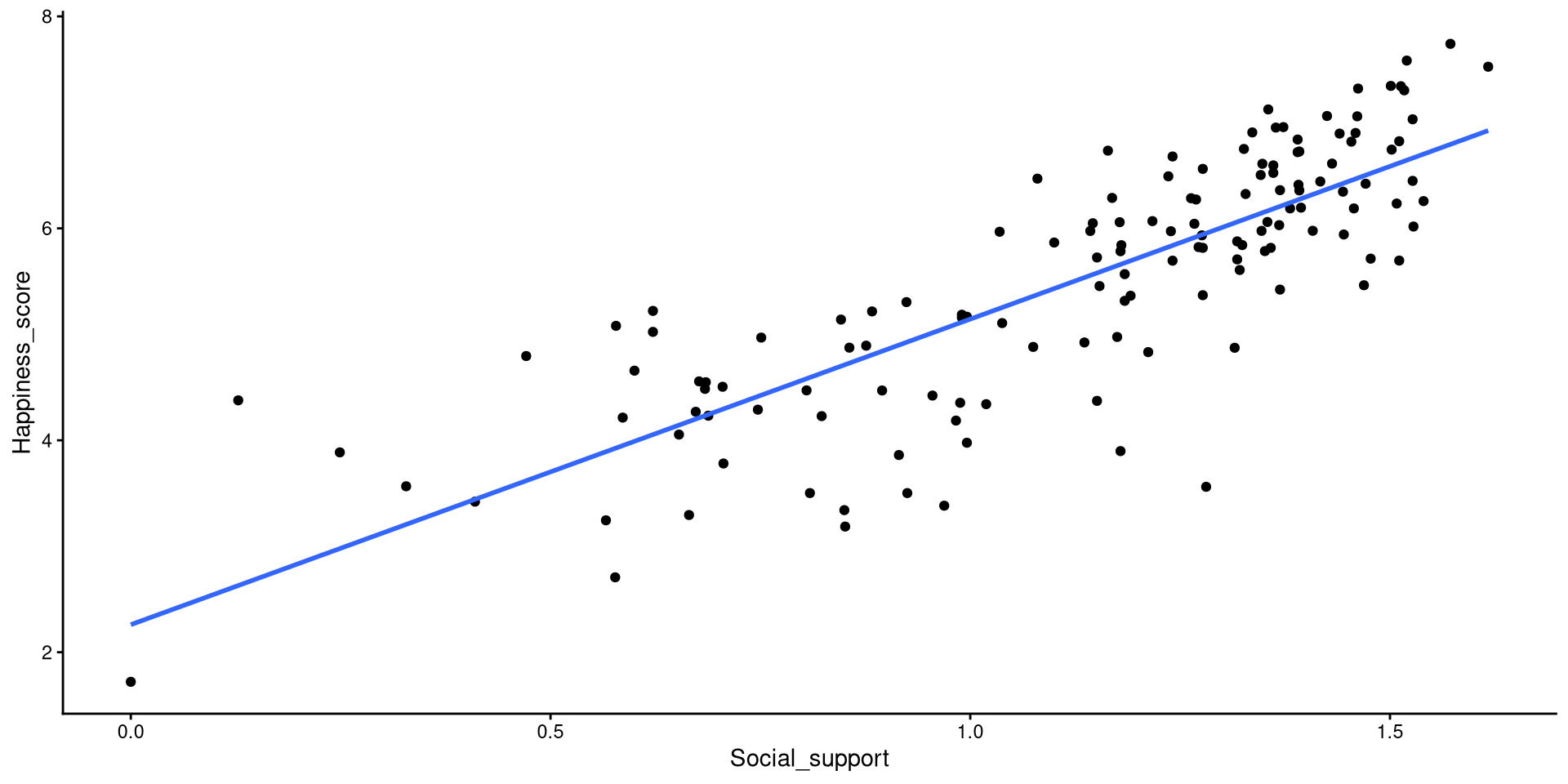
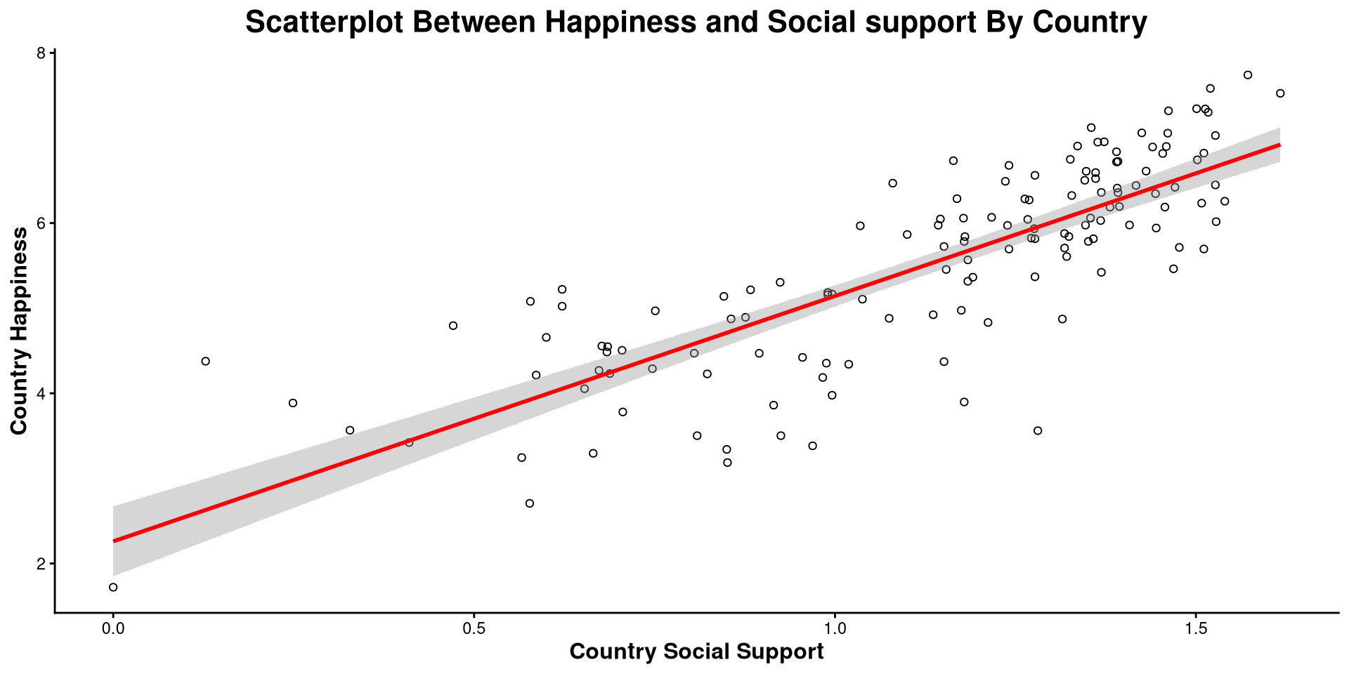
Modify Plot Elements

Here I made a bunch of changes to the plot. Spot the differences! What changes in the code resulted in what changes in the plot?

ggplot(WH_2024,  
 aes(x = Social_support, 
     y = Happiness_score))  +
       geom_point(shape = 1) +
       theme_classic() +
       geom_smooth(method = "lm", 
                   color = "red") +
       labs(title = "Scatterplot Between Happiness and Social support By Country",
            y= "Country Happiness", 
            x = "Country Social Support") +
       theme(plot.title = element_text(hjust = 0.5, face = "bold", size = 16),
             axis.title.x  = element_text(face= "bold", size = 12),
             axis.title.y = element_text(face= "bold", size = 12))


NOTE: The theme() function takes in many arguments (see here) that allow you to modify font size, position of plot elements, and much more!
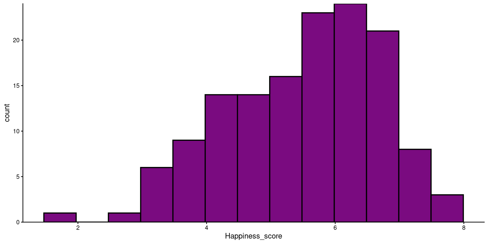
Histograms

Histograms are fairly useful for visualizing distributions of single variables. But you have to choose the number of bins appropriately.

# set theme globally
theme_set(theme_classic())

ggplot(WH_2024,  
       # note that we only need to give X, why?
       aes(x = Happiness_score)) +
       geom_histogram()

bins?

the number of bins is the number of bars on the plot. the geom_histogram() function defaults to 30 bins unless you specify otherwise (we indeed have 30 bars on the plot if you count them).

There are a bit too many bins, so it is hard to get a good sense of the distribution.
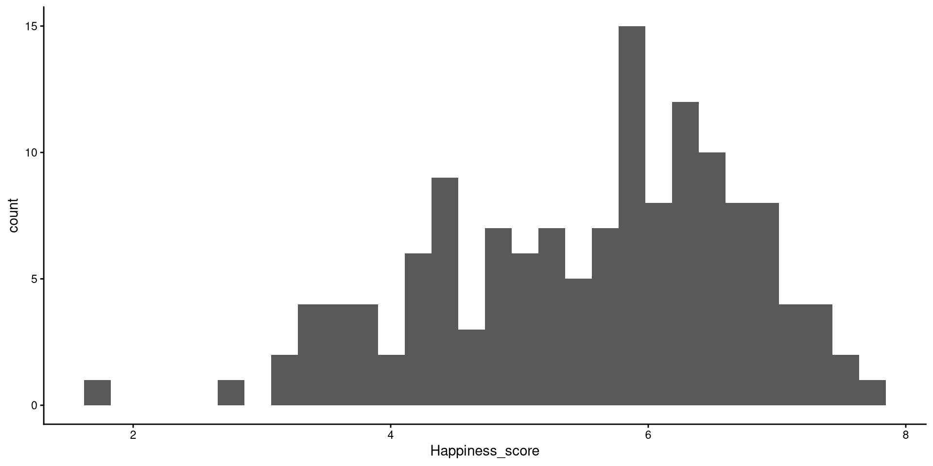
Histograms bins

Now that we have reduced the number of bins, the distribution looks more reasonable (still not the best though).

ggplot(WH_2024,  
       aes(x = Happiness_score)) +
       geom_histogram(bins = 13) 

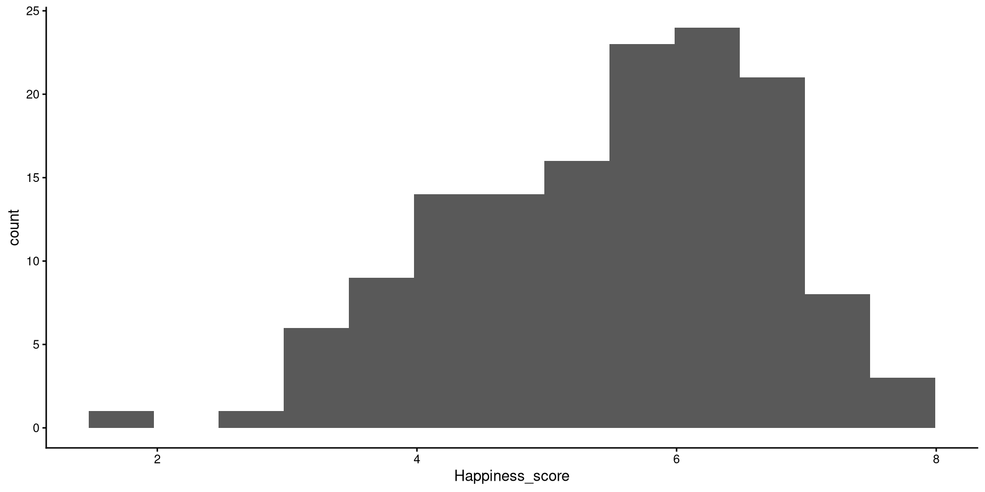
Better Looking Histogram

Here I just touched up the plot a bit. Notice the scale_y_continuous(expand = c(0,0)) function. Try running the plot without it and see if you notice the difference!

ggplot(WH_2024,  
       aes(x = Happiness_score)) +
       geom_histogram(bins = 13, 
                      color = "black",
                      linewidth = .8,
                      fill = "#7a0b80") +
      scale_y_continuous(expand = c(0,0))

HEX color codes

The “#7a0b80” is actually a color. R supports HEX color codes, which are codes that can represent just about all possible colors. There are many online color pickers (see here for example) that will let you select a color and provide the corresponding HEX color code.
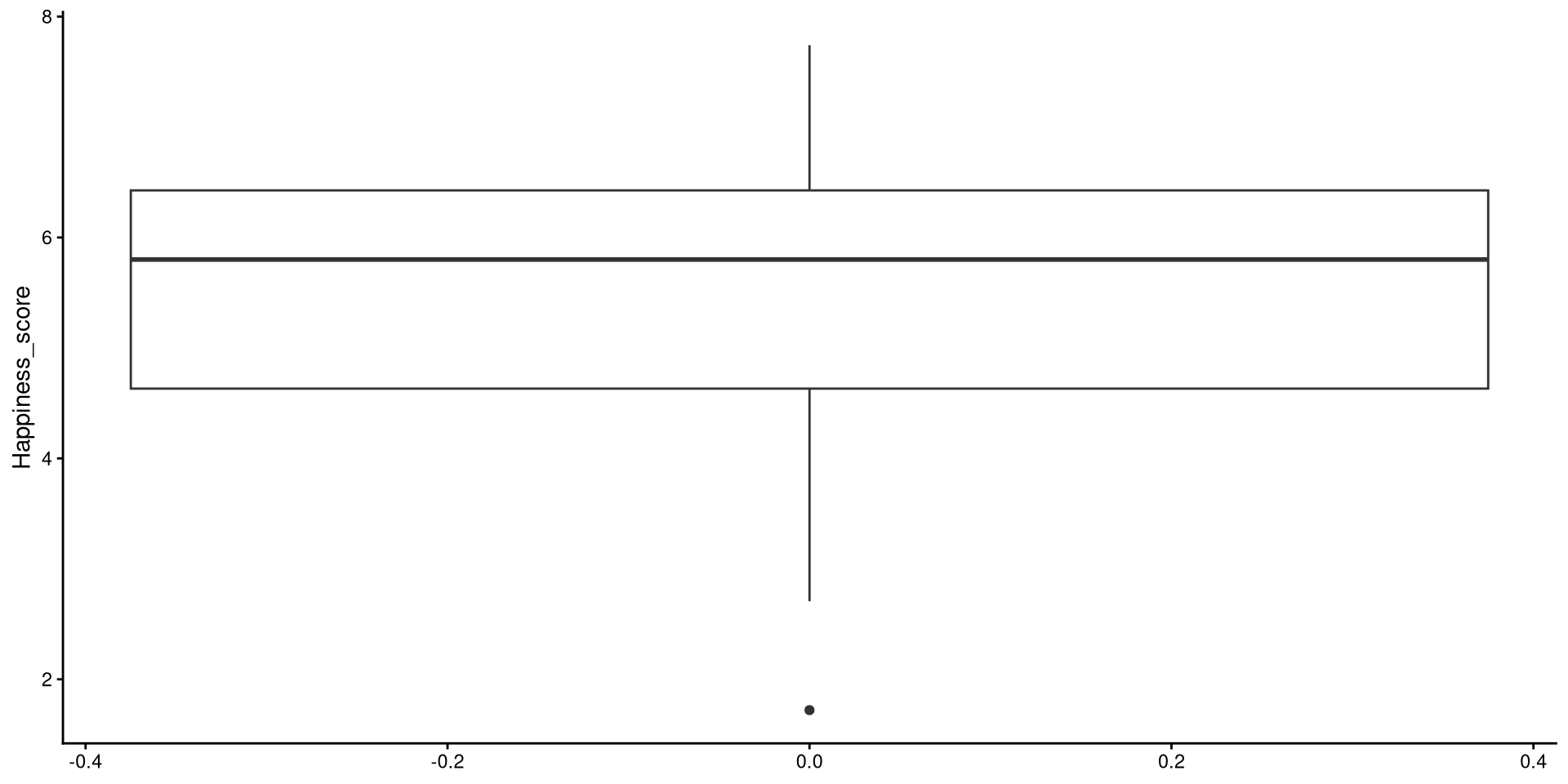
Boxplots

Box-plots very useful to get a sense of the variable’s variance, range, and to check for presence of outliers.

ggplot(WH_2024,
       aes(y = Happiness_score)) +
       geom_boxplot()

Reading a Box-plot

The square represents the interquartile range, meaning that the bottom edge is the \(25^{th}\) percentile of the variable and the top edge is the \(75^{th}\) percentile of the variable. The bolded line is the median of the variable, which is not quite in the middle of the box. This suggests some degree of skew.
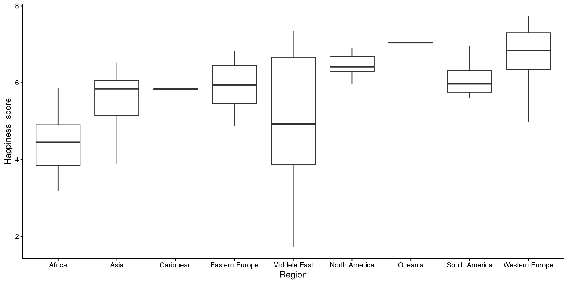
Grouped Boxplots

Boxplots also work quite well to get a graphical representation of group differences. Let’s plot Happiness_score by Region:

ggplot(WH_2024,
       aes(y = Happiness_score,
           x = Region)) +
       geom_boxplot()

So, just by looking at this boxplot we can tell that there are some noticeble differences in the distribution of Happiness_score across Region

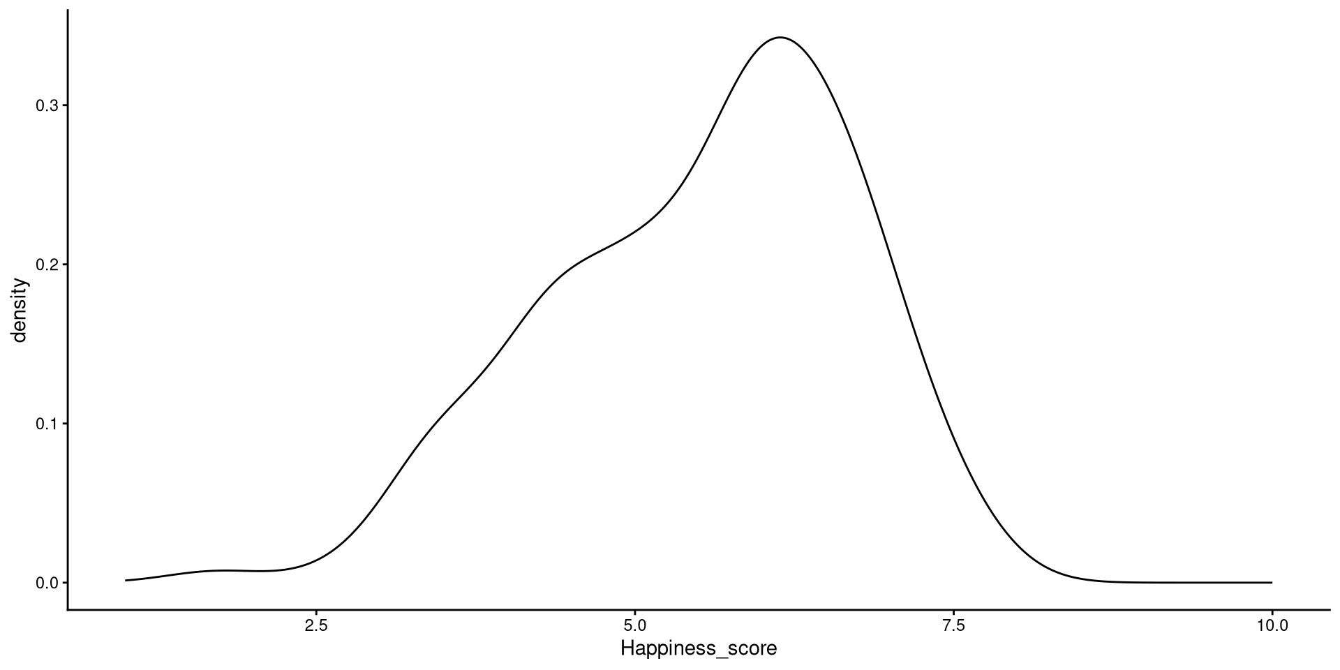
Kernel Density plots

Kernel density plots do a similar job to histograms, but I tend to prefer them over histograms.

ggplot(WH_2024,
       aes(x = Happiness_score)) +
       geom_density() +
       xlim(1, 10)
The xlim() function takes in 2 values that define the lower and upper bound of the x-axis (from 1 to 10).

Kernel?

The word kernel takes on widely different meanings depending on the context. In this case it is a function that estimates the probability distribution of some data (the black line in the plot) by looking at the density of observations at every point on the \(x\)-axis. Kernel estimation is often referred to as a non-parametric method.

References

Becker, M., Klößner, S., & Heinrich, J. (2024). PearsonDS: Pearson Distribution System.
Meyer, D., cre, Dimitriadou, E., Hornik, K., Weingessel, A., Leisch, F., C++-code), C.-C. C. (libsvm., & C++-code), C.-C. L. (libsvm. (2024). E1071: Misc Functions of the Department of Statistics, Probability Theory Group (Formerly: E1071), TU Wien.
Wickham, H., Chang, W., Henry, L., Pedersen, T. L., Takahashi, K., Wilke, C., Woo, K., Yutani, H., Dunnington, D., Brand, T. van den, Posit, & PBC. (2024). Ggplot2: Create Elegant Data Visualisations Using the Grammar of Graphics.
Wickham, H., François, R., Henry, L., Müller, K., Vaughan, D., Software, P., & PBC. (2023). Dplyr: A Grammar of Data Manipulation.
Wickham, H., & RStudio. (2023). Tidyverse: Easily Install and Load the ’Tidyverse.