NY_temp <- try(import("NY_Temp.txt"))Error : No such file: NY_Temp.txtPSYC 7804 - Regression with Lab
install.packages("rio")
install.packages("tidyverse")
install.packages("psych")library(rio)
library(tidyverse)
library(psych)The rio package (Becker et al., 2024) developers describe this package as the Swiss-Army Knife for Data I/O. The import() and export() functions can import/export just about any data type.
The tidyverse package (Wickham & RStudio, 2023) loads a suite of packages that help with data cleaning and visualization. Among others, tidyverse loads both dplyr and ggplot2.
The psych package (Revelle, 2024) includes MANY functions that help with data exploration and running analyses typically done in the social sciences.

There are millions of ways of doing the same thing. Loading data into R is the same. Here are your two alternatives for loading data into R:
Option 1: keep track of all the different functions to load different types of data files
read.csv()
read.table()
read.delim()
read.ftable()
read.csv2()
readRDS()
readr::read_csv()
readr::read_tsv()
readxl::read_excel()
haven::read_sav()
haven::read_dta()
haven::read_sas()
haven::read_stata()
# there's more, but you get the point
Option 2: achieve complete peace of mind 😌 by using the import() function from the rio package
rio::import()import() works on just about any type of data
How many of you have tried to load a data file, only to find out that it wasn’t in your working directory?
Typical Fordham stats lab experience:
NY_temp <- try(import("NY_Temp.txt"))Error : No such file: NY_Temp.txtNew and improved experience?
I have uploaded all the datasets that we will use for this lab to a github repository.
# run the line below and you should see the data appear in your environment
NY_temp <- import("https://github.com/quinix45/PSYC-7804-Regression-Lab-Slides/raw/refs/heads/main/Slides%20Files/Data/NY_Temp.txt")
Now that we have loaded our data , we should compute some descriptive statistics.
The str() function can give you good sense of the type of variables you are dealing with
str(NY_temp)'data.frame': 111 obs. of 5 variables:
$ Case : int 1 2 3 4 5 6 7 8 9 10 ...
$ NY_Ozone: int 41 36 12 18 23 19 8 16 11 14 ...
$ SolR : int 190 118 149 313 299 99 19 256 290 274 ...
$ Temp : int 67 72 74 62 65 59 61 69 66 68 ...
$ Wind : num 7.4 8 12.6 11.5 8.6 13.8 20.1 9.7 9.2 10.9 ...When dealing with continuous variables, the describe() function from the psych package is quite handy
# the `trim = .05` argument calculates means without the bottom/top 2.5% of the data
# add IQR = TRUE to get the interquartile range
psych::describe(NY_temp[,-1], trim = .05)
vars n mean sd median trimmed mad min max range skew kurtosis se
NY_Ozone 1 111 42.10 33.28 31.0 39.50 25.20 1.0 168.0 167.0 1.23 1.13 3.16
SolR 2 111 184.80 91.15 207.0 186.52 91.92 7.0 334.0 327.0 -0.48 -0.97 8.65
Temp 3 111 77.79 9.53 79.0 77.89 10.38 57.0 97.0 40.0 -0.22 -0.71 0.90
Wind 4 111 9.94 3.56 9.7 9.84 3.41 2.3 20.7 18.4 0.45 0.22 0.34The :: operator
Notice the psych::describe(). This reads “use the describe() function from the psych package”. This is equivalent to running library(psych) and then describe(), but using psych::describe() is better for learning purposes. Why? 🤔
I use ggplot2 a lot, but I can’t say that I would be able to create all plots “off the top of my head”. There are millions of ggplot2 functions, so learning what all of them do is impossible. When using ggplot2, I recommend that you:
ggplot’s syntax.
GGplot fact that you did not ask for
ggplot2 (Wickham et al., 2024) is an implementation of Leland Wilkinson’s Grammar of Graphics, a scheme that breaks down data visualization into its components (e.g, lines, axes, layers…)

As mentioned in the box on the last slide, ggplot2 breaks visualizations into small parts and pastes them on top of each other through the + operator.
ggplot() Just running ggplot() actually gives output! This is our “canvas”

We use the aes() function to defined coordinates. Note that the name of the data object (NY_temp in our case) is almost always the first argument of the ggplot() function. Let’s plot the temperature observed (Temp, \(y\)) at every measured time point (Case, \(x\)).
ggplot(NY_temp,
aes(x = Case, y = Temp)) 
We use one of the geom_...() functions to add shapes to our plot. This is a Profile plot.
ggplot(NY_temp,
 aes(x = Case, y = Temp)) +
 geom_point()
geom_...()
The geom_...() functions add geometrical elements to a blank plot (see here for a list of all the geom_...() functions). Note that most geom_...() will inherit the X and Y coordinates from the ones given to the aes() function in the ggplot() function.
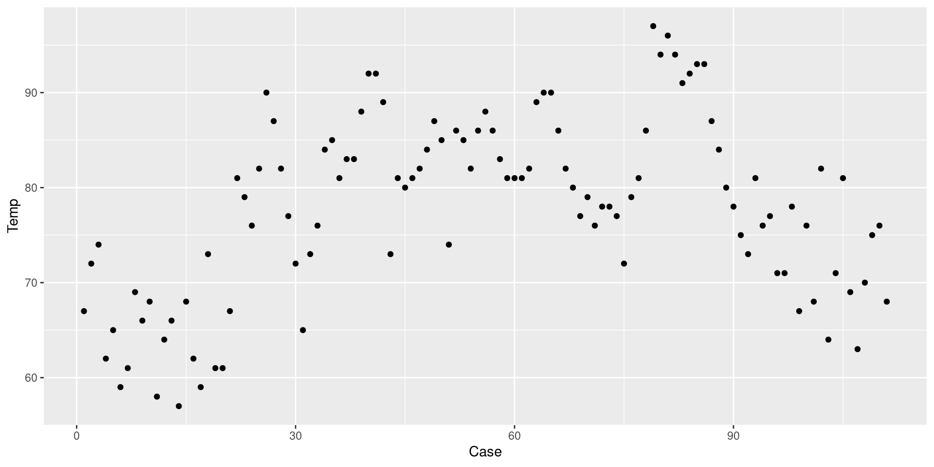
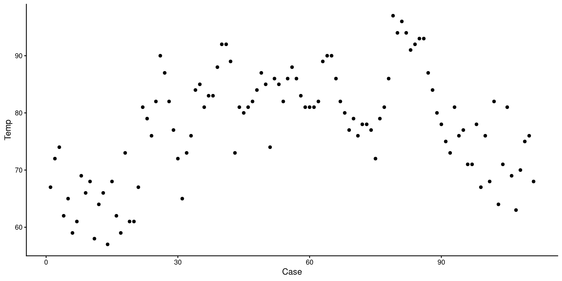
Before we do anything else, let’s save our eyes from ggplot2’s default theme. There are many themes you can choose form, I like theme_classic().
ggplot(NY_temp,
 aes(x = Case, y = Temp)) +
 geom_point() +
 theme_classic()
Set plots theme globally
You can also use the theme_set() that will set a default theme for all the plots that you create afterwards. So, in our case, we could run theme_set(theme_classic()), and the theme_classic() function would be applied to all the following plots, without needing to specify + theme_classic() every time.
We just drew a linear regression line through the data. What do you think of the trend of temperature in NYC over time?
ggplot(NY_temp,
 aes(x = Case, y = Temp)) +
 geom_point() +
 theme_classic() +
 geom_smooth(method = "lm",
             se = FALSE)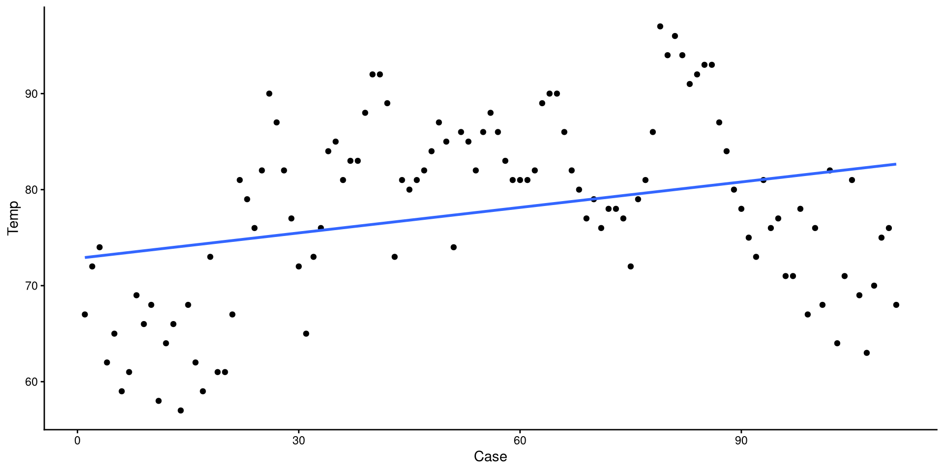
Now we added a quadratic regression line. Does this look better?
ggplot(NY_temp,
 aes(x = Case, y = Temp)) +
 geom_point() +
 theme_classic() +
 geom_smooth(method = "lm",
             se = FALSE) +
 geom_smooth(method = "lm",
             formula = y ~ poly(x, 2),
             color = "red",
             se = FALSE)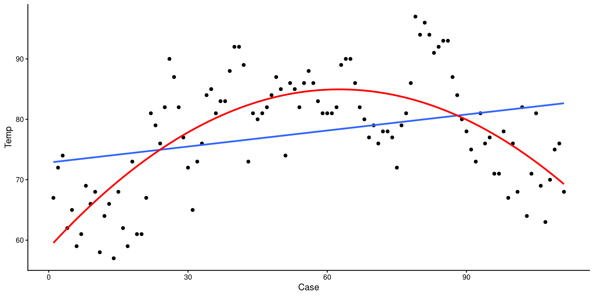
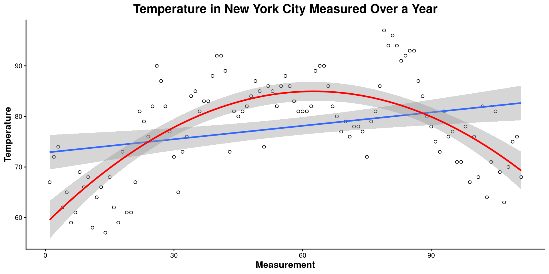
Here I made a bunch of changes to the plot. Spot the differences! What changes in the code resulted in what changes in the plot?
ggplot(NY_temp,
       aes(x = Case, y = Temp)) +
       geom_point(shape = 1) +
       theme_classic() +
       geom_smooth(method = "lm") +
       geom_smooth(method = "lm", formula = y ~ poly(x, 2),
                   color = "red") +
       labs(title = "Temperature in New York City Measured over a Year",
            y= "Temperature",
            x = "Measurement") +
       theme(plot.title = element_text(hjust = 0.5, face = "bold", size = 16),
             axis.title.x  = element_text(face= "bold", size = 12),
axis.title.y = element_text(face= "bold", size = 12))theme() function takes in many arguments (see here) that allow you to modify font size, position of plot elements, and much more!
This is the one-dimensional representation of the Temp variable.
ggplot(NY_temp,
       aes(x = Temp, y = 0)) +
       geom_point(shape = 1) +
       theme_classic()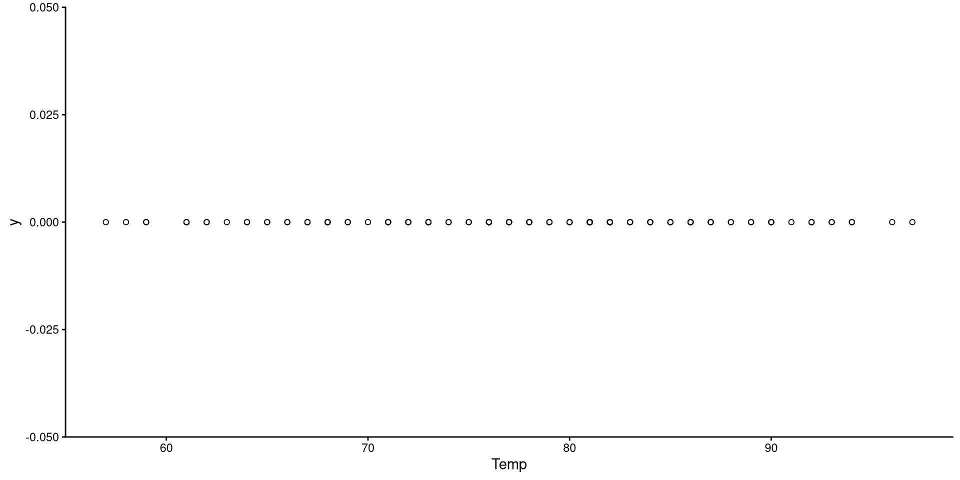
This plot gives a good graphical representation of the variance of a variable (I will use it again in a later lab to show something!). However, for visualizing data, we have better options…
Histograms are fairly useful for visualizing distributions of single variables. But you have to choose the number of bins appropriately.
# set theme globally
theme_set(theme_classic())

ggplot(NY_temp,
       # note that we only need to give X, why?
       aes(x = Temp)) +
       geom_histogram()
bins?
the number of bins is the number of bars on the plot. the geom_histogram() function defaults to 30 bins unless you specify otherwise (we indeed have 30 bars on the plot if you count them).
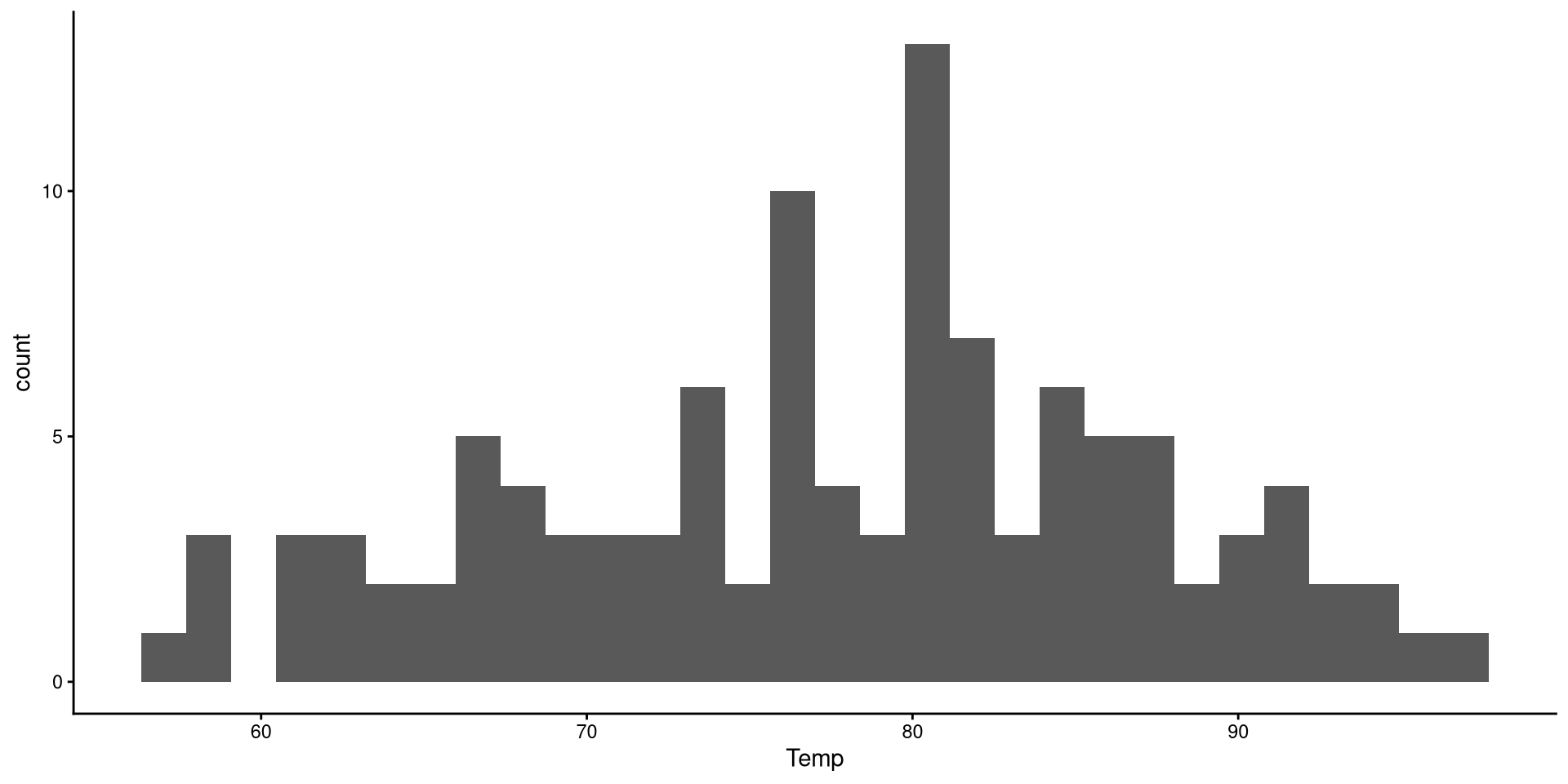
There are a bit too many bins, so it is hard to get a good sense of the distribution.
Now that we have reduced the number of bins, the distribution looks more reasonable.
ggplot(NY_temp,
       aes(x = Temp)) +
geom_histogram(bins = 15) 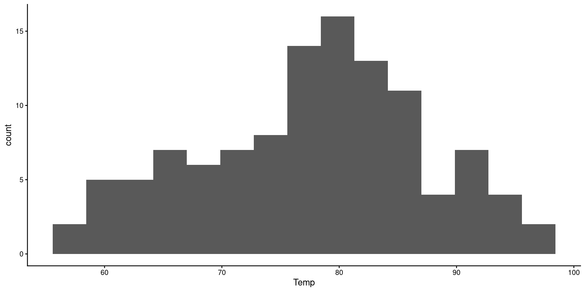
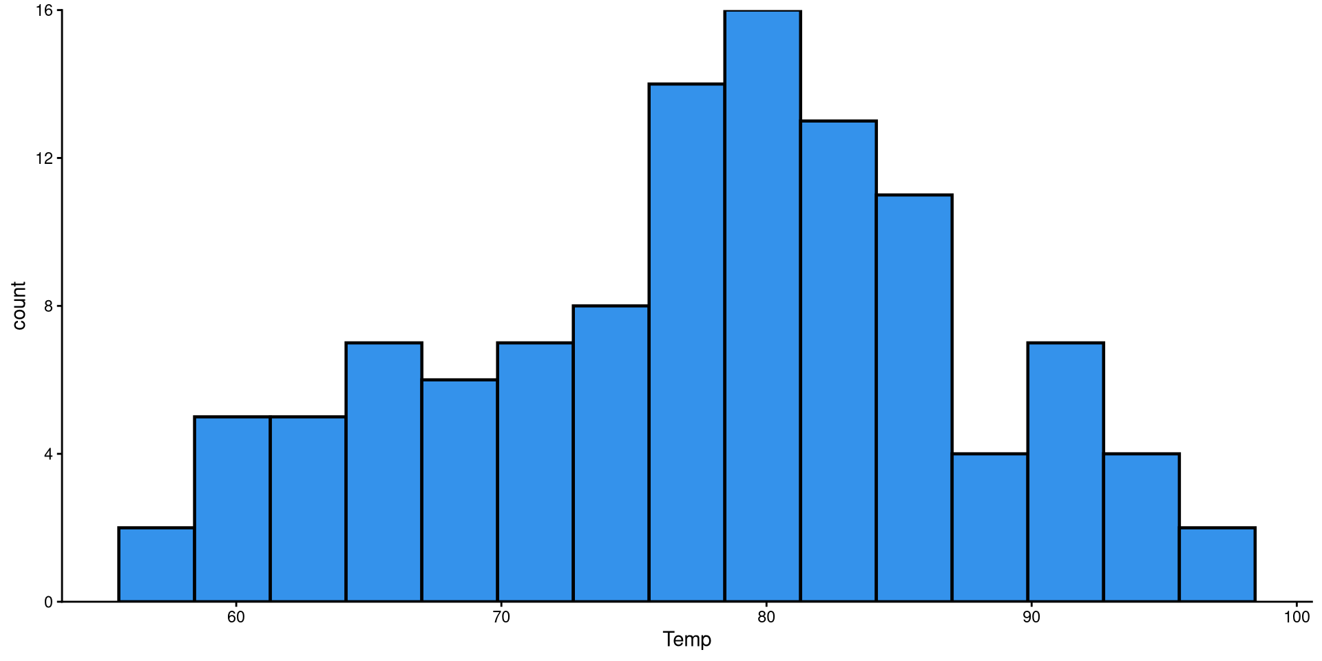
Here I just touched up the plot a bit. Notice the scale_y_continuous(expand = c(0,0)) function. Try running the plot without it and see if you notice the difference!
ggplot(NY_temp,
       aes(x = Temp)) +
       geom_histogram(bins = 15,
                      color = "black",
                      linewidth = .8,
                      fill = "#3492eb") +
      scale_y_continuous(expand = c(0,0))
HEX color codes
The “#3492eb” is actually a color. R supports HEX color codes, which are codes that can represent just about all possible colors. There are many online color pickers (see here for example) that will let you select a color and provide the corresponding HEX color code.
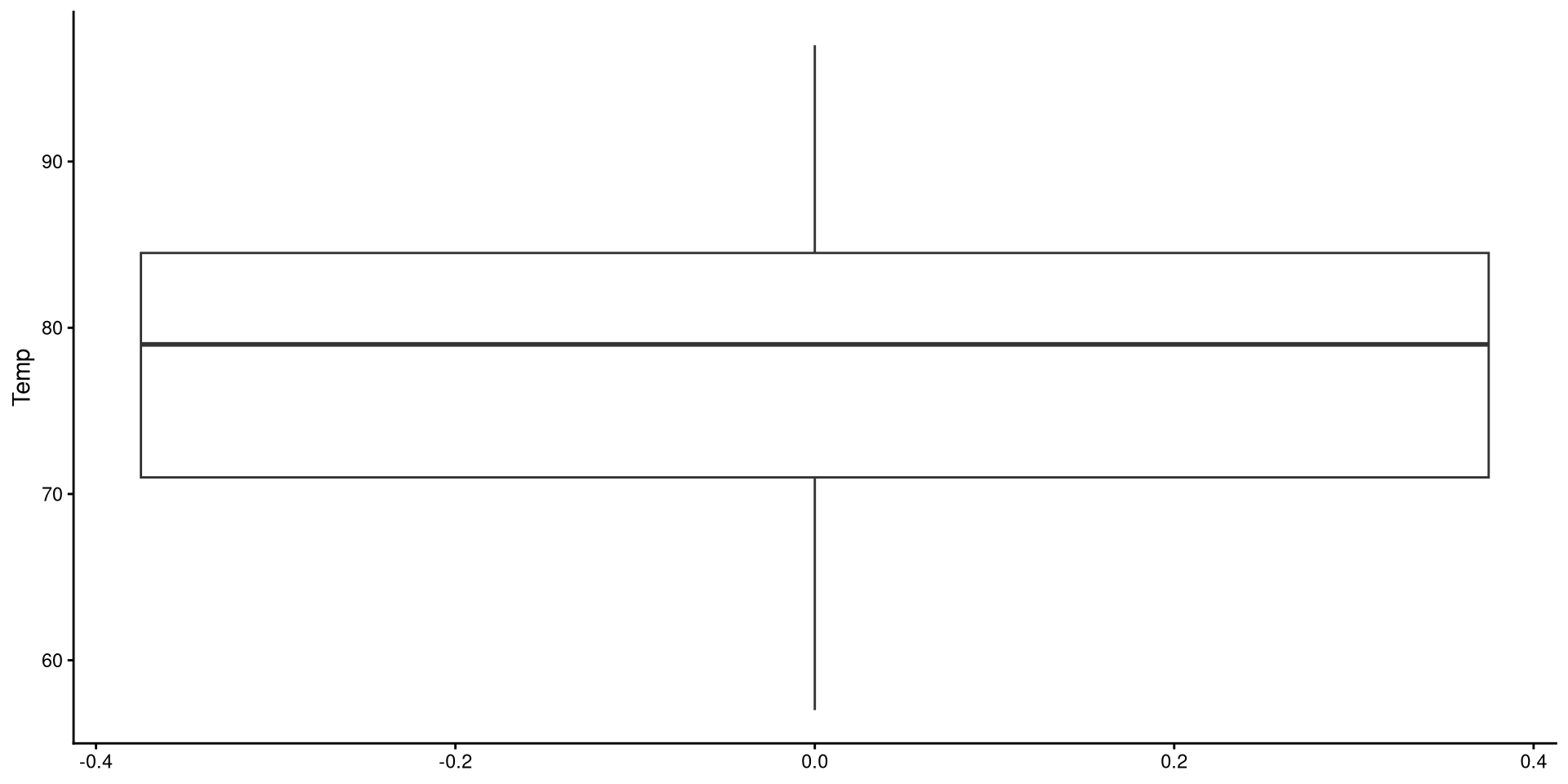
Box-plots useful to get a sense of the variable’s variance, range, presence of outliers.
ggplot(NY_temp,
       aes(y = Temp)) +
       geom_boxplot()
Reading a Box-plot
The square represents the interquartile range, meaning that the bottom edge is the \(25^{th}\) percentile of the variable and the top edge is the \(75^{th}\) percentile of the variable. The bolded line is the median of the variable, which is not quite in the middle of the box. This suggests some degree of skew.
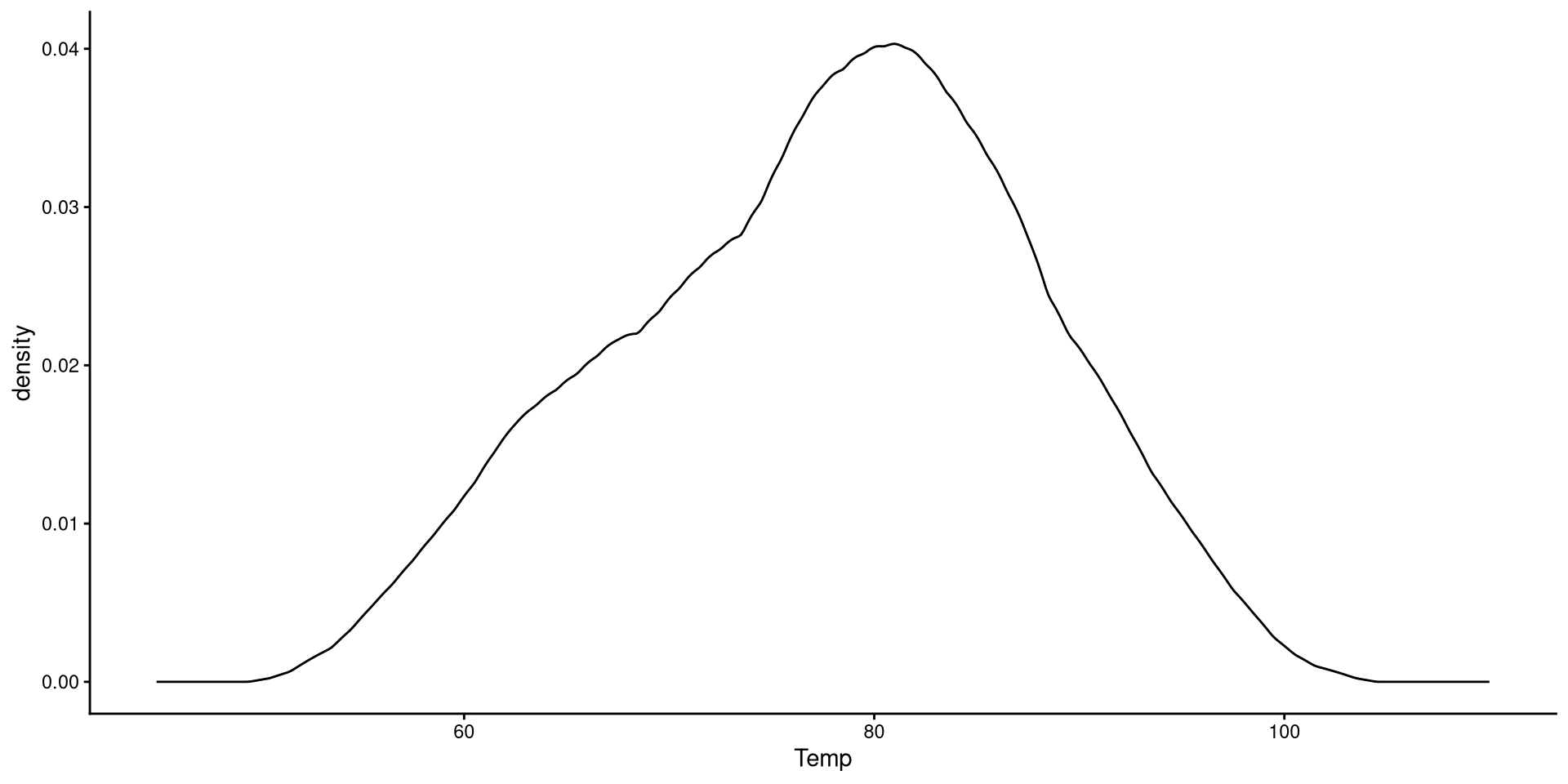
Kernel density plots do a similar job to histograms, but I tend to prefer them over histograms.
ggplot(NY_temp,
       aes(x = Temp)) +
       geom_density() +
       xlim(45, 110)
Here we just modify the type of kernel to “epanechnikov”. the default is “gaussian”, which I believe is very similar to Epanechnikov’s. See here at the bottom of the page for other kernel options.
ggplot(NY_temp,
       aes(x = Temp)) +
       geom_density(kernel = "epanechnikov") +
       xlim(45, 110)
Kernel?
The word kernel takes on widely different meanings depending on the context. In this case it is a function that estimates the probability distribution of some data (the black line in the plot) by looking at the density of observations at every point on the \(x\)-axis. Kernel estimation is often referred to as a non-parametric method.
You can also use the adjust = argument to determine how fine-grained you want your density plot to be. The default is adjust = 1. Here, adjust = .2 is a bit too fine-grained.
ggplot(NY_temp,
       aes(x = Temp)) +
       geom_density(kernel = "epanechnikov",
                    adjust = .2) +
       xlim(45, 110)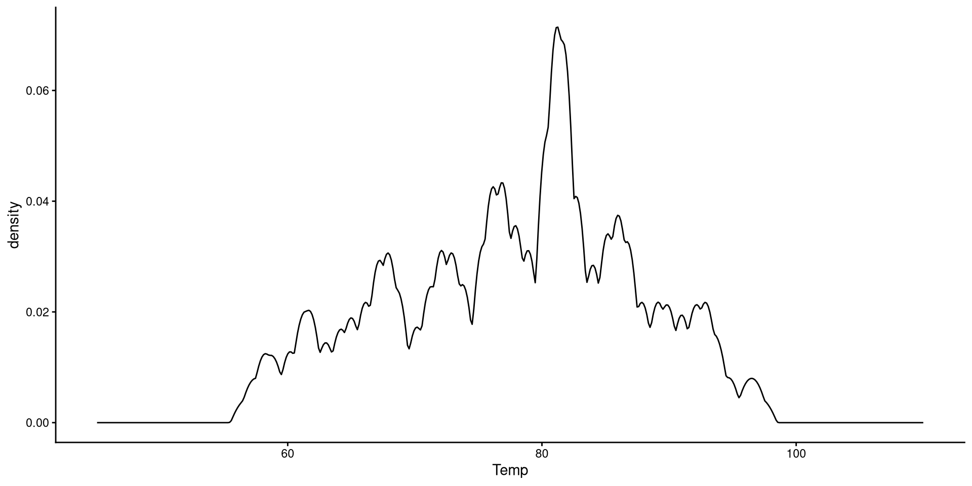
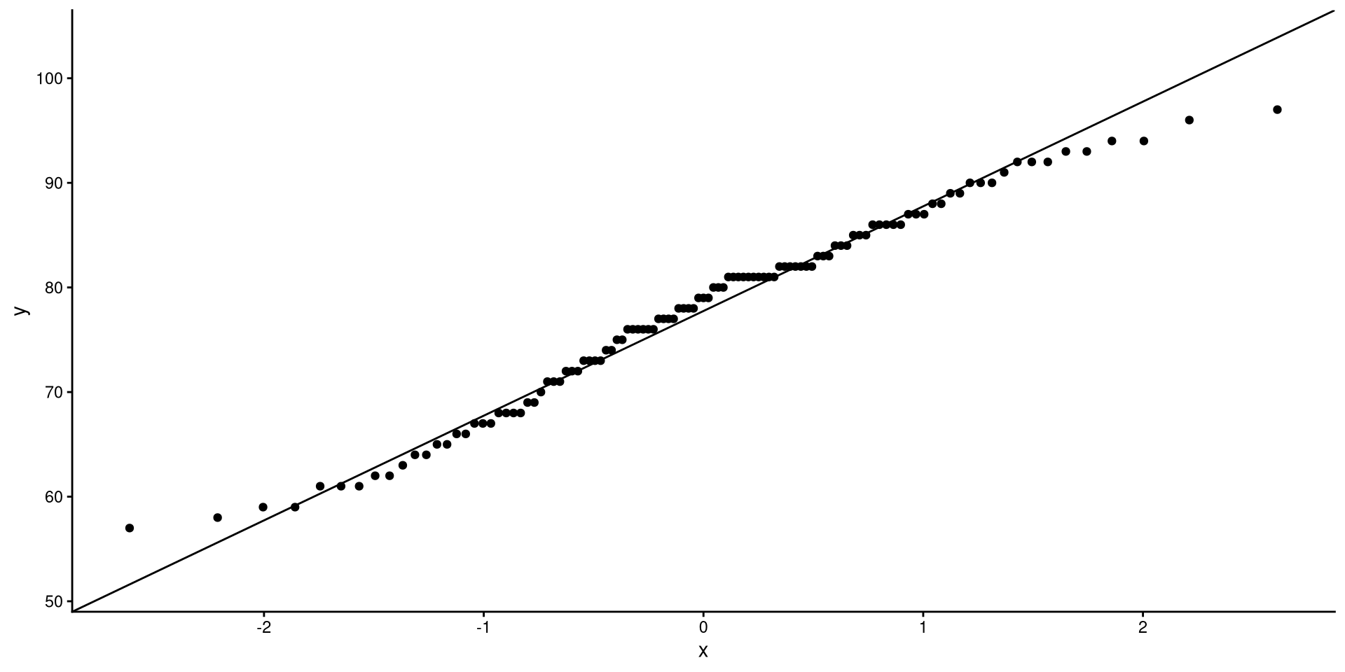
QQplots give a graphical representation of how much a variable deviates from normality. Personally, I find QQplots a bit unintuitive 😕. Unlike other plots, the meaning of their axes is not very clear. For now, let’s look at how to create a QQplot. The next slides will have an explanation of what a QQplot actually does.
ggplot(NY_temp,
       aes(sample = Temp)) +
       stat_qq() +
       stat_qq_line()
This is the code that you want to use to use to create QQplots. All the code on the next slides is for learning purposes only.
If the explanation before made no sense, here’s a recreated QQplots to convince you (hopefully?)
The pattern of points is the exact same as the one generated by the stat_qq() function.
ggplot(QQdata,
       aes(x = Xaxis, y = Yaxis)) +
      geom_point()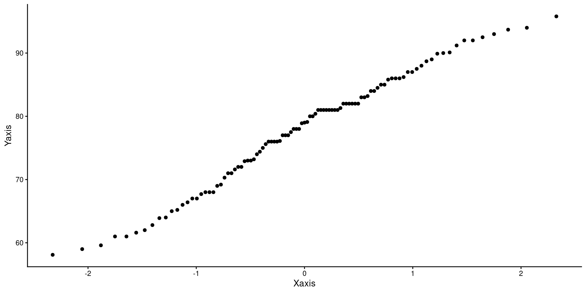
ggplot(QQdata,
       aes(x = Xaxis_2, y = Yaxis)) +
      geom_point()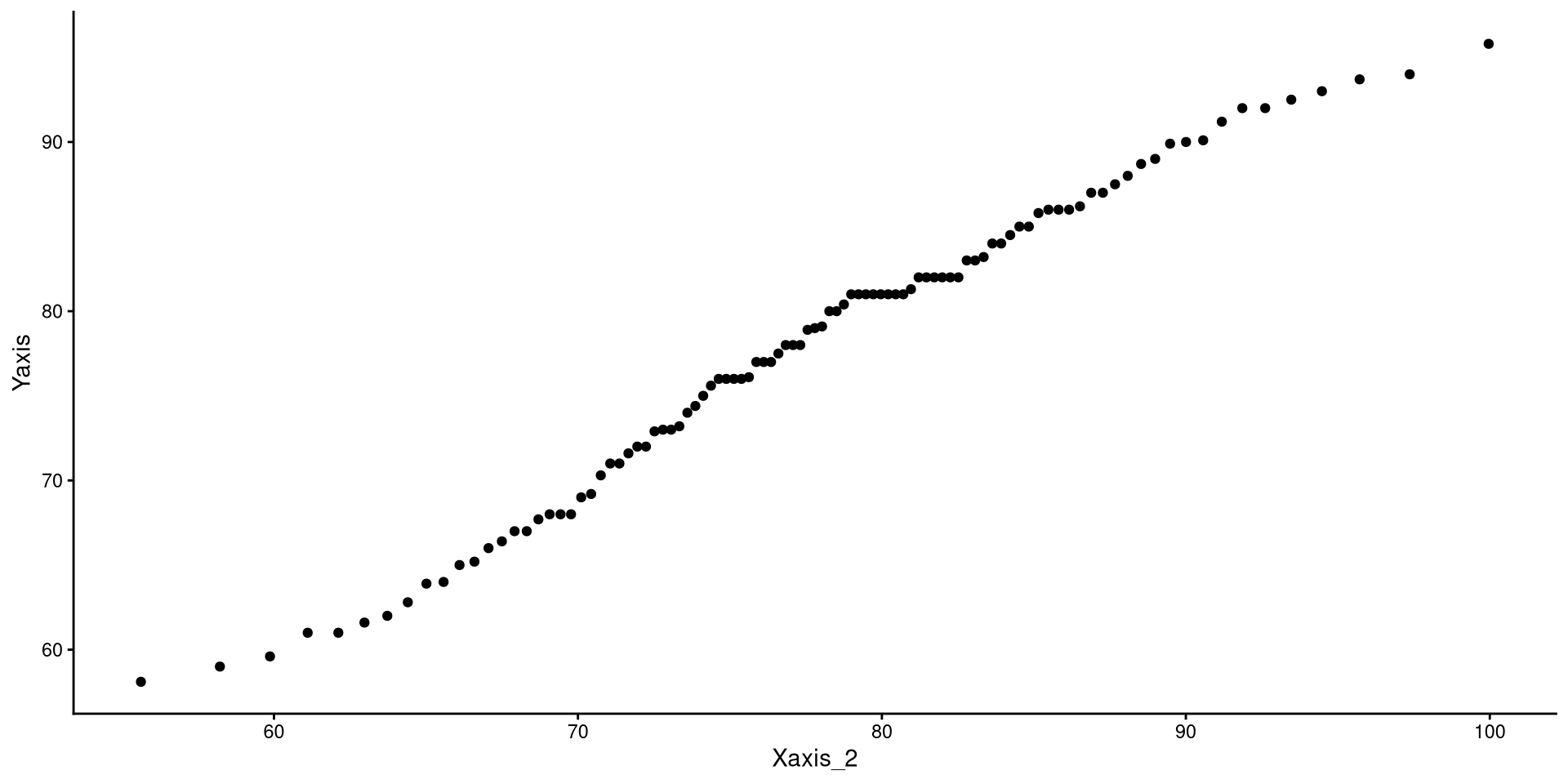
ggplot(QQdata,
       aes(x = Xaxis_2, y = Yaxis)) +
       geom_point() +
       # equivalent to stat_qq_line()
       geom_abline(intercept = 0, slope = 1)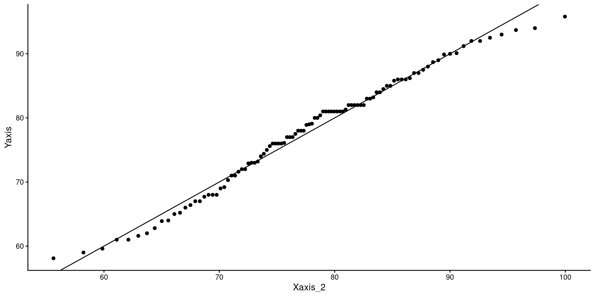
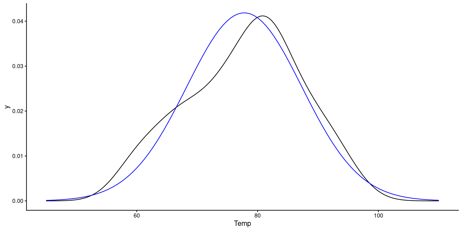
ggplot(NY_temp, aes(x = Temp)) +
       geom_density() +
      # the funciton below adds the normal distribution (in blue)
       geom_function(fun = dnorm,
                     args = list(mean = mean(NY_temp$Temp),
                                 sd = sd(NY_temp$Temp)),
                     color = "blue") + xlim(45, 110)