Lab 6: Correlation and Regression
Association Between Variables
When look at scatterplots, we can intuitively spot associations between two variables.
If we plot eduaction and prestige, we can tell that there is some sort of trend; as the values of one variable increase, the values of the other variable also increase.
ggplot(data = dat,
        aes(x = education, y = prestige)) +
          geom_point()
Covariance
The most basic measure of association between two continuous cariables is the covariance. The sign of the covaraince describes the direction of the relation between two variables:
ggplot(data = dat,
        aes(x = education, y = prestige)) +
          geom_point()
We can use cov() to calculate the covariance between education and prestige:
cov(dat$education, dat$prestige)[1] 39.90856The covariance is positive so we know that as one variable increases or decreases, so does the other variable. In this case, the higher the average years of education of individuals in a profession, the higher the perceived prestige of that profession.
ggplot(data = dat,
        aes(x = women, y = income)) +
          geom_point()
If we calculate the covariance between women and income:
cov(dat$women, dat$income)[1] -59411.38We see that the covariance is negative. meaning that, in 1971, the more women were in a certain profession, the less was the average income for that profession.
The Steps Graphically
The important point is that standardizing does not change the shape of the distribution of a variable, it just moves it and resizes it. let’s look at what happens step by step when we standardize education:
Plot Code
ggplot(dat, aes(x = education)) +
  geom_density(aes(color = "Raw")) +
  xlim(c(-10, 20)) +
  scale_y_continuous(expand = c(0,0)) +
  scale_color_manual(
    values = c("Raw" = "blue"),
    name = "",
    labels = c( "Raw" = expression(x[i]))) +
  theme(
    axis.title.y = element_blank(),
    axis.text.y  = element_blank(),
    axis.ticks.y = element_blank(),
    axis.line.y  = element_blank())
The blue density is the original education variable and it represents the average years of education for each of the 102 occupations in the data.
This is the \(x_i\) part of the formula
\[z_i = \frac{x_i - \bar{x}}{S_x}\]
Plot Code
ggplot(dat, aes(x = education)) +
  geom_density(aes(color = "Raw")) +
  geom_density(aes(x = education - mean(dat$education), color = "Centered")) +
  xlim(c(-10, 20)) +
  scale_y_continuous(expand = c(0,0)) +
  scale_color_manual(
    values = c("Raw" = "blue",
               "Centered" = "red"),
    name = "",
    labels = c(
      "Raw" = expression(x[i]),
      "Centered" = expression(x[i] - bar(x)))) +
  theme(
    axis.title.y = element_blank(),
    axis.text.y  = element_blank(),
    axis.ticks.y = element_blank(),
    axis.line.y  = element_blank())
The red density is the education variable after we subtract its mean from all the values. So the red density represents the the \(x_i - \bar{x}\) part of \(z_i = \frac{x_i - \bar{x}}{SD_x}\).
This is known as mean centering, and it comes up in moderation analyses to get easier interpretations.
Plot Code
ggplot(dat, aes(x = education)) +
  geom_density(aes(color = "Raw")) +
  geom_density(aes(x = education - mean(dat$education), color = "Centered")) +
  geom_density(aes(x = (education - mean(dat$education)) / sd(dat$education),
                   color = "Standardized")) +
  xlim(c(-10, 20)) +
  scale_y_continuous(expand = c(0,0)) +
  scale_color_manual(
    values = c("Raw" = "blue",
               "Centered" = "red",
               "Standardized" = "purple"),
    name = "",
    labels = c(
      "Raw" = expression(x[i]),
      "Centered" = expression(x[i] - bar(x)),
      "Standardized" = expression((x[i] - bar(x)) / SD[x])
    )
  ) +
  theme(
    axis.title.y = element_blank(),
    axis.text.y  = element_blank(),
    axis.ticks.y = element_blank(),
    axis.line.y  = element_blank())
The purple density is \(z_i = \frac{x_i - \bar{x}}{S_x}\). Dividing by the SD “squishes” the distribution, but the shape does not change! The important implication is that standardizing does not change the relation between variables.
Note that there is nothing special about mean = 0 and SD = 1. You could add any value and that will become the new mean. Having a mean of 0 and an SD of 1 usually makes things easier.
Linear Regression
Onto what is probably the most important analysis in statistics, linear regression. On slide 2 we showed the scatterplot between education and prestige, and saw a noticeable trend.
A regression line captures the linear trend between two variables.
More importantly, the regression line has a very simple mathematical form,
\[y = b_0 + b_1 \times x\]
In the case of this graph, we would write:
\[\mathrm{prestige} = b_0 + b_1 \times \mathrm{education}\]
meaning that we think that perceived occupation prestige is predicted by the education required for that occupation.
ggplot(data = dat,
        aes(x = education, y = prestige)) +
          geom_point() +
           geom_smooth(method = "lm")
Regression Coefficients: Intercept
The intercept, \(b_0\), is the “expected value of the \(y\) variable when \(x\) is 0”. In our case, \(b_0 = -10.73\). This number makes no sense for two reasons: (1) prestige cannot be negative, and (2) education cannot be 0. What is going on? 🤨
The intercept is mathematically where the regression line hits the \(y\)-axis. If the the 0 value for \(x\) is out of range, than the intercept will generally be meaningless.
This is not an “issue” and it’s only a consequence of the scale of our variables. We will see what happens once we standardize our variables.
In practice, you do not care much about the intercept, as it does not carry any information about the relation between the \(x\) and \(y\) variables.
Plot Code
ggplot(data = dat,
        aes(x = education, y = prestige)) +
          geom_point() +
            geom_abline(intercept =  as.numeric(reg$coefficients[1]),
                        slope =  as.numeric(reg$coefficients[2],
                        fill = "#7a0b80"))+
             geom_vline(xintercept = 0, lty = 2) +
             geom_segment(y = as.numeric(reg$coefficients[1]), x = 0,
                          yend = as.numeric(reg$coefficients[1]), xend = -10, lty = 3) +
            annotate("text", x = -3, y = 0, label = "the dot is the \n intercept") +
            geom_point(aes(x = 0, y = as.numeric(reg$coefficients[1]), col = "red", size = 3), show.legend = FALSE) +
             xlim(c(-5, 20)) +
             ylim(c(-30, 90))
More Slopes Examples
It follows that the sign of the slope determines whether the line trends up (positive slope) or down (negative slope). Here are some examples:
plot Code
ggplot(data = dat,
        aes(x = education, y = prestige)) +
          geom_point() +
          geom_smooth(method = "lm", se = FALSE)
Correlation:
cor(dat$prestige, dat$education)[1] 0.8501769Slope:
lm(prestige ~ education, data = dat)$coef[2]education
5.360878 plot Code
ggplot(data = dat,
        aes(x = women, y = education)) +
          geom_point() +
          geom_smooth(method = "lm", se = FALSE)
Correlation:
cor(dat$women, dat$education)[1] 0.06185286Slope:
lm(education ~ women, data = dat)$coef[2] women
0.005319541 plot Code
ggplot(data = dat,
        aes(x = women, y = income)) +
          geom_point() +
          geom_smooth(method = "lm", se = FALSE)
Correlation:
cor(dat$women, dat$income)[1] -0.4410593Slope:
lm(income ~ women, dat)$coef[2] women
-59.02939 A Graphical Comparison
Before we look at the difference more closely, the two regressions on the previous slide are equivalent. As you can see, the two plots are indistingushable, save for the names and values of the x and y axes.
plot Code
ggplot(data = dat,
        aes(x = education, y = prestige)) +
          geom_point() +
          geom_smooth(method = "lm", se = FALSE)
plot Code
ggplot(data = dat,
        aes(x = education_std, y = prestige_std)) +
          geom_point() +
          geom_smooth(method = "lm", se = FALSE)
Standardized Coefficients: Intercept
Whenever we standardize all the variables in a regression, the intercept will always be 0.
round(reg_std$coef[1], 3)(Intercept)
0 This is because standardizing has the effect of centering the data, and the regression line, at the 0 point.
This is apparent in the graph on the right, where the regression line hits the y-axis at 0 exactly.
Plot Code
ggplot(data = dat,
        aes(x = education_std, y = prestige_std)) +
          geom_point() +
          geom_hline(yintercept = 0, lty = 3) +
          geom_vline(xintercept = 0, lty = 3) +
          geom_smooth(method = "lm", se = FALSE)
If the \(t\)-statistic is the same…
To refer back to hypothesis testing, we use test statistics like the \(t\)-statistic to test hypotheses. In the case of regression and correlation, the \(t\)-statistic is always used to ask this question:
Then, if the \(t\)-statistics are the exact same, it means that we are asking the same exact question. In other words, unstandardized, standardized regression coefficients, and correlations are the same.
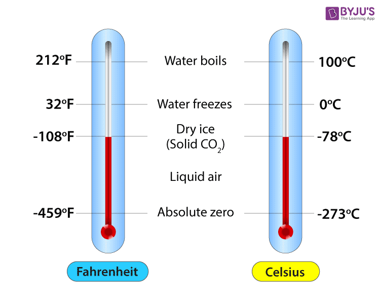
The true temperature does not change whether we measure it in Fahrenheit or Celsius; similarly, the true relation between two variables does not depend on the numbers we choose to represent those variables. 🧘
It may not click now, but why this point is very important will becomes much clearer when will interpret the magnitude of slopes in some later labs.
Let’s Talk Residuals
At a conference in the Summer of 2025 I met this gentleman on the right 👉
He talked A LOT about how checking residuals is probably the most important thing to do when you run regression models (even more important than checking regression coefficients!). He is probably right 🤷
A residual is the distance between the regression line and a data point. Points with large residuals are not predicted well by a regression, whereas points with small residuals are predicted quite well.

The One Regression Assumption
Mathematically, the regression line represents the mean of the \(y\) variable after finding out about \(x\). Importantly, the residuals are expected to be normally distributed around the regression line at each point of \(x\).
There are many complicated terms relating to regression assumptions, but the only real regression assumption is
You never get something like this in reality. Let’s look at some examples.
Plot Code
# Generate idealized data

set.seed(7757)

# generate X values
education <- rep(seq(min(dat$education), max(dat$education), by =.1), 150)

# the code below generates data according to the regression model

intercept <- coef(reg)[1]
slope <- coef(reg)[2]
residual_var <- sigma(reg)

ideal_data <- rnorm(length(education), mean = intercept + education*slope, sd = sigma(reg))

# plot the idealized data

ggplot(mapping =  aes(x = education, y = ideal_data)) +
  geom_point(alpha = .2)+
  ggtitle("The Data Regression Expects") +
  ylab("prestige") +
  xlab("education") +
      geom_smooth(method = "lm", se = FALSE)
Residuals of prestige ~ education
Given a regression line, every datapoint will have a residual, which represents the distance of the point from the regression line. For any object created with lm() residuals are saved under $residuals.
reg <- lm(prestige ~ education, data = dat)
dat$resid_prestige <- reg$residuals
We want to check that that the residuals are normally distributed around their mean, which is always \(0\), for all values of the \(x\) variable:
ggplot(dat, aes(x = education, y = resid_prestige)) +
        geom_point() +
        geom_hline(yintercept = 0) +
        geom_smooth(method = "loess", se = FALSE)
The loess line helps with checking for non-normality. Here, I would say that the residuals are fairly normally distributed around 0 across the range of \(x\) ✅
Residuals of income ~ women
reg2 <- lm(income ~ women, data = dat)
dat$resid_income <- reg2$residualsggplot(dat, aes(x = women, y = resid_income)) +
geom_point() +
geom_hline(yintercept = 0) +
geom_smooth(method = "loess", se = FALSE)Here, you should notice that although the residuals are fairly normally distributed for profession with \(10\%\) to \(100\%\) women, the residuals are really strange for professions with \(0\%\) women.

So, the regression does well enough from the 10 to 100 range of \(x\) ✅, but does not do a good job at all at describing income for jobs where there are no women ❌ Also notice that the loess line does not help much in detecting this anomaly.
Normality of residuals: QQplots
Residual plots like the ones on the previous slides are the most informative way of checking that your regression model describes the data reasonably well. Checking the normality is the also good for assumption checks, but can sometimes hide important nuances.
ggplot(dat,
       aes(sample = resid_prestige)) +
       stat_qq() +
       stat_qq_line()
Again, I would say this is alright overall.

ggplot(dat,
       aes(sample = resid_income)) +
       stat_qq() +
       stat_qq_line()
Clearly some strangeness going on for professions with high income.

Normality of residuals: Density
Once again, I find density plots more intuitive than QQplots, although they both convey the same type of information.
ggplot(dat,
       aes(x = resid_prestige)) +
        geom_density()
ggplot(dat,
       aes(x = resid_income)) +
        geom_density()
Where there is a very clear right tail.

Implications on Generalizability
The main reason why we collect data and run statistical analyses is to (hopefully) generalize the results to some population.
Call:
lm(formula = income ~ women, data = dat)

Residuals:
    Min      1Q  Median      3Q     Max
-7177.3 -2338.6  -343.1  1019.0 17607.8

Coefficients:
            Estimate Std. Error t value Pr(>|t|)
(Intercept)  8508.52     514.73  16.530  < 2e-16 ***
women         -59.03      12.01  -4.914 3.49e-06 ***
---
Signif. codes:  0 '***' 0.001 '**' 0.01 '*' 0.05 '.' 0.1 ' ' 1

Residual standard error: 3830 on 100 degrees of freedom
Multiple R-squared:  0.1945,    Adjusted R-squared:  0.1865
F-statistic: 24.15 on 1 and 100 DF,  p-value: 3.488e-06
Why “Variance explained”? 🤔
Variance is the part of a variable that is not predictable , or rather, that we cannot predict given the information that we have. Let’s look at the case of the prestige ~ education regression:
Let’s say that the only information we have is the prestige column, our \(y\) variable. Then, a friend says that they are going to take some value from the prestige column at random.
Our job is to pick a number that will be as close as possible to any random value from prestige. What is our best possible guess?
As math would have it, the best guess is mean of prestige:
mean(dat$prestige)[1] 46.83333Plot Code
ggplot(dat,
       aes(x = prestige -  mean(prestige), y = 0)) +
       geom_point(shape = 1,
                  size=6.5) +
  annotate("text", y = 0.008, x = 0, label = "These would be the residuals of Prestige, \n if our best guess is the mean", size = 7.5) +
  annotate("text", y = - 0.008, x = 0, label = "The variance of these residuals is the exact same as \nthe variance of the original prestige variable", size = 7.5) +
  theme(axis.title.y=element_blank(),
        axis.text.y=element_blank(),
        axis.ticks.y=element_blank(),
        axis.line.y =  element_blank()) +
          ylim(c(-.01, .01)) +
          xlab("Residuals of Prestige")
Reducing Variance
Now let’s say that we play the same game, but this time, before our friend tells us the value of prestige that they picked at random, they tell us the education value associated with it, and let us adjust our guess accordingly.
Having learned linear regression, if we know a value of \(x\), we can improve our guess of \(y\)!
The blue dots represent our residuals for the regression prestige ~ education. After finding out about education, we reduced the variance in the residuals by:
\[1 - \frac{82.87}{295.99} = .72\]
This is the \(R^2\) for the prestige ~ education regression. education explained \(72\%\) of the variance in prestige.
Plot Code
ggplot(dat,
       aes(x = prestige -  mean(prestige), y = 0)) +
       geom_point(shape = 1,
                  size=6.5) +
  annotate("text", y = 0.015, x = 0, label = paste("The Original residuals had a \n variance of", round(var(dat$prestige), 2)), size = 7.5)+
  geom_point(aes(x = dat$resid_prestige, y = - .03), shape = 1,
                  size=6.5, col = "blue") +
    annotate("text", y = -0.015, x = 0, label = paste("After finding out about education, \n the variance of the residuals becomes", round(sum(dat$resid_prestige^2)/100, 2)), size = 7.5, col = "blue")+
  theme(axis.title.y=element_blank(),
        axis.text.y=element_blank(),
        axis.ticks.y=element_blank(),
        axis.line.y =  element_blank()) +
          ylim(c(-.04, .02)) +
          xlab("Residuals of Prestige")
Another visualization
Here is a visualization of our best possible line before and after finding out about education. The concept is the same as before, but visualized in a slightly different way:
The lines is the mean of prestige and is our best guess. You can run a regression with a single variable actually:
reg_one_var <- lm(prestige ~ 1, data = dat)
coef(reg_one_var)
(Intercept)
46.83333 The intercept, which is all you get, is the mean of the one variable:
mean(dat$prestige)[1] 46.83333Plot Code
# fit a linear model
fit <- lm(prestige ~ 1, data = dat)

# add fitted values to the data
dat$resid_line <- predict(fit)

ggplot(data = dat, aes(x = education, y = prestige)) +
  geom_point() +
  geom_hline(yintercept =  mean(dat$prestige)) +
  geom_segment(aes(xend = education,
                   yend = resid_line),
               linetype = "dotted", color = "red")
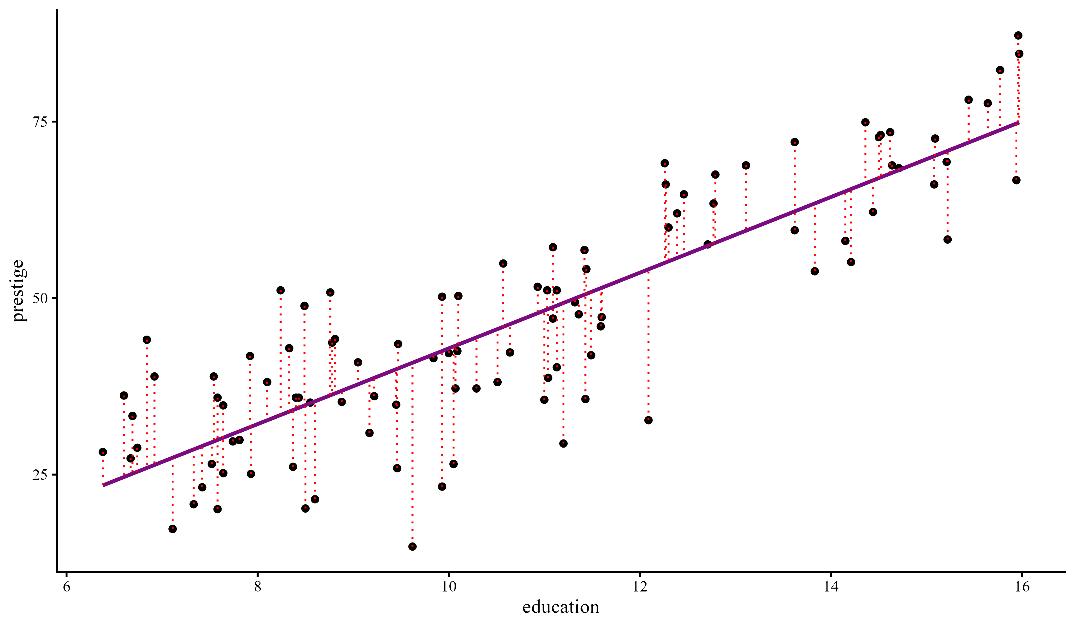
Now that we know about education we can improve our prediction greatly by finding the regression line.
You should see that all the red dotted lines are much shorter on average. That means that the variance of the residuals is much smaller. Once again, this is the variance explained.
Plot Code
library(ggplot2)

# fit a linear model
fit <- lm(prestige ~ education, data = dat)

# add fitted values to the data
dat$resid_line <- predict(fit)

ggplot(data = dat, aes(x = education, y = prestige)) +
  geom_point() +
  geom_smooth(method = "lm", se = FALSE) +
  geom_segment(aes(xend = education,
                   yend = resid_line),
               linetype = "dotted", color = "red")