Lab 1: Descriptive Techniques and One-Predictor Regression
PSYC 7804 - Regression with Lab
Describing the Data Graphically
To create plots we will use the GGplot2 package (Wickham et al., 2024), which is loaded automatically by tidyverse. For a refresher on tidyverse and GGplot2 basics see Lab 2 of PSYC 6802.
The general idea of GGplot2 is that we start with some blank canvas:
ggplot() The ggplot() function by itself will actually create our blank canvas. Now we need to add elements on top of it.

Adding Coordinates
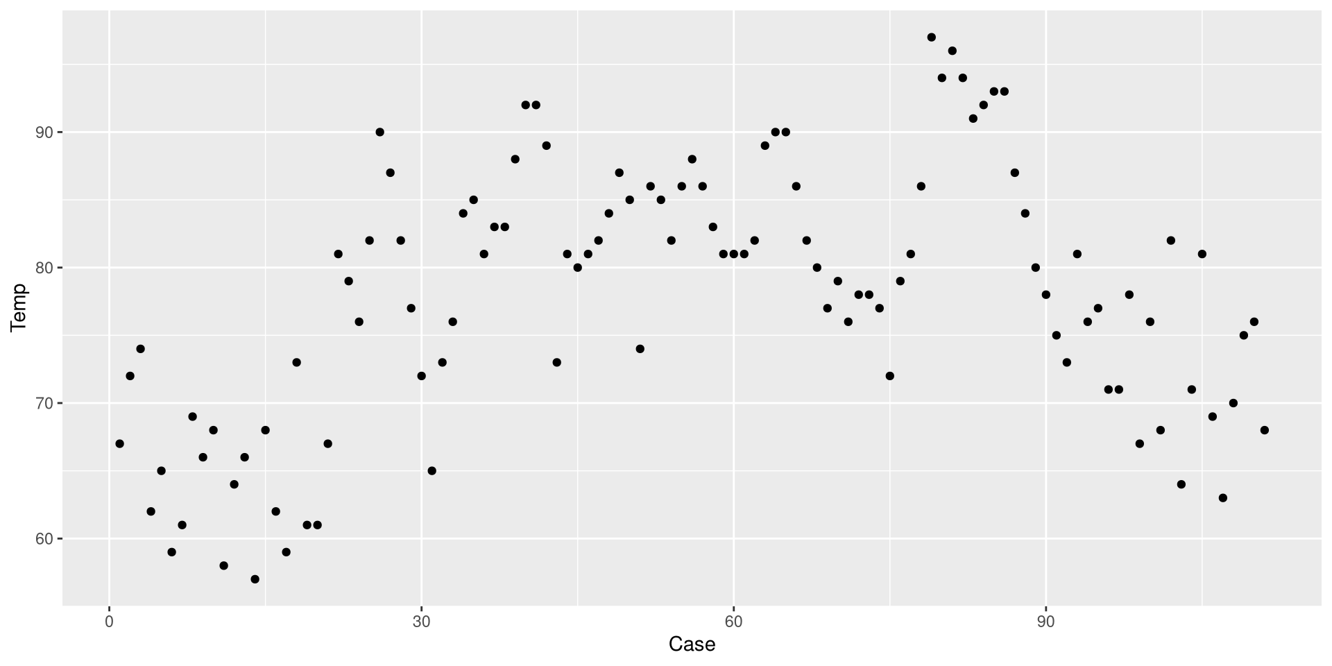
We use the aes() function to defined coordinates. Note that the name of the data object (dat in our case) is almost always the first argument of the ggplot() function.
We define the temperature observed (Temp) as the \(y\)-axis and the measueremnt instance (Case) as the \(x\)-axis .
ggplot(dat,
aes(x = Case, y = Temp)) 
A Basic Plot
We use one of the geom_...() functions to add shapes to our plot.
ggplot(dat,
 aes(x = Case, y = Temp)) +
 geom_point()
This is a Profile plot, which in this case shows the trend of Temp over time.
geom_...()
The geom_...() functions add geometrical elements to a blank plot (see here for a list of all the geom_...() functions). Note that most geom_...() will inherit the x and y coordinates from the ones given to the aes() function in the ggplot() function.
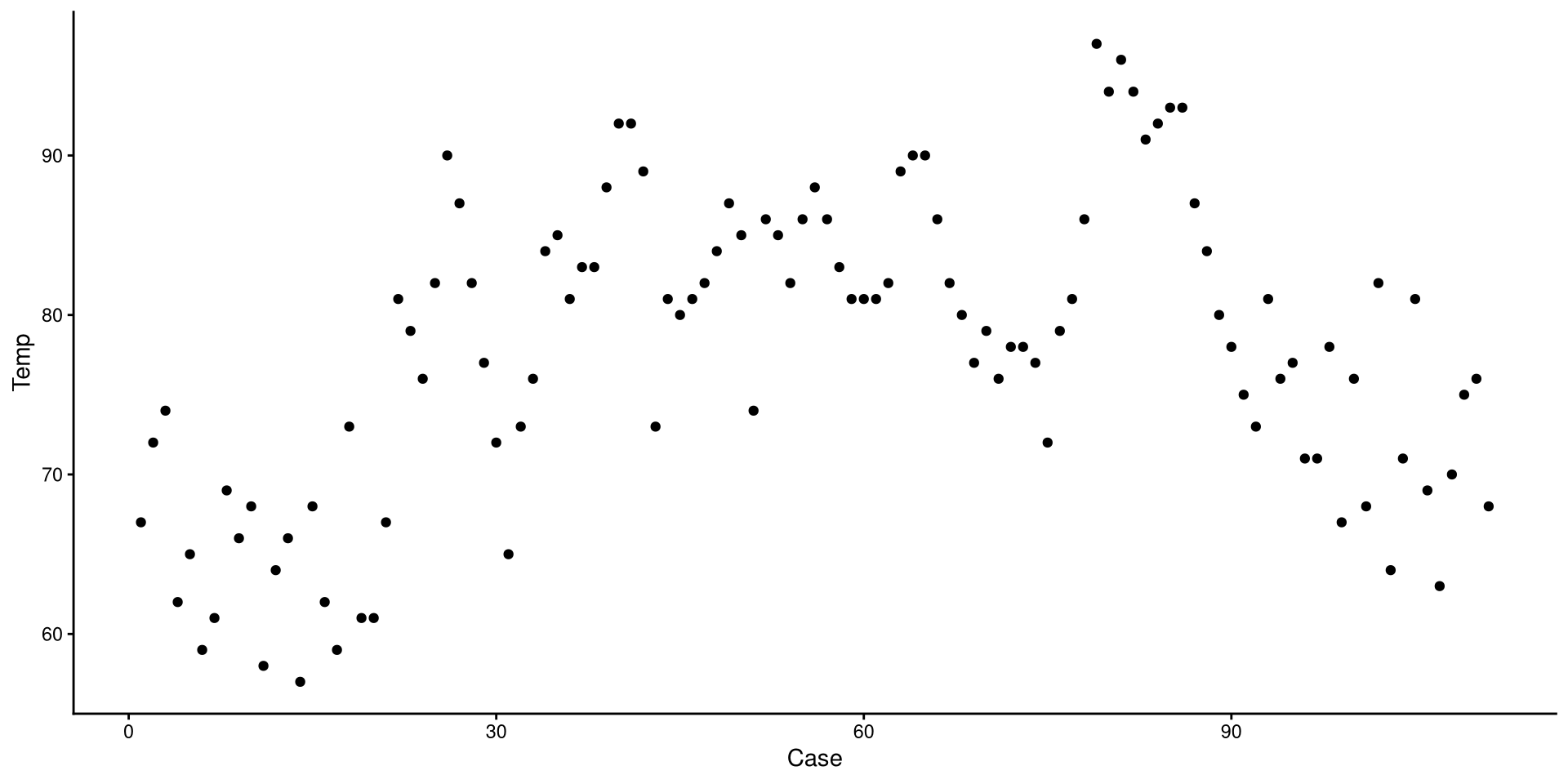
Change the Theme
I personally find GGplot2’s default theme a bit ugly. Luckily there are much nicer alternatives (see here). I like theme_classic():
ggplot(dat,
 aes(x = Case, y = Temp)) +
 geom_point() +
 theme_classic()
Whenever I plan on creating a bunch of plots, I fist set the theme globally, which can be done with:
theme_set(theme_classic())Now, all the following plots will use theme_classic() as the default theme.
Add Linear Regression Line
We can use the geom_smooth() function to draw trend lines. The method = argument can be use to specify the type of trend line. We specify "lm" to choose a linear regression line:
ggplot(dat,
 aes(x = Case, y = Temp)) +
 geom_point() +
 geom_smooth(method = "lm")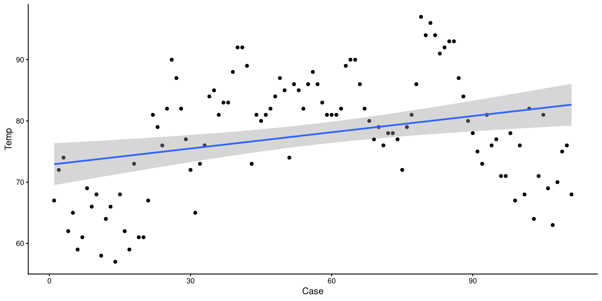
The grey band around the line is the 95% confidence interval. we can add the se = FALSE argument to remove it for nicer looking plots.
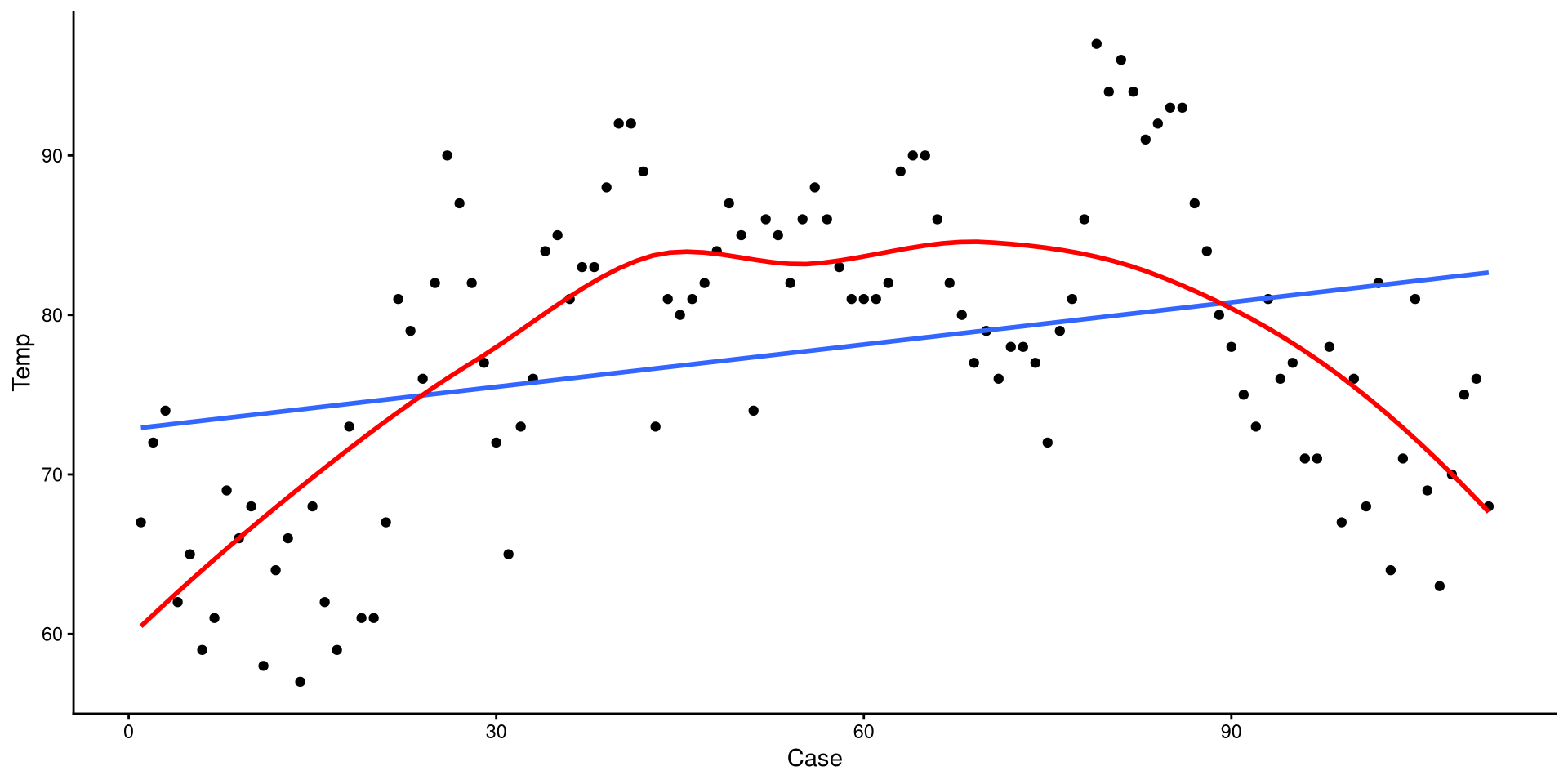
Add a Loess Line
method = "loess" can be used to add a loess line.
ggplot(dat,
 aes(x = Case, y = Temp)) +
 geom_point() +
 geom_smooth(method = "lm", se = FALSE) +
 geom_smooth(method = "loess", se = FALSE,
             col = "red")
Loess lines should mostly be used as an exploratory tool to detect non-linear trends. Because this is temperature across the year, a non-liner trend should be expected.
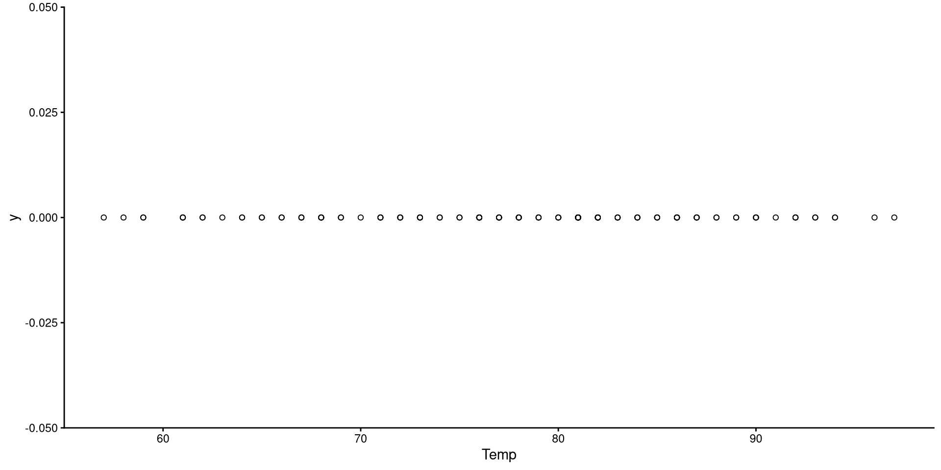
1D Scatterplot 🤔
This is the one-dimensional representation of the Temp variable.
ggplot(dat,
       aes(x = Temp, y = 0)) +
       # shape = n can be used to change the shape of the dots. there are 25 shapes (1 to 25)
       geom_point(shape = 1) +
       theme_classic()
This plot gives a good graphical representation of the variance of a variable. However, for visualizing data, we have better options…
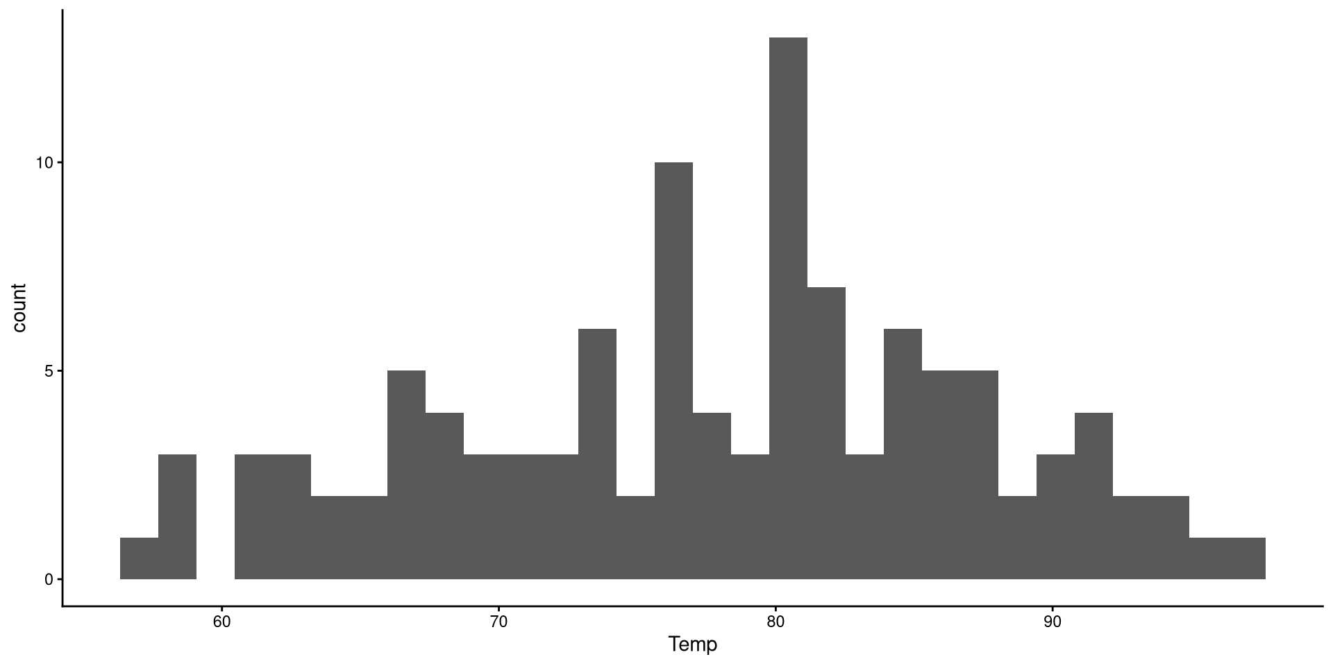
Histograms
Histograms are fairly useful for visualizing distributions of single variables. But you have to choose the number of bins appropriately.
ggplot(dat,
       # note that we only need to give X
       aes(x = Temp)) +
       geom_histogram()
There are a bit too many bins, so it is hard to get a good sense of the distribution. We can use the bins = argument to change the number of bins, which is the number of bars on the plot.
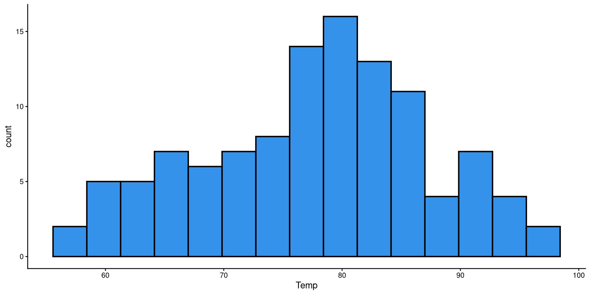
Histogram: Adjusting Bins
Here I just touched up the plot a bit and set the bins to 15. It is much easier to tell what the distribution looks like now.
ggplot(dat,
 aes(x = Temp)) +
 geom_histogram(bins = 15,
                color = "black",
                linewidth = .8,
                fill = "#3492eb")
HEX color codes
The "#3492eb" is actually a color. R supports HEX color codes, which are codes that can represent just about all possible colors. There are many online color pickers (see here for example) that will let you select a color and provide the corresponding HEX color code.
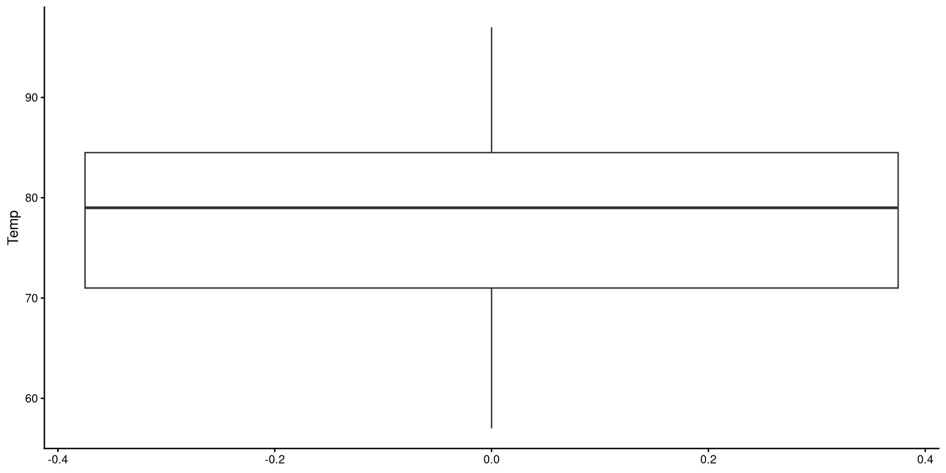
Box-Plots
Box-plots useful to get a sense of the variable’s variance, range, presence of outliers.
ggplot(dat,
       aes(y = Temp)) +
       geom_boxplot()
Reading a Box-plot
The square represents the interquartile range, meaning that the bottom edge is the \(25^{th}\) percentile of the variable and the top edge is the \(75^{th}\) percentile of the variable. The bolded line is the median of the variable, which is not quite in the middle of the box. This suggests some degree of skew.
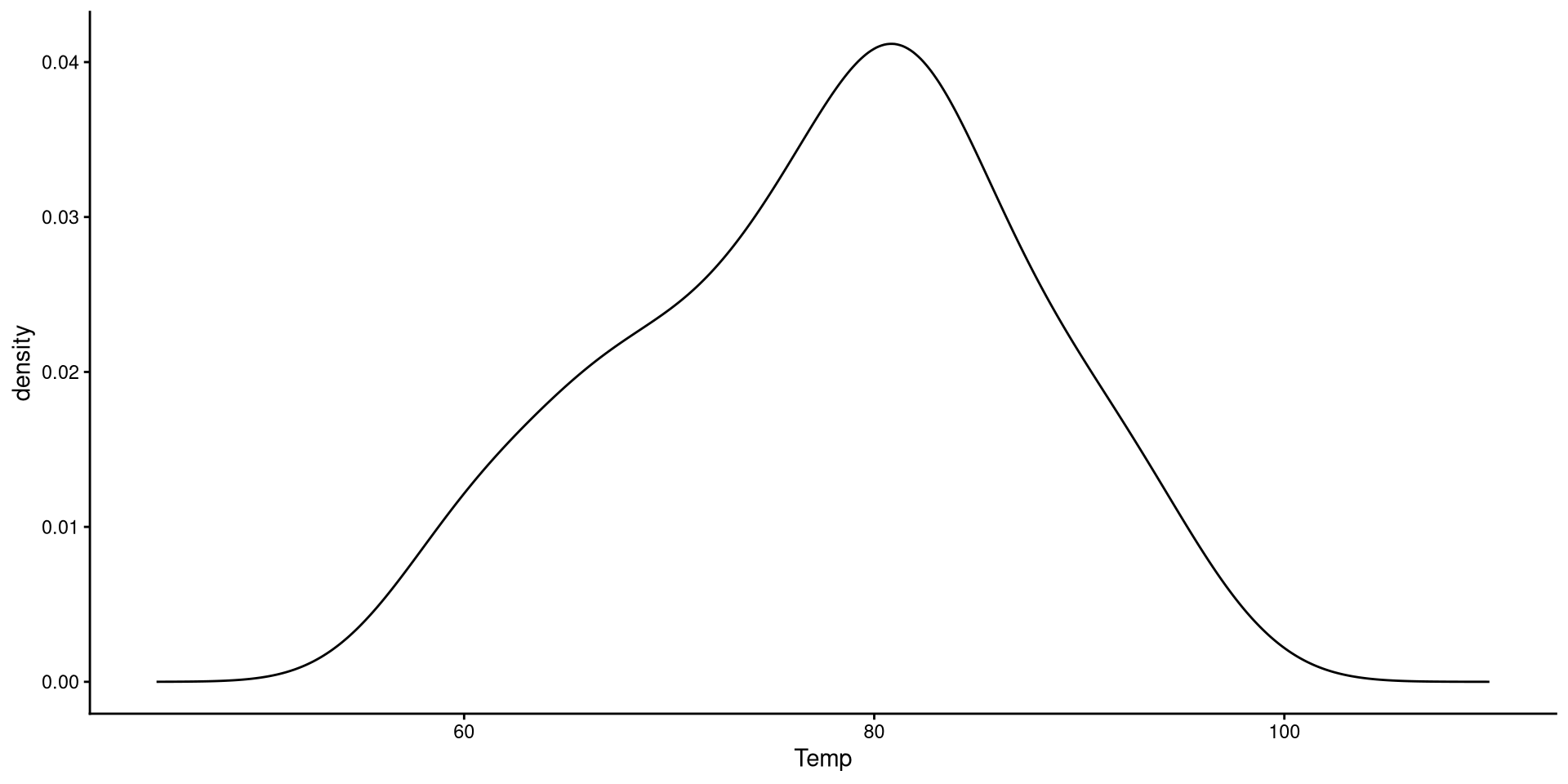
Kernel Density plots
Kernel density plots do a similar job to histograms, but I tend to prefer them over histograms.
ggplot(dat,
       aes(x = Temp)) +
       geom_density() +
       xlim(45, 110)
The “kernel” is the mathematical function that is used to draw the density. We can change the type of kernel with the kernel = argument. See here at the bottom of the page for other kernel options.
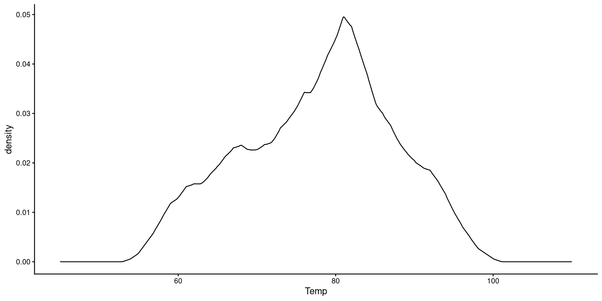
Change Kernel and Smoothing Parameter
Aside from changing the kernel, I also tweak the smoothing parameter (adjust =), which determines how “smooth” the distribution will look.
ggplot(dat,
 aes(x = Temp)) +
 geom_density(kernel = "triangular",
              adjust = 0.5) +
 xlim(45, 110)
Generally, R’s default choice of the smoothing parameter is pretty good (here I decreased it). You generally do not want to increase the smoothing parameter too much becuause it will end up hiding irregularities in the distribution.
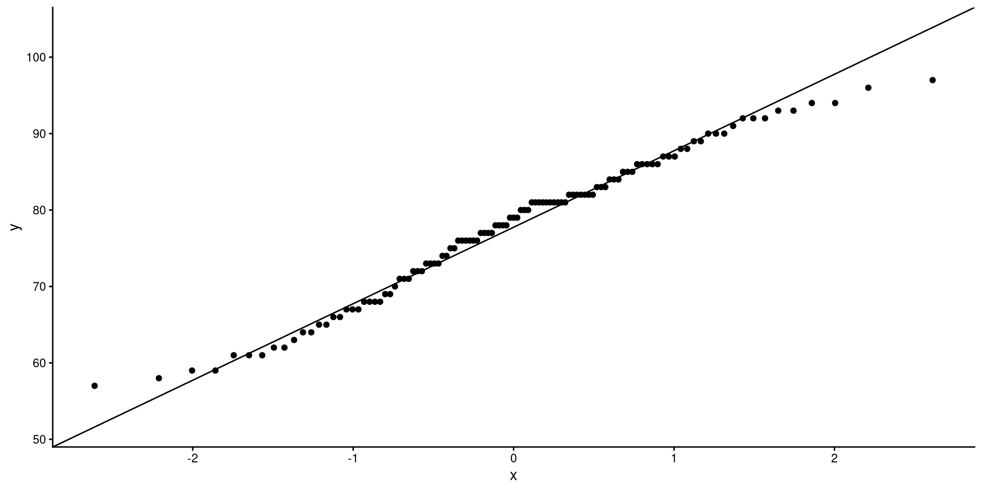
QQplots
QQplots give a graphical representation of how much a variable deviates from normality.
ggplot(dat,
       aes(sample = Temp)) +
       stat_qq() +
       stat_qq_line()
In general, you want the points to be as close as possible to the line. Here I would say that the distribution does not look too non-normal.
See the appendix for an explanation of what are the axes of a QQplot represent.
One-Predictor Regression

Our Variables
We will be using wind speed (Wind) to predict temperature (Temp). First let’s take a look at these two variables:
ggplot(dat,
 aes(x = Wind, y = Temp)) +
 geom_point() +
 geom_smooth(method = "lm",
             se = FALSE)
We can tell that there is a very clear negative trend. If we calculate the correlation between the two variables, we get:
cor(dat$Wind, dat$Temp)[1] -0.4971459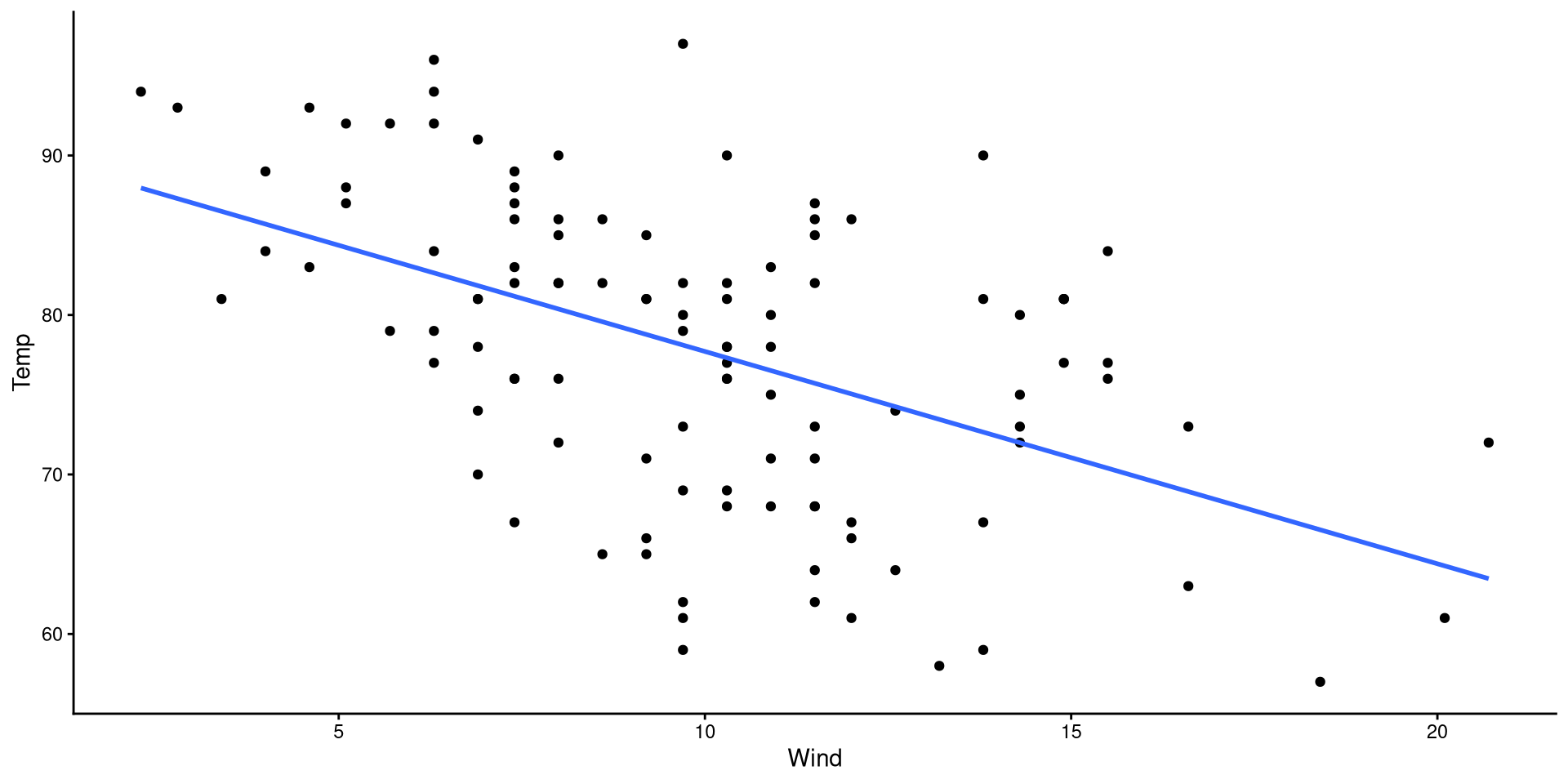
Our goal is to find the mathematical formula that describes the regression line on the plot!
Making Predictions
For many reasons, once we have a regression, we may want to predict values of \(Y\) based on some values of \(X\).
From the previous slide, we know that \(\hat{Y} = 91.02 - 1.33 \times X\). So, to find values of \(\hat{Y}\) we plug in some values of \(X\).
- If \(X = 13\), then \(\hat{Y} = 91.02 - 1.33 \times 13 = 73.71\)
- If \(X = 17\), then \(\hat{Y} = 91.02 - 1.33 \times 17 = 68.39\)
Plot Code
ggplot(dat,
       aes(x = Wind, y = Temp)) +
  geom_point(alpha = 0.5, shape = 1) +
  geom_smooth(method = "lm",
              se = FALSE) +
  geom_segment(x = 13,
               xend = 13,
               y = 0,
               yend = coef(reg)[1] + coef(reg)[2]*13,
               linetype = 2) +
    geom_segment(x = 0,
                 xend = 13,
                 y = coef(reg)[1] + coef(reg)[2]*13,
                 yend = coef(reg)[1] + coef(reg)[2]*13,
                 linetype = 2)  +
  geom_segment(x = 17,
               xend = 17,
               y = 0,
               yend = coef(reg)[1] + coef(reg)[2]*17,
               linetype = 2) +
    geom_segment(x = 0,
                 xend = 17,
                 y = coef(reg)[1] + coef(reg)[2]*17,
                 yend = coef(reg)[1] + coef(reg)[2]*17,
linetype = 2) 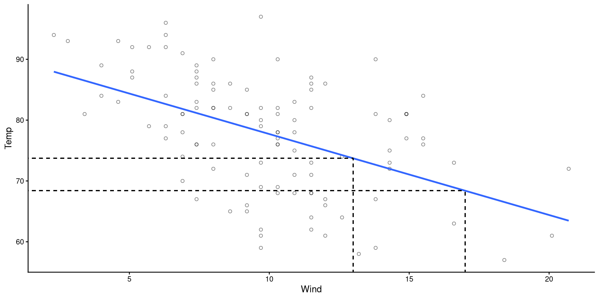
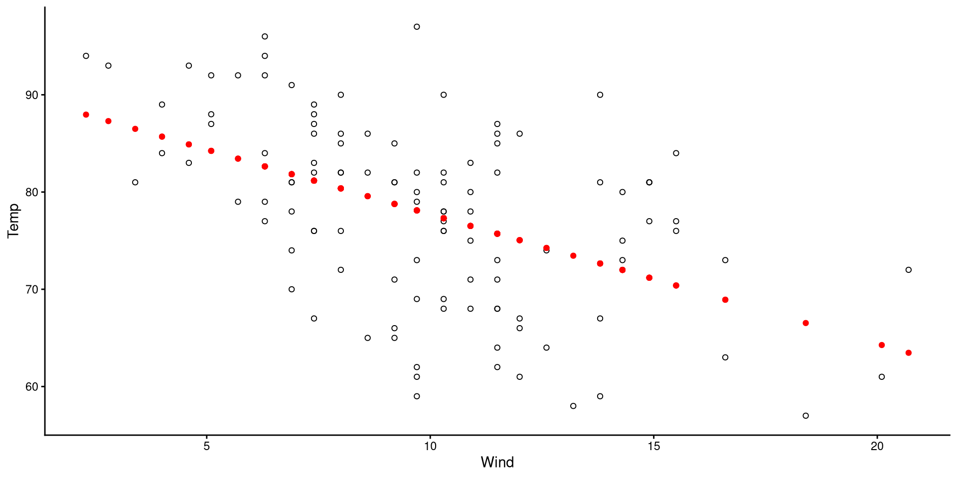
Visualizing Predictions
ggplot(dat,
 aes(x = Wind, y = Temp)) +
 geom_point(shape = 1) +
 geom_point(aes(y = reg$fitted),
col = "red")- The black circles are the observed data points.
- The red dots are the predicted values for our data points.
(although it may be obvious to most, the predictions always fall on the regression line)
Visualizing Residuals
ggplot(dat,
 aes(x = Wind, y = Temp)) +
 geom_point(shape = 1) +
 geom_point(aes(y = reg$fitted),
                col = "red") +
 geom_segment(y = reg$fitted,
              x = dat$Wind,
              xend = dat$Wind,
              yend = dat$Temp,
              linetype = 2,
              alpha = 0.5)
The length of the dashed lines are the residuals, which represent the difference between observed values (black circles) and predicted values (red dots)
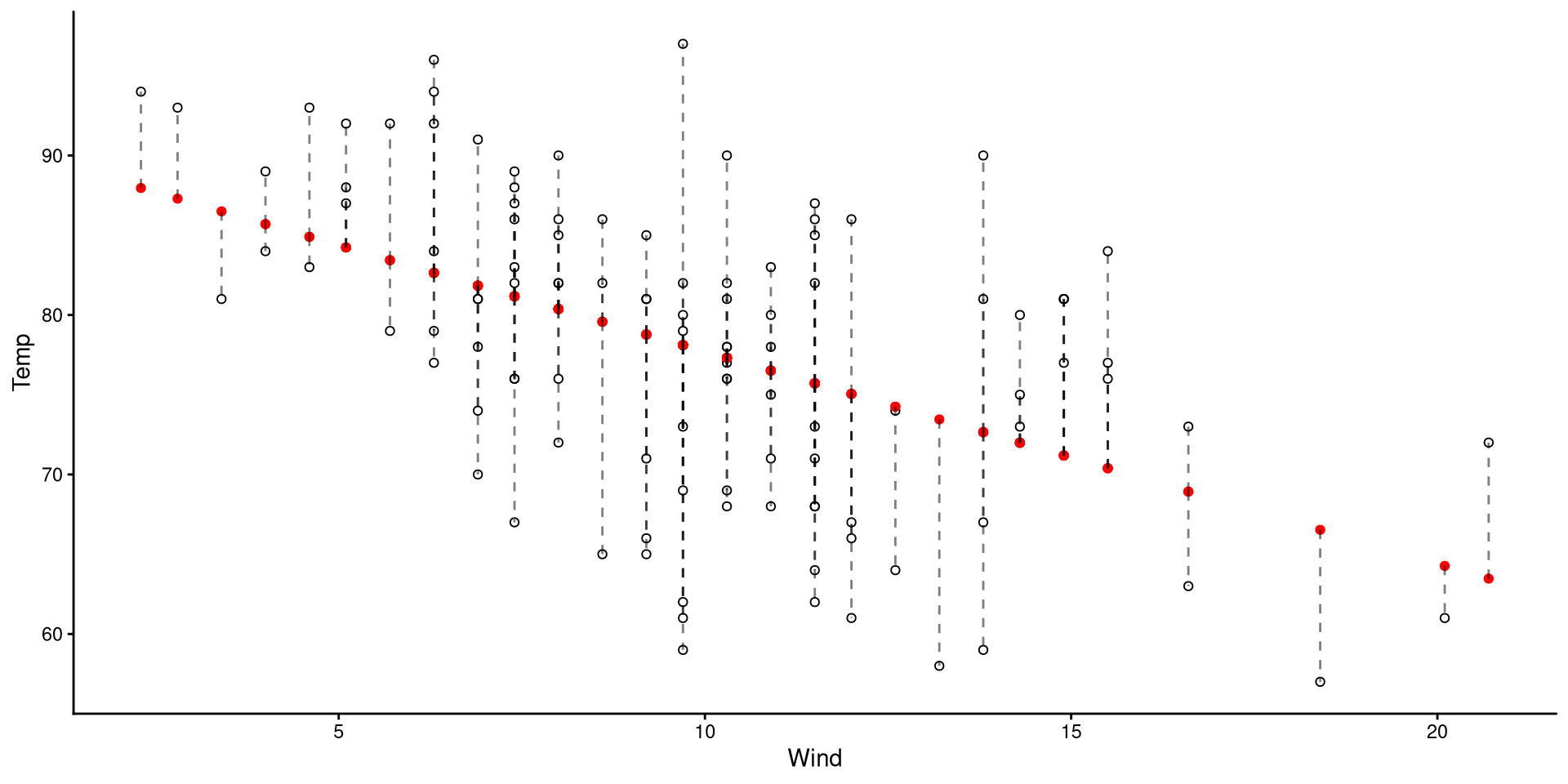
A datapoint with a large residual implies that the regression does a particularly bad job at predicting that datapoint.
Normality of Residuals
The fact that residuals must be normally distributed is the main regression assumption. QQplots can help us infer how much residuals deviate from normality.
The qqPlot() function from the car package is helpful here:
car::qqPlot(reg)As long as roughly 95% of the residuals (dots) are within the band, there should be no cause for concern.
NOTE: since the shaded area represents a 95% confidence interval, seeing roughly 5% of the residuals outside would be within our expectations.
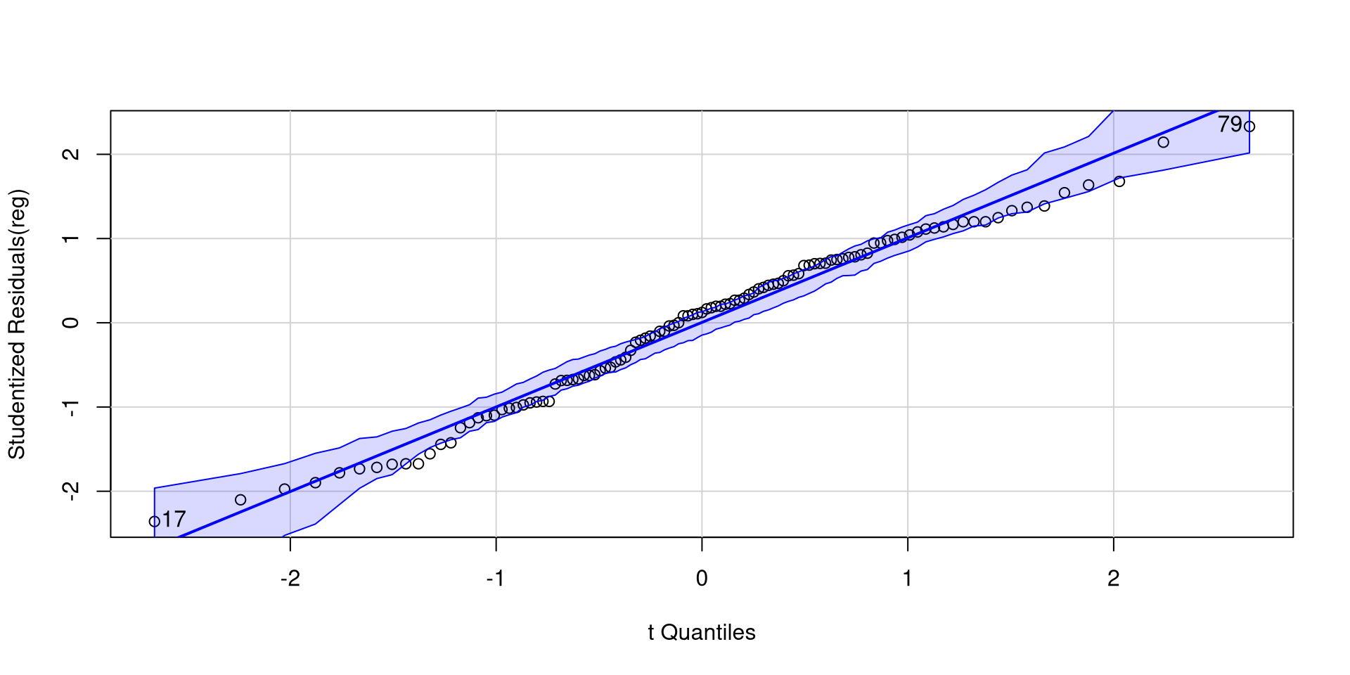
[1] 17 79Plotting Residuals Against Predictors
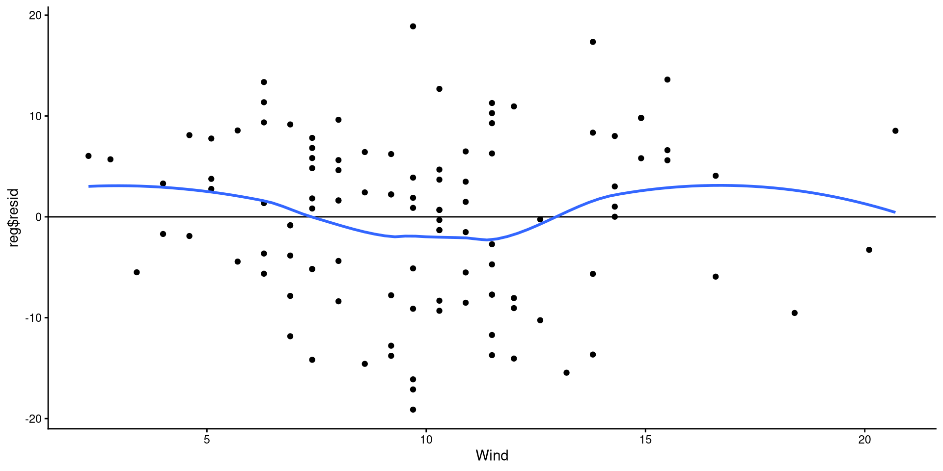
Equivalently, we can also check that the residuals are evenly distributed around 0 and there are no non-linear trends.
ggplot(dat,
  aes(x = Wind, y = reg$resid)) +
  geom_point() +
  geom_hline(yintercept = 0) +
  geom_smooth(method = "loess",
              se = FALSE)
The points look reasonably distributed around the 0 line to me. I would not give the loess line too much weight here.
Note that this is the regrerssion plot tilted such that the regression line is perfectrly horizontal.
Appendix
What is a QQplot?

QQplot The Data
If the explanation before made no sense, here’s a recreated QQplots to convince you (hopefully?)
The pattern of points is the exact same as the one generated by the stat_qq() function.
ggplot(QQdata,
       aes(x = Xaxis, y = Yaxis)) +
      geom_point()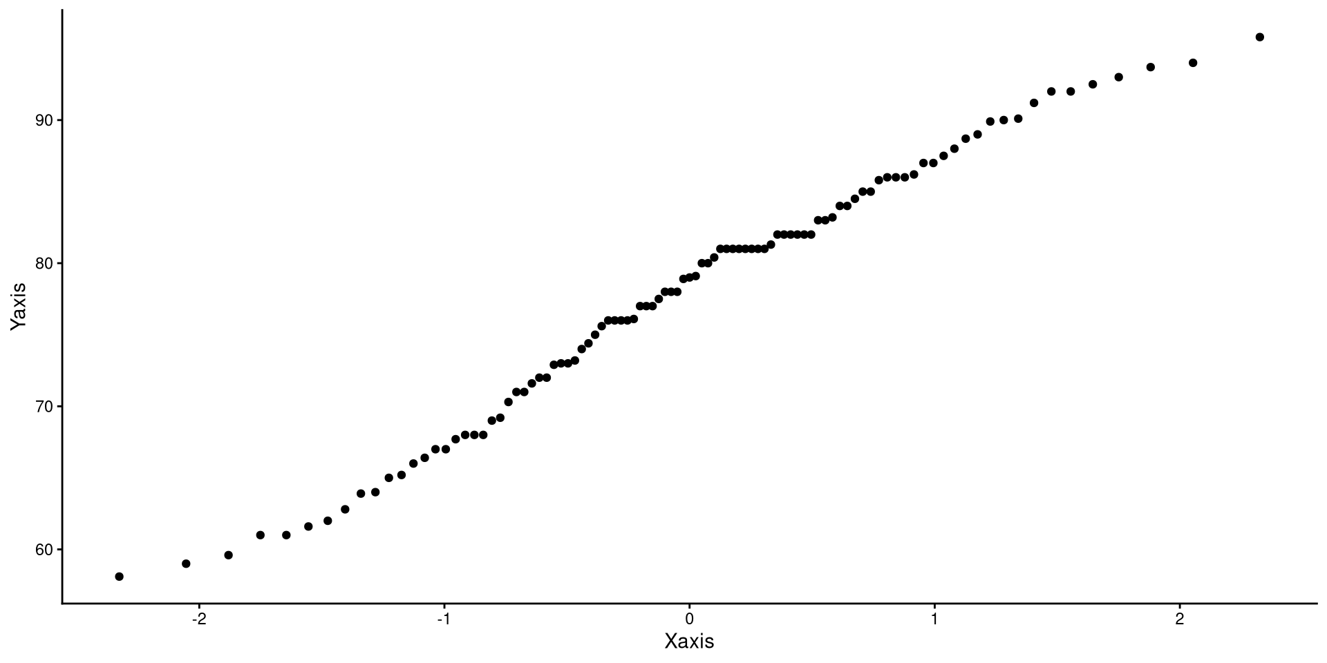
As mentioned, the quantiles generated from any different normal distribution will not change the pattern of the dots (magic? Do give this some thought if it does not make sense to you)
ggplot(QQdata,
       aes(x = Xaxis_2, y = Yaxis)) +
      geom_point()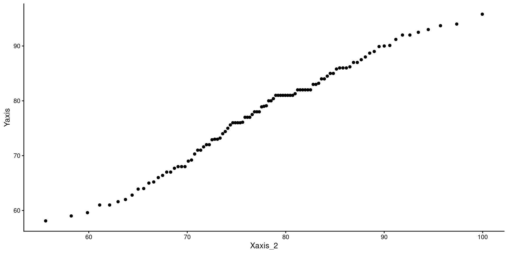
A more intuitive “QQplot”?
Really, what a QQplot does is tell you how much your observed data (Y-axis) match/mismatch a perfectly normal distribution (X-axis). The same exact information can be conveyed in a possibly more intuitive way…
ggplot(QQdata,
       aes(x = Xaxis_2, y = Yaxis)) +
       geom_point() +
       # equivalent to stat_qq_line()
       geom_abline(intercept = 0, slope = 1)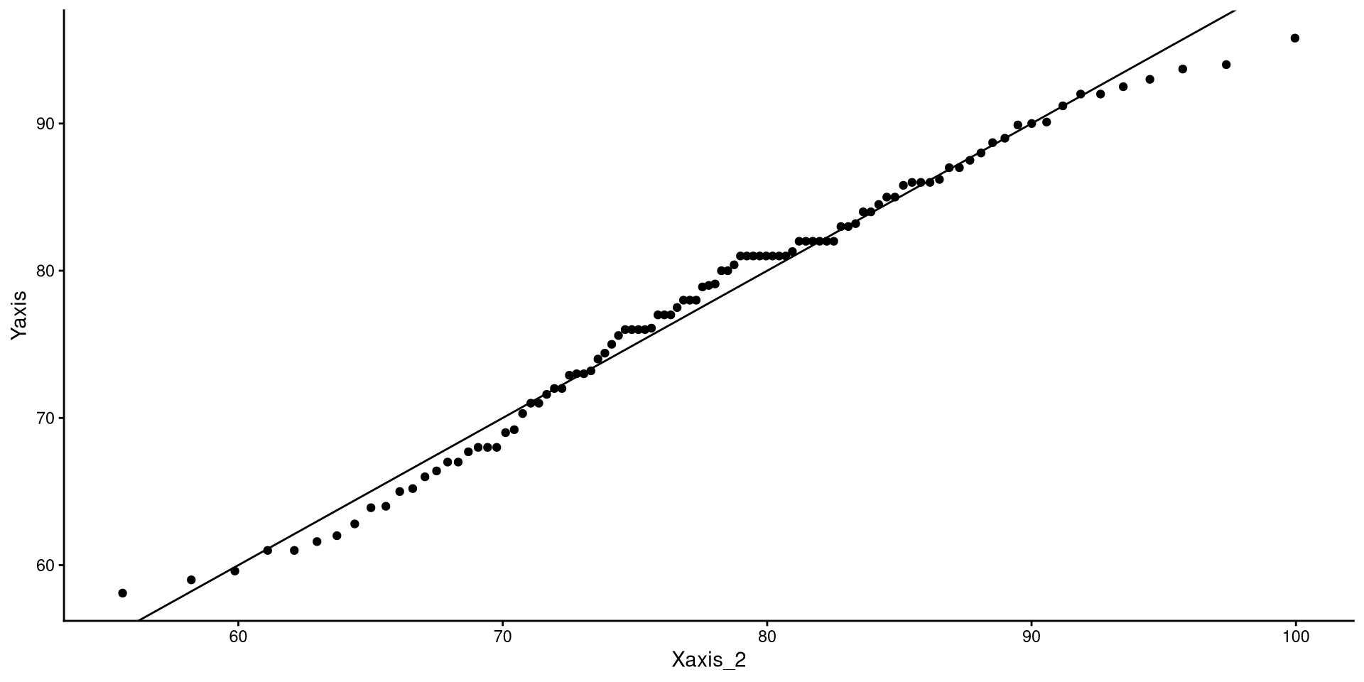
ggplot(dat, aes(x = Temp)) +
 geom_density() +
# the function below adds the normal distribution (in blue)
 geom_function(fun = dnorm,
               args = list(mean = mean(dat$Temp),
                           sd = sd(dat$Temp)), color = "blue") + xlim(45, 110)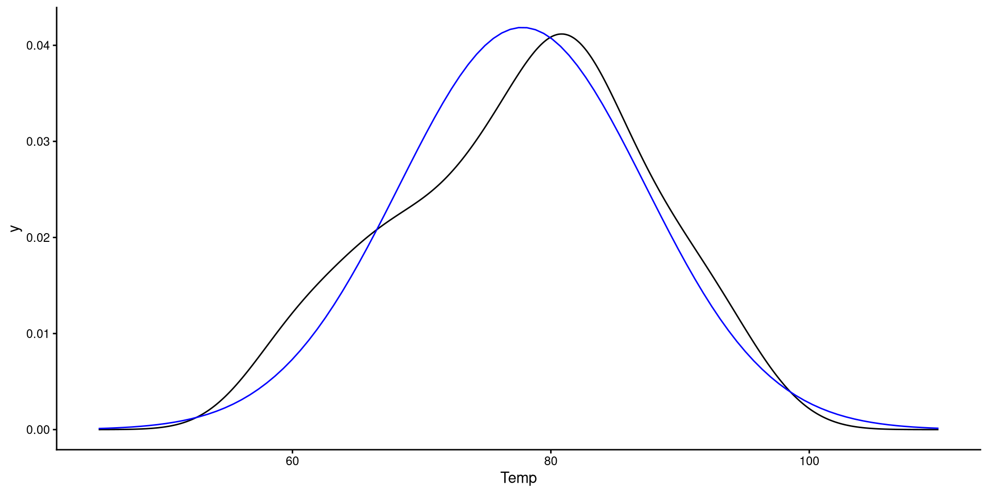
You should be able to see that the observed data deviating from the normal distribution in the plot on the right is mirrored exactly by the dots deviating form the line in the plot on the left 🧐