Lab 9: Multiple Regression I
Well, That’s just the correlation 🤷
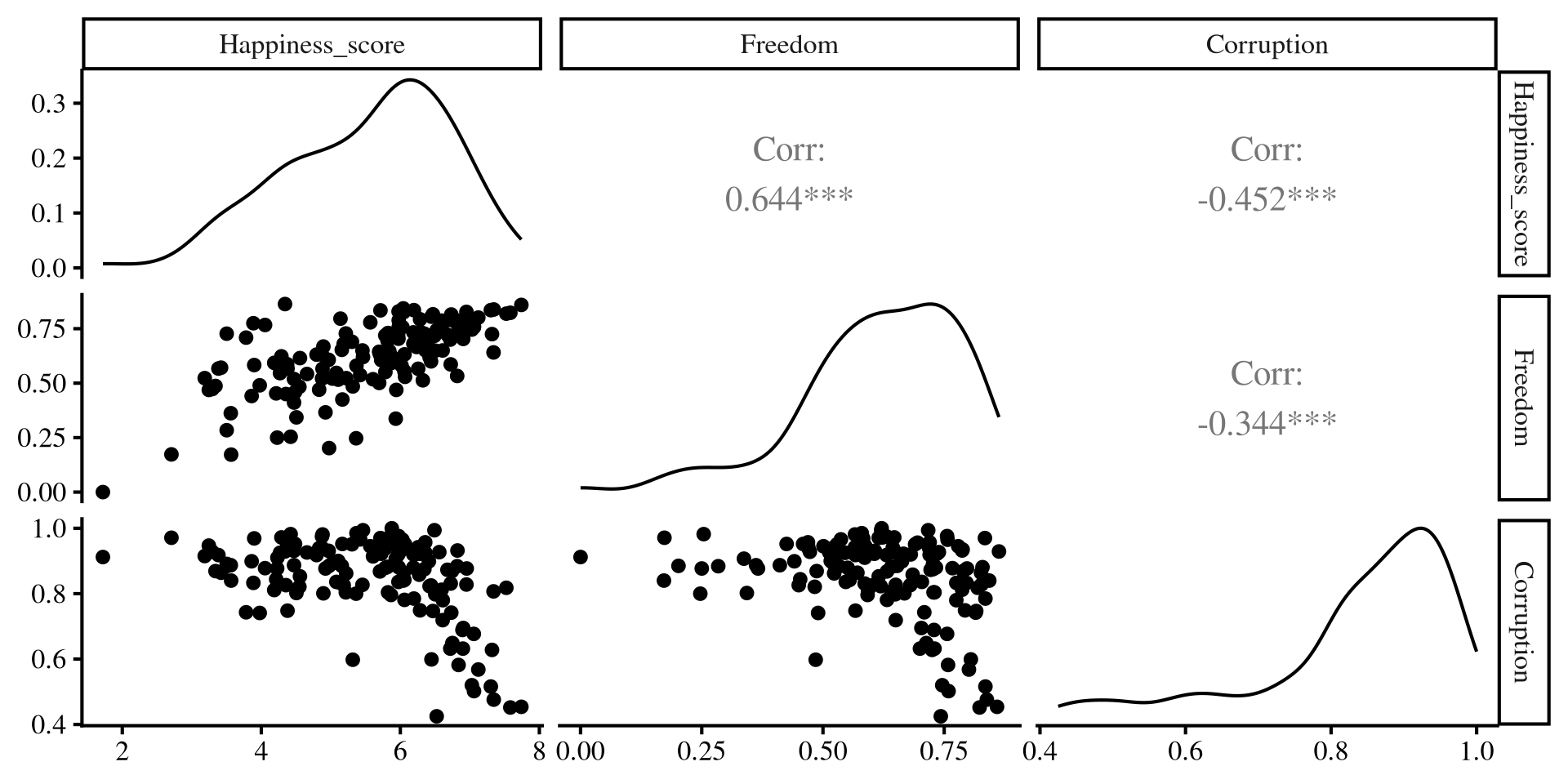
As we have learned, regression with one predictor is just a contrived way of calculating correlations among variables. We can better visualize the relation among out 3 variables with the ggpairs() function from GGally:
# here I am selecting the 3 columns that I wantr to plot
ggpairs(dat[,c(3, 7,9)])- Lower part: scatterplot between variables
- Diagonal: variable distribution
- Upper part: correlation between variables
Notably, Freedom and Corruption are also correlated.
Separate regressions miss the points that our predictors share information!
Individual regression plots
Below I plot the individual regression lines for Freedom and Corruption predicting Happiness.
Plot Code
ggplot(dat,
 aes(x = Freedom, y = Happiness_score)) +
 geom_point() +
    geom_smooth(method = "lm",
                se = FALSE)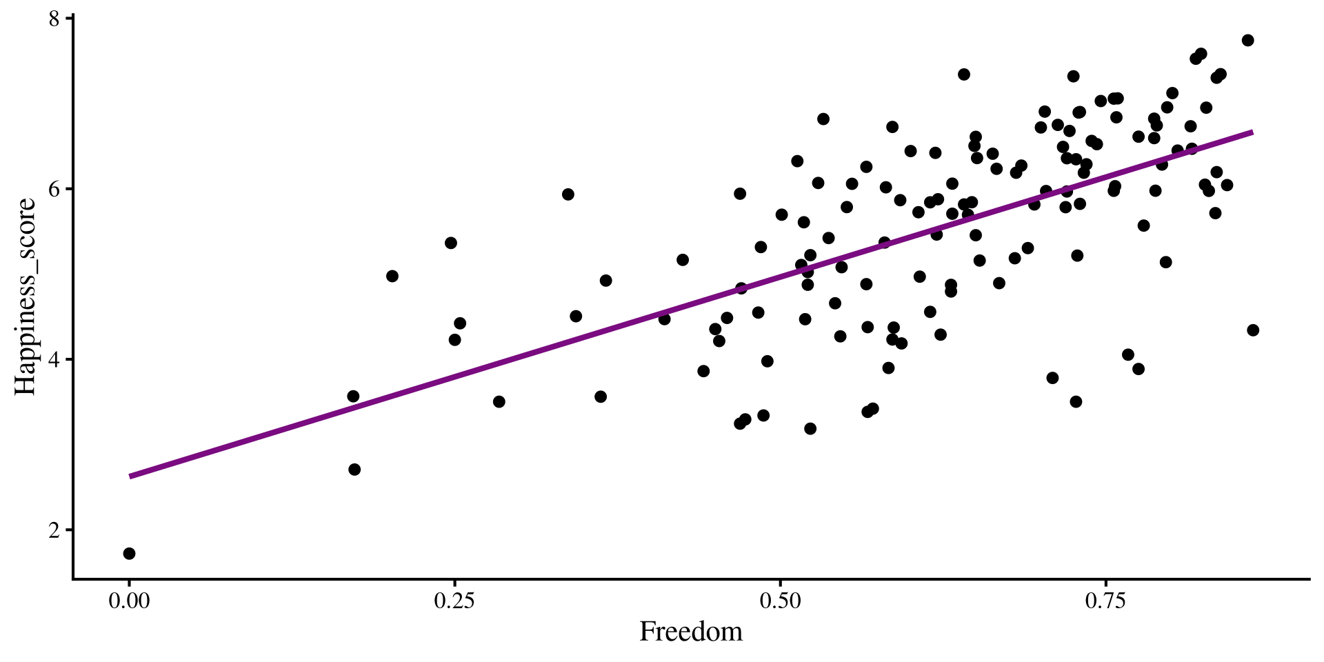
Plot Code
ggplot(dat,
 aes(x = Corruption, y = Happiness_score)) +
 geom_point() +
    geom_smooth(method = "lm",
                se = FALSE)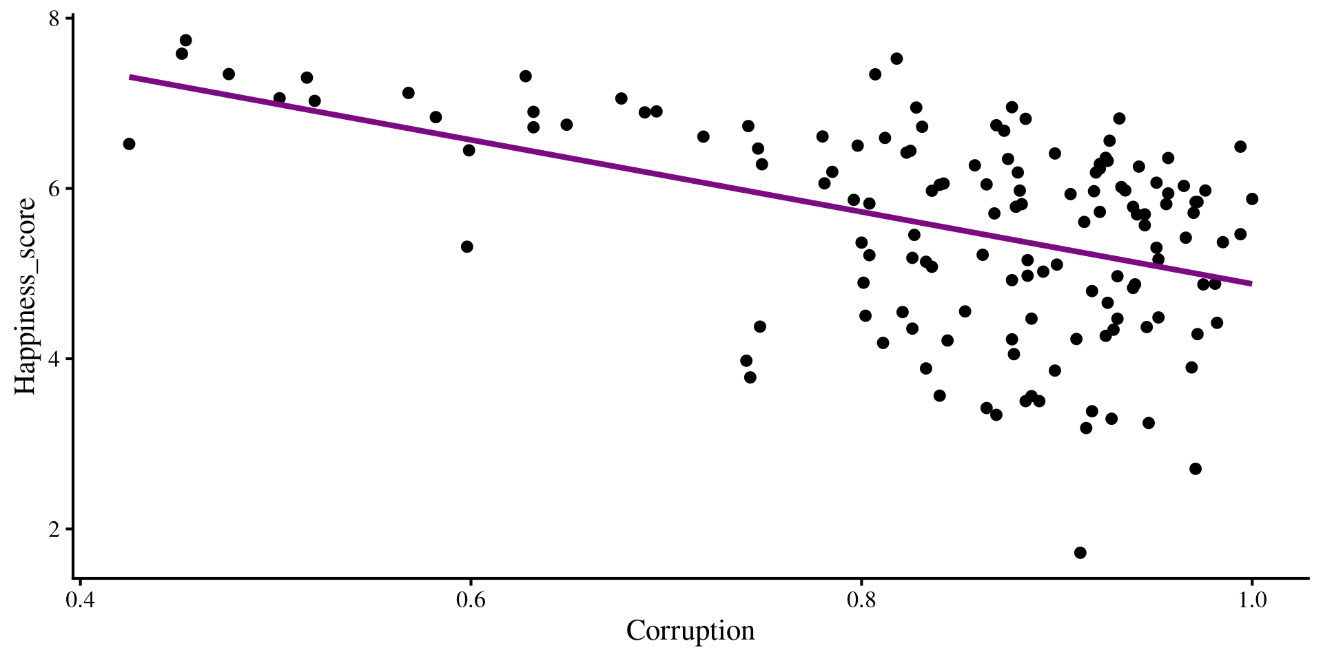
Now, what happens if we try to overlay the regression lines that we got from our multiple regression? Will they “fit the data” better that the regression lines shown here?
Adding Multiple regression Lines
if we add our multiple regression lines to the plot… (🥁 drum roll)
Plot Code
ggplot(dat,
 aes(x = Freedom, y = Happiness_score)) +
 geom_point() +
    geom_smooth(method = "lm",
                se = FALSE) +
    geom_abline(intercept = coef(reg_multi)[1],
                slope = coef(reg_multi)[2])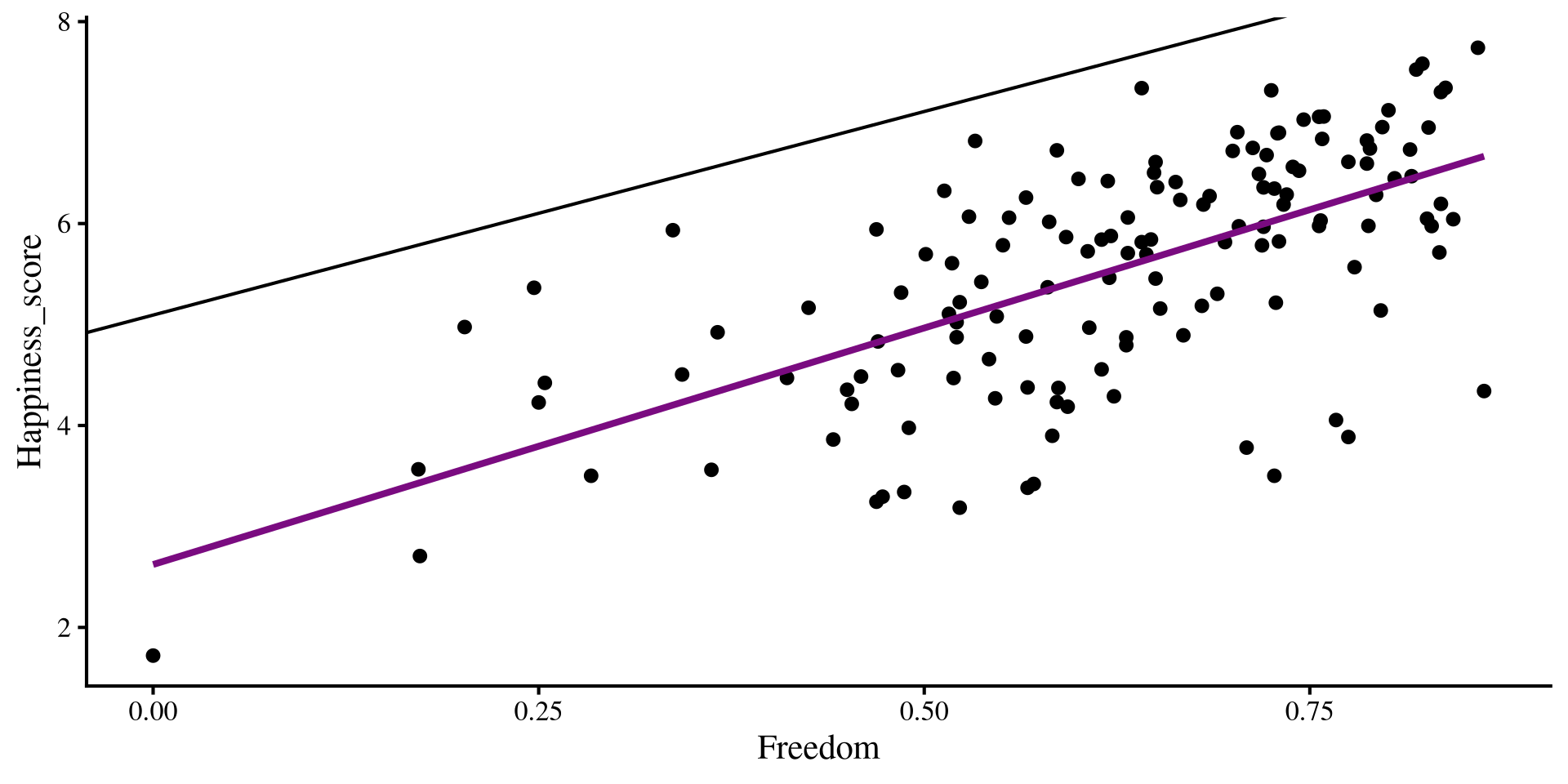
Plot Code
ggplot(dat,
 aes(x = Corruption, y = Happiness_score)) +
 geom_point() +
    geom_smooth(method = "lm",
                se = FALSE)+
    geom_abline(intercept = coef(reg_multi)[1],
                slope = coef(reg_multi)[3])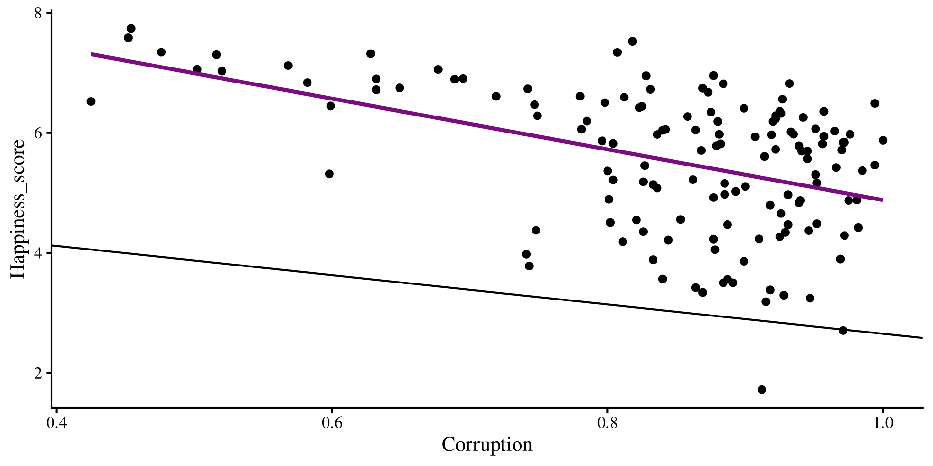
Wait, we are way off now 🤨 And here I thought multiple regression would be better 😑 …Unsurprisingly, the multiple regression is fine, our perspective is the problem!
Added Variable Plots
If the 3D plot is a bit much for you, you can also visualize the results of multiple regression with added variable plots. To do that, we can pass out lm() object to the avPlots() function from car:
car::avPlots(reg_multi)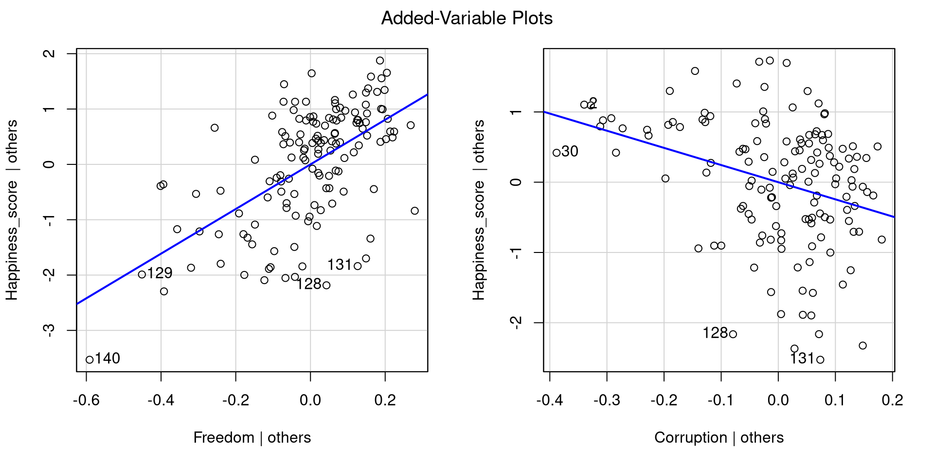
Essentially, added variable plots give you a visual representation of the relation between an IV and the DV after accounting for all other IVs.
Added variable plots have the advantage of being able to show multiple regression results when more than 2 IVs are involved. Why? Because with 3 IVs you would need a 4D plot, and humans can’t really do that 😔
Checking Residuals
Because now we have multiple IVs, we need need to check the residuals against each of them. We can use the residualPlots() function from car to quickly get residual plots for all of our predictors:
car::residualPlots(reg_multi, fitted = FALSE, test = FALSE)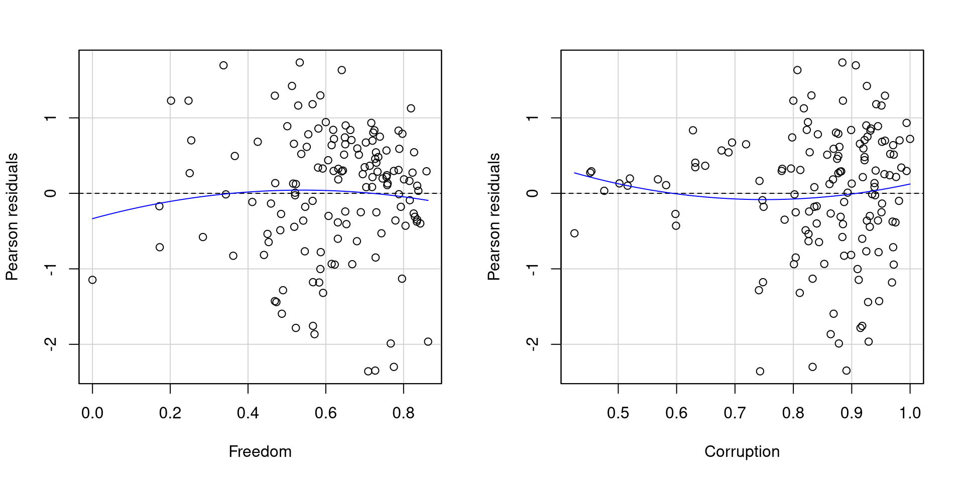
As far as residuals go, I would say that these two plots are not too bad.
The residuals of Freedom probably look better than those of Corruption mostly because Corruption has more points clustered at higher values and few points at lowe values.
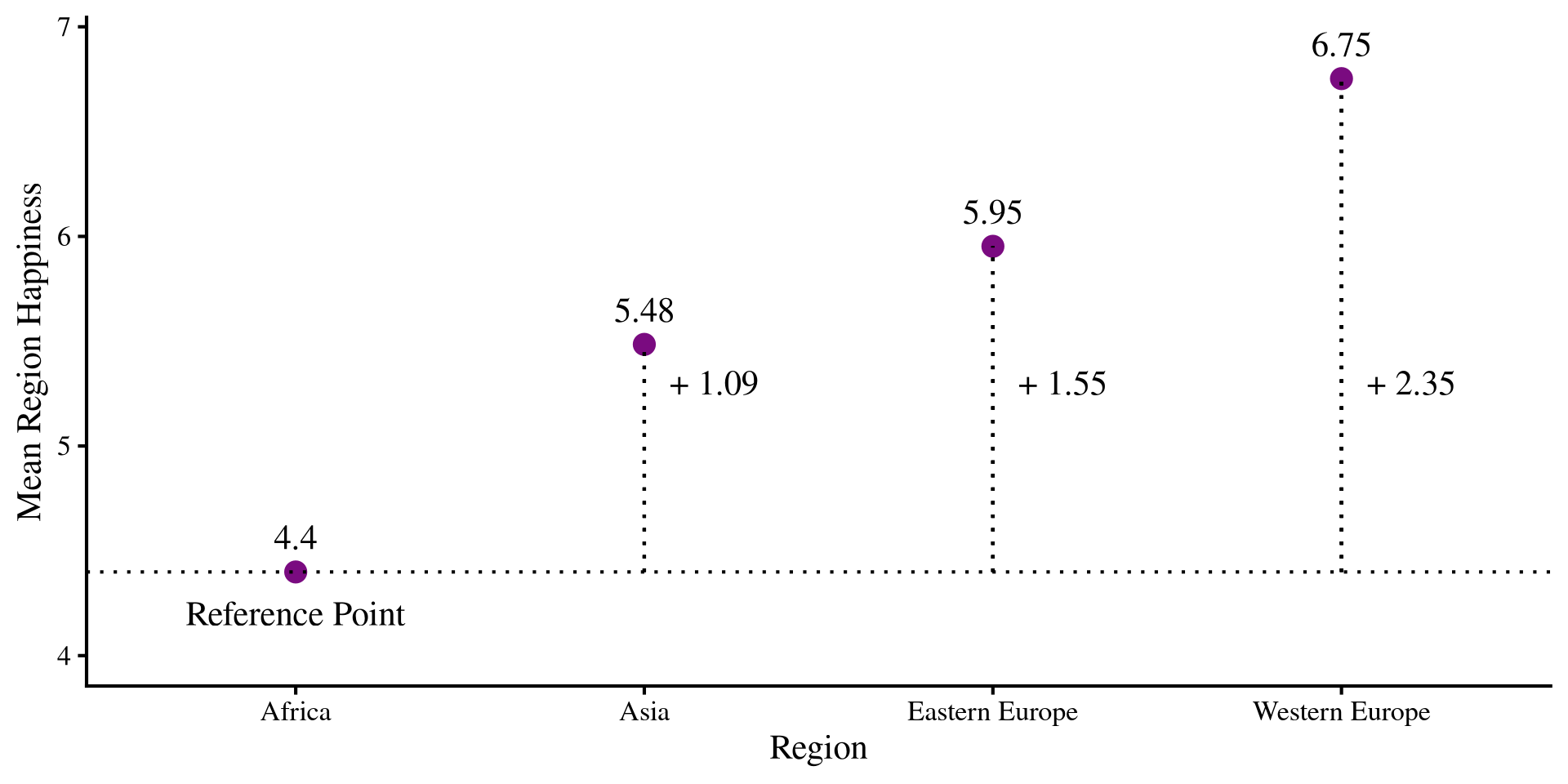
The Graphical intuition
What is happening is that we have a reference group, which is the one coded a all 0s, Africa in our case. All other slopes will be the mean differences from the reference group.
the intercept and the slopes are:
     Coefficient Value
1      Intercept  4.40
2           Asia  1.09
3 Eastern Europe  1.55
4 Western Europe  2.35
The slopes represent the change in mean Happiness for each region from the reference group!
Plot Code
happ_means <- dat_filt %>%
   group_by(Region) %>%
    summarise(Happ_mean = mean(Happiness_score))

# reference mean
ref <- as.numeric(happ_means[1,2])

ggplot(happ_means, aes(x = Region, y = Happ_mean)) +
  geom_point(size = 4, color = "#7a0b80") +
  geom_text(aes(label = round(Happ_mean, 2)), vjust = -1) +
  geom_hline(yintercept = ref, lty = 3) +
  geom_segment(x = "Asia",
               xend = "Asia",
               y = ref,
               yend = as.numeric(happ_means[2,2]), lty = 3) +
 geom_segment(x = "Eastern Europe",
               xend = "Eastern Europe",
               y = ref,
               yend = as.numeric(happ_means[3,2]), lty = 3) +
geom_segment(x = "Western Europe",
               xend = "Western Europe",
               y = ref,
               yend = as.numeric(happ_means[4,2]), lty = 3) +
annotate("text", x = 1,  y = 4.2, label = "Reference Point") +
annotate("text", x = 2.2,  y = 5.3, label = paste("+", round(coef(reg_cat)[2], 2))) +
annotate("text", x = 3.2,  y = 5.3, label = paste("+", round(coef(reg_cat)[3], 2))) +
annotate("text", x = 4.2,  y = 5.3, label = paste("+", round(coef(reg_cat)[4], 2))) +
ylim(c(4, 6.9)) +
ylab("Mean Region Happiness")