library(ppcor)library(tidyverse)# I am setting a theme for all the plotstheme_set(theme_classic(base_size =16, accent ="#7a0b80",base_family ='serif'))
The ppcor package (Kim, 2015) is is a pretty simple package with a small number of functions. We will use it to compute partial and semi-partial correlations.
Data
Today we will look at some data about US states. I chose this subset of variables from a larger dataset that you can find here.
dat <- rio::import("https://fabio-setti.netlify.app/data/States_subset.csv")
Another Perspective on Residuals
in Lab 6 we have described variance as the part of a variable that is not predictable. Let’s say that we run a regression with the state population, Population, predicting the number of airports in the state, Nairports.
reg_pop <-lm(Nairports ~ Population, dat)
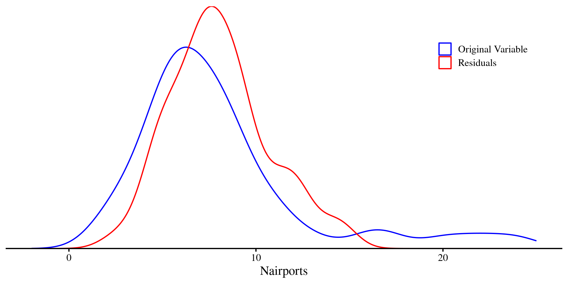
And then we plot the original Nairports along with the residuals of Nairports. Crucially, the variance of the red density (residuals) is half that of the blue density (original variable):
In a way, the residuals are the unpredictable part of a DV left after regression. That is, everything that cannot be explained by the IV.
Correlations With Residuals
If \(Y\) is our DV and \(X\) is our IV, the residuals of \(Y\)given\(X\) will be the part of \(Y\) that cannot be predicted by \(X\), which we will call \(Y_{.x}\). Let’s say that \(Y =\)Nairports, \(X =\)Population, and \(Z =\)TotalSqMiles.
Partial correlation
The partial correlation between two variables \(Y\) and \(Z\) accounting for \(X\) is the correlation between \(Y_{.x}\) and \(Z_{.x}\).
This is the relation between Nairports and TotalSqMiles after partialling out the part that is predicted by population from both variables.
Semi-Partial correlation
The semi-partial correlation between two variables \(Y\) and \(Z\) accounting for \(X\) is the correlation between \(Y\) and \(Z_{.x}\)or\(Y_{.x}\) and \(Z\). Because you partial out \(X\) from only one of the two variables, we have two possible semi-partial correlations!
# Y.x and Zcor(reg_YX$residuals, dat$TotalSqMiles)
[1] 0.8149457
# Y and Z.xcor(dat$Nairports, reg_ZX$residuals)
[1] 0.5765179
The “semi-” part comes from the fact that we partial out \(X\) only from one variable involved in the correlation.
Some More intuition
The partial and semi-partial correlation may seem to come a bit out of nowhere, but their idea is the exact same as multiple regression: we want to know the relation between two variables, after controlling for some other variables. We can see that the standardized slopes will be very close to the semi-partial correlation:
# standardize our X, Y, Z variablesdat$Nairports_std <-scale(dat$Nairports)[,1]dat$Population_std <-scale(dat$Population)[,1]dat$TotalSqMiles_std <-scale(dat$TotalSqMiles)[,1]reg_std <-lm(Nairports_std ~ Population_std + TotalSqMiles_std , dat)# here I am printing the intercept and slopesround(coef(reg_std), 3)
# Y and Z.x (Nairports correalted with the residual of TotalSqMiles after accounting for Population)cor(dat$Nairports, reg_ZX$residuals)
[1] 0.5765179
Where the semi-partial correlation and the standardized regression coefficient of TotalSqMiles are very similar, but not quite the same (see the 3rd post here).
In contrast, the partial correlation is just the correlation between two residuals. One good use of partial correlation is calculating the correlation between two variables, after accounting for some Confounding variable.
Semi-partial Correlation as Effect Size
Semi-partial correlations are also quite useful because they happen to be measures of effect size 😃
Let’s say that we run a regression with Population predicting Nairports and look at the \(R^2\):
             Nairports TotalSqMiles Population
Nairports    1.0000000    0.5765179  0.6319791
TotalSqMiles 0.8149457    1.0000000 -0.4899079
Population   0.8380858   -0.4596045  1.0000000
Here, the correlation matrix is not symmetric because, two semi-partial correlations are possible. The variable that is untouched is the variable in the row, while the variable in the column is adjusted for the remaining variables.
You can extract additional information such as significance and tests statistics just as we did in Lab 6 with the corTest() function.
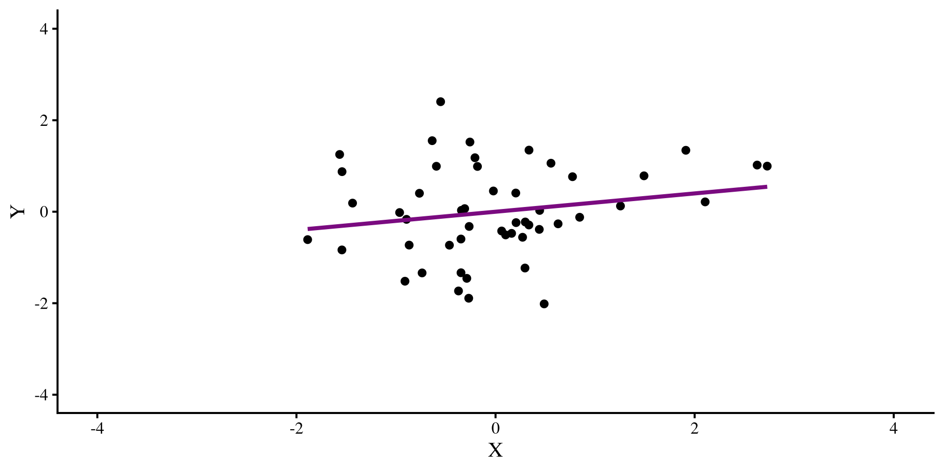
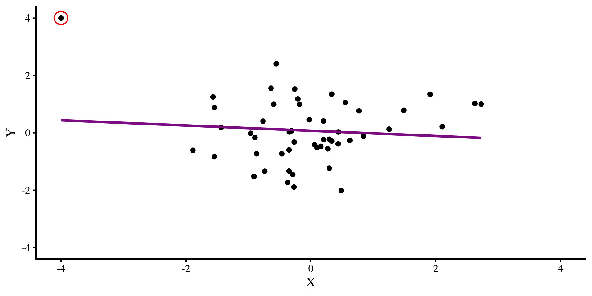
Pesky Data Points
Let’s say that we have this regression, where we see a positive relation between X and Y:
But then we find out that we forgot to include an observation. We include the new observation:
The datapoint that we added is an outlier, and it influences the regression so much that it flips the relation between X and Y 😱 Ideally, we would want to catch such pesky data points, although in the real world, it is usually not possible to eye regression results and tell which observations have this oversized influence on our regression.
Regression Diagnostics
When we are working with a lot of data and/or we have a lot of predictors, it is not possible to graphically establish what points may warrant more attention. Regression diagnostics are a set of statistics that aim at identifying data points that may influence your regression in certain ways. There are 3 types of regression diagnostics. You may see slightly different definitions for these 3 terms. I am getting these definitions/examples from chapter 16 of Darlington & Hayes (2016):
Leverage
Leverage measures quantify how unusual a certain observation is given the full set of predictors. For example, if our predictors are age and whether a person is pregnant, it would not be unusual to separately see someone whose age is 55 and some pregnant individuals. However, it would be unusual to see someone who is both 55 and pregnant. Such an observation would have high leverage.
Distance
Distance measures how far away the observed value of \(Y\) is from the predicted value \(\hat{Y}\). Residuals are a measure of distance. However, raw residuals, \(Y - \hat{Y}\), are not the best way of measuring distance, so we will see more general measures later. Regardless, high distance means that your regression is not predicting those data points well.
Influence
In my opinion, the most important category of regression diagnostics. For each observation, influence measures tell you how much the values of your slopes would change if you removed that data point. The outlier in the last slide had strong influence, as it completely changed the slope when introduced.
Quick Regression Diagnostics Summary
Here is a quick summary of the regression diagnostics that we will look at today. In general, influence measures are more useful, because, for each data point, they tell you what would happen to your results if you deleted that data point.
Hat values: measure how unusual an observation is compared to the average observation. (leverage)
Studentized Residuals: For each data point, it measures how large the residual is on a standardized scale (distance).
DFFITS: For each data point, it measures how large the change in the predictions, \(\hat{Y}\), would be if that data point was removed (influence).
Cook’s D: For each data point, it measures how large the change in the predictions, \(\hat{Y}\), would be if that data point was removed. Very similar to DFFITS (influence).
COVRATIO: For each data point, it measures how large the average change in all the standard errors of the regression coefficients would be if that data point was removed (influence).
DFBETAS: For each data point, it measures how much each individuals regression coefficient would change if that data point was removed (influence).
DFBETAS () is my favorite measure because for each data point, it tells you how much each regression coefficient will change if that data point is removed. Other measures give some average, which, for most purposes, is not as informative in my opinion.
Our Regression and a Quick Graphical Look
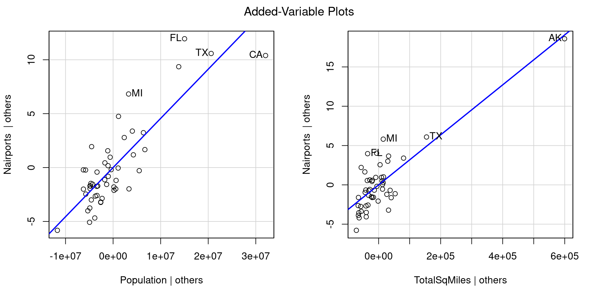
Let’s say that we want to predict Nairports based on Population and TotalSqMiles. We can run the regression and look at the added variable plots to get sense of how our regression looks:
#label the rows so that the avPlots() function shows the row names instead of just numbersrownames(dat) <- dat$Abbreviationreg_full <-lm(Nairports ~ Population_std + TotalSqMiles, dat)car::avPlots(reg_full)
For each plot, the avPlots() function prints the two points with the largest residual and the 2 points with the largest leverage. Although, they are based on individual plots, not the full data.
We can also see that our regression assumptions are probably violated, especially in the second plot, where Alaska is very far away from all the other points.
Leverage: Hat Values
Hat values measure how unusual an observation is compared to the average observation. They are a measure of leverage, and the higher the values, the more unusual the observation given the set of predictors (the lowest possible value is \(0\)).
To compute hat values for all your observations we use the hatvalues() function. Here I only print the 5 largest values:
        AK         CA         TX         FL         NY
0.82010855 0.42227644 0.25961442 0.10494988 0.09244746
Here are all the hat values:
Leverage is just a way of determining whether an observation is unusual, but it does not necessarily mean that the observation is problematic. I generally don’t like guidelines of “how big is too big” for regression diagnostics because they don’t generalize well to real world cases. Here, Alaska’s hat value is around twice as large as the second largest one, so somewhat big relative to all other data points.
Distance: Studentized Residuals
Studentized Residuals measure how large each residual is on a standardized scale (a t scale really, but makes no difference in practice). This is a measure of distance from the regression line/plane.
To compute studentized residuals for all your observations you use the rstudent() function. Here I only print the 5 largest and smallest values:
rstud <-rstudent(reg_full)# just printing some valuesround(c(sort(rstud,)[1:5], rev(sort(rstud, decreasing =TRUE)[1:5])), 2)
   CA    NJ    NV    NM    OH    NY    HI    WA    FL    MI
-2.73 -1.67 -1.38 -1.33 -1.32  1.50  1.93  2.03  2.63  2.64
Here are all the residuals:
We are talking about residuals, so they can be both positive (above the regression line) and negative (below the regression line). Because the residuals are on a standardize scale, around 0 is an average residual, where anything with an absolute value of 2 or more is somewhat high. So california, Washington, Florida and Michigan are not very well predicted.
Influence: DFFITS
DFFITS measure how large the change in the predictions, \(\hat{Y}\), would be on average if that data point was removed.
To compute DFFITS for all your observations you use the dffits() function. Here I only print the 5 largest and smallest values:
   CA    AK    NJ    NM    OH    TX    HI    MI    NY    FL
-2.34 -1.10 -0.31 -0.25 -0.25  0.37  0.38  0.42  0.48  0.90
Here are all the residuals:
Predictions can change either positively or negatively, so we should look at extreme values both ways. You can think of DFFITS as a measure that summarizes how much the whole regression model changes when a data point is removed. Here, we can see that the DFFITS value for California is more than twice as large as the next largest DFFITS value!
Influence: Cook’s D
Cook’s D is very similar to DFFITS because it also summarizes the change in the predictions, \(\hat{Y}\), given any data point if that data point was removed (influence). The difference is that Cook’s D is always positive, and large values imply larger influence.
To compute Cook’s distance for all your observations you use the cooks.distance() function. Here I only print the 5 largest values:
        CA         AK         FL         NY         MI
1.60005270 0.41133412 0.24041602 0.07436620 0.05279961
Here are all the values:
Data points with large DFFITS (in magnitude) will have large Cook’s D, so the interpretation is similar; you can check that the largest absolute values on the previous slides all appear here. As mentioned above, the one notable difference is that Cook’s distance is always positive, so may be easier to interpret from some.
Influence: COVRATIO
COVRATIO measures how large the average change in all the standard errors of the regression coefficients would be if that data point was removed.
To compute COVRATIO values for all your observations you use the covratio() function. Here I only print the 5 largest and smallest values
  MI   FL   WA   HI   NJ   MT   RI   CA   TX   AK
0.72 0.78 0.84 0.88 0.92 1.11 1.11 1.18 1.40 5.83
The interpretation of these values is a bit more nuanced than the other regression diagnostics 🤔
Here are all the values:
You may notice that COVRATIO values hover around 1. In fact, \(\mathrm{COVRATIO} = 1\) means that removing the point has no impact whatsoever on the standard errors. On the other hand, \(\mathrm{COVRATIO} < 1\) means that removing the point will make standard errors smaller, while \(\mathrm{COVRATIO} > 1\) means that removing the point will make standard errors larger.
Influence: DFBETAS
DFBETAS represent the change in standard error units (the std.error column in the regression summary) in the intercept and slopes if if that data point was removed.
To compute DFBETAS we use the dfbetas() function:
dfbetas(reg_full)
DFBETAS provide more information than the other measures. Removing a data point may have stronger influence on one of the slopes, but not as much influence on another slope or the intercept 🧐
You can click on the column names in the table on the left to order the table by each column and see the more extreme values for each column.
The change is in standard deviation units, so, for example, removing California reduces the slope of Population by \(2.23\) standard errors (a lot!), but only reduces the slope of TotalSqMiles by \(.17\). Other regression diagnostics do not provide this nuance!
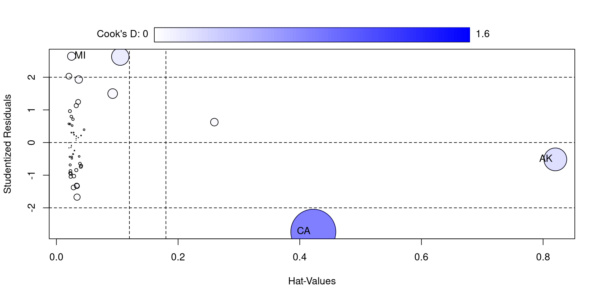
Influence plot with car
The influencePlot() function from the car package also offers a nice visualization for studentized residuals, hat values, and Cook’s D at the same time
car::influencePlot(reg_full)
So, compared to the other states, California and Alaska are quite high on some of these measures. If you think about it, they are both have “unusual” compared to other state in the California has by far the largest population and Alaska has by far the largest surface.
I also feel like the function is not very aptly named because only Cook’s D is a measure of influence 🫣
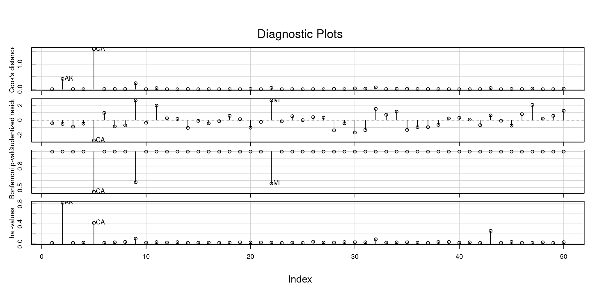
Another Neat car Plot
The influenceIndexPlot() function offers a visualization of a bunch of regression diagnostics. This helps visualizing what observations are extreme relative to other observations
car::influenceIndexPlot(reg_full)
In general, and especially with these measures, I like to look at how large they are relative to all other observations. If you have a data point that is 3 times as large as everything else, it probably warrants some attention.
However, above all, never remove outliers or influential observations unless you have a really good justification. The problem is often with the model, not the data!
Variance Inflation Factor
Another important statistic that may as well be a regression diagnostic is the variance inflation factor (VIF), which can be calculated for all regression predictors. For a predictor \(X\),
\[ VIF_x = \frac{1}{1 - R^2}\]
where the \(R^2\) represents the variance explained in the predictor \(X\) by all other predictors. The higher the correlation between predictors, the higher VIFs are going to be. VIFs above 10 generally means that some of your predictors are very highly correlated
we can use the vif() function from the car package to calculate the VIFs for all of our predictors.
car::vif(reg_full)
  Population TotalSqMiles
    1.017082     1.017082
VIFs close to 1 mean that there isn’t much correlation between the predictors. High VIF is not desirable because (1) it inflates standard errors of regression coefficients, and (2) it usually makes regression coefficients uninterpretable. Let’s see an example…
Multiple Regression Weirdness
We want to predict percentage of practicing catholics in each state, PctCatholic, based on voting patterns in the 2020 elections.
we have two variables in our data, PctBiden2020 and PctTrump2020, which are the percentages of Biden and Trump voters in each state in 2020. Let’s look at the regression slopes with the two predictors separately and then together:
…Do you notice anything strange about the regression with both predictors? 🤔
Multicollinearity and Regression Weirdness
In the previous slide we found that the higher percentage of Biden voters was associated with a higher percentage of catholics, whereas the relation was reversed in the case of percentage of Trump voters. However, when we ran a multiple regression, both regression slopes were positive (a bit spooky if you ask me 😱). What is happening?
Well, because of the 2 party system in the US, PctBiden2020 and PctTrump2020 are almost perfectly negatively correlated:
cor(dat$PctBiden2020, dat$PctTrump2020)
[1] -0.9973258
Unsurprisingly, the VIFs are off the charts:
# with only two predictors, the VIF is going to be the exact samecar::vif(reg_both)
PctBiden2020 PctTrump2020
    187.2237     187.2237
A case of highly correlated predictors is generally referred to as multicollinearity. In such cases, regression slopes are not to be trusted. Another clue that something is not right comes from comparing the \(R^2\) from the individual and multiple regressions:
If you move the plot around, you will notice that there is no depth to the cloud of points. That is, we are missing a dimension!
This should really be a 2D plot. Once again, this happens because PctBiden2020 and PctTrump2020 are the same variable and we just have a 2D scatterplot, not a 3D one 🙃
Expand
You can imagine how the math may break down when we ask for a regression plane for this sort of data.
All we need is a line, and asking for a plane forces the plane to contort in really strange ways to fit the 2D data 🧐 This is why the regression slopes get really funky in these cases.
Expand
References
Darlington, R. B., & Hayes, A. F. (2016). Regression analysis and linear models: Concepts, applications, and implementation. Guilford Publications.
Kim, S. (2015). Ppcor: An R Package for a Fast Calculation to Semi-partial Correlation Coefficients. Communications for Statistical Applications and Methods, 22(6), 665–674. https://doi.org/10.5351/CSAM.2015.22.6.665
 ) is my favorite measure because for each data point, it tells you how much each regression coefficient will change if that data point is removed. Other measures give some average, which, for most purposes, is not as informative in my opinion.