Lab 3: Two-Predictor Regression
PSYC 7804 - Regression with Lab
Well, That’s just the correlation 🤷
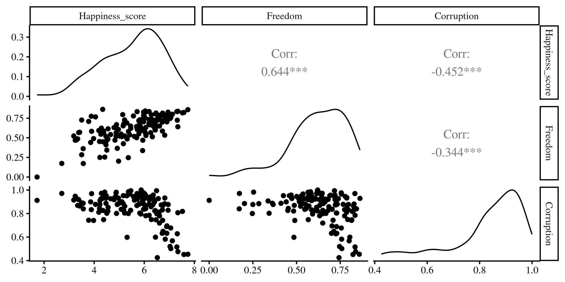
As we have learned, regression with one predictor is just a contrived way of calculating correlations among variables. We can better visualize the relation among out 3 variables with the ggpairs() function from GGally:
# here I am selecting the 3 columns that I wantr to plot
GGally::ggpairs(dat[,c(3, 7,9)])- Lower part: scatterplot between variables
- Diagonal: variable distribution
- Upper part: correlation between variables
Notably, Freedom and Corruption are also correlated.
Separate regressions miss the points that our predictors share information!
Individual regression plots
Below I plot the individual regression lines for Freedom and Corruption predicting Happiness.
Plot Code
ggplot(dat,
 aes(x = Freedom, y = Happiness_score)) +
 geom_point() +
    geom_smooth(method = "lm",
                se = FALSE)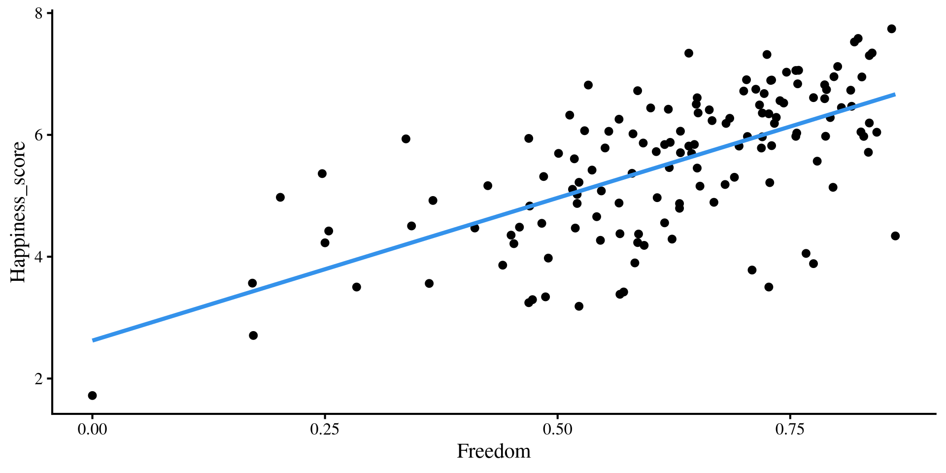
Plot Code
ggplot(dat,
 aes(x = Corruption, y = Happiness_score)) +
 geom_point() +
    geom_smooth(method = "lm",
                se = FALSE)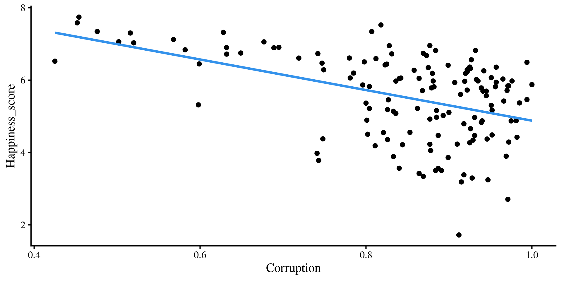
Now, what happens if we try to overlay the regression lines that we got from our multiple regression? Will they “fit the data” better that the regression lines shown here?
Adding Multiple regression Lines
if we add our multiple regression lines to the plot… (🥁 drum roll)
Plot Code
ggplot(dat,
 aes(x = Freedom, y = Happiness_score)) +
 geom_point() +
    geom_smooth(method = "lm",
                se = FALSE) +
    geom_abline(intercept = coef(reg_multi)[1],
                slope = coef(reg_multi)[2])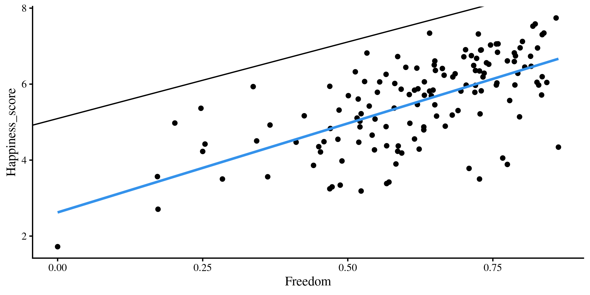
Plot Code
ggplot(dat,
 aes(x = Corruption, y = Happiness_score)) +
 geom_point() +
    geom_smooth(method = "lm",
                se = FALSE)+
    geom_abline(intercept = coef(reg_multi)[1],
                slope = coef(reg_multi)[3])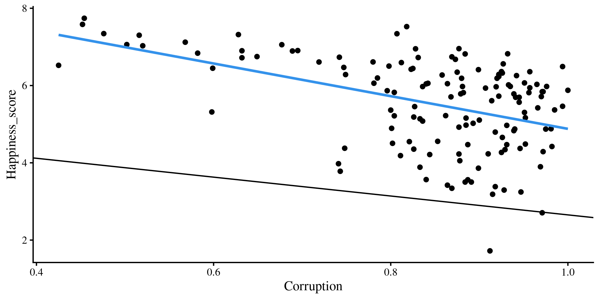
Wait, we are way off now 🤨 And here I thought multiple regression would be better 😑 …Unsurprisingly, the multiple regression is fine, our perspective is the problem!
Variance as what we cannot predict
At this point, a quick detour about variance is in order. In Psychology we work with random variables. The word random is important because it means that there is something that we cannot predict about the variable (e.g., we cannot perfectly predict depression, nor will we ever be able to).
However, given a sample, we can quantify the unpredictability of a variable. The variance (or equivalently the SD) measure how uncertain a variable is!
We can see that the red distribution has a larger variance than the blue distribution. That is, the red distributrion has more unpredictability.
(by the way, generally Entropy is used to quantify unpredictability of a random variable)
Plot code
ggplot() +
 geom_function(fun = dnorm,
               args = list(mean = -4,
                           sd = 1), color = "blue") +
 geom_function(fun = dnorm,
               args = list(mean = 4,
                           sd = 2), color = "red") +
                        theme(axis.title.y=element_blank(),
        axis.text.y=element_blank(),
        axis.ticks.y=element_blank(),
        axis.line.y =  element_blank()) + xlim(c(-10, 10))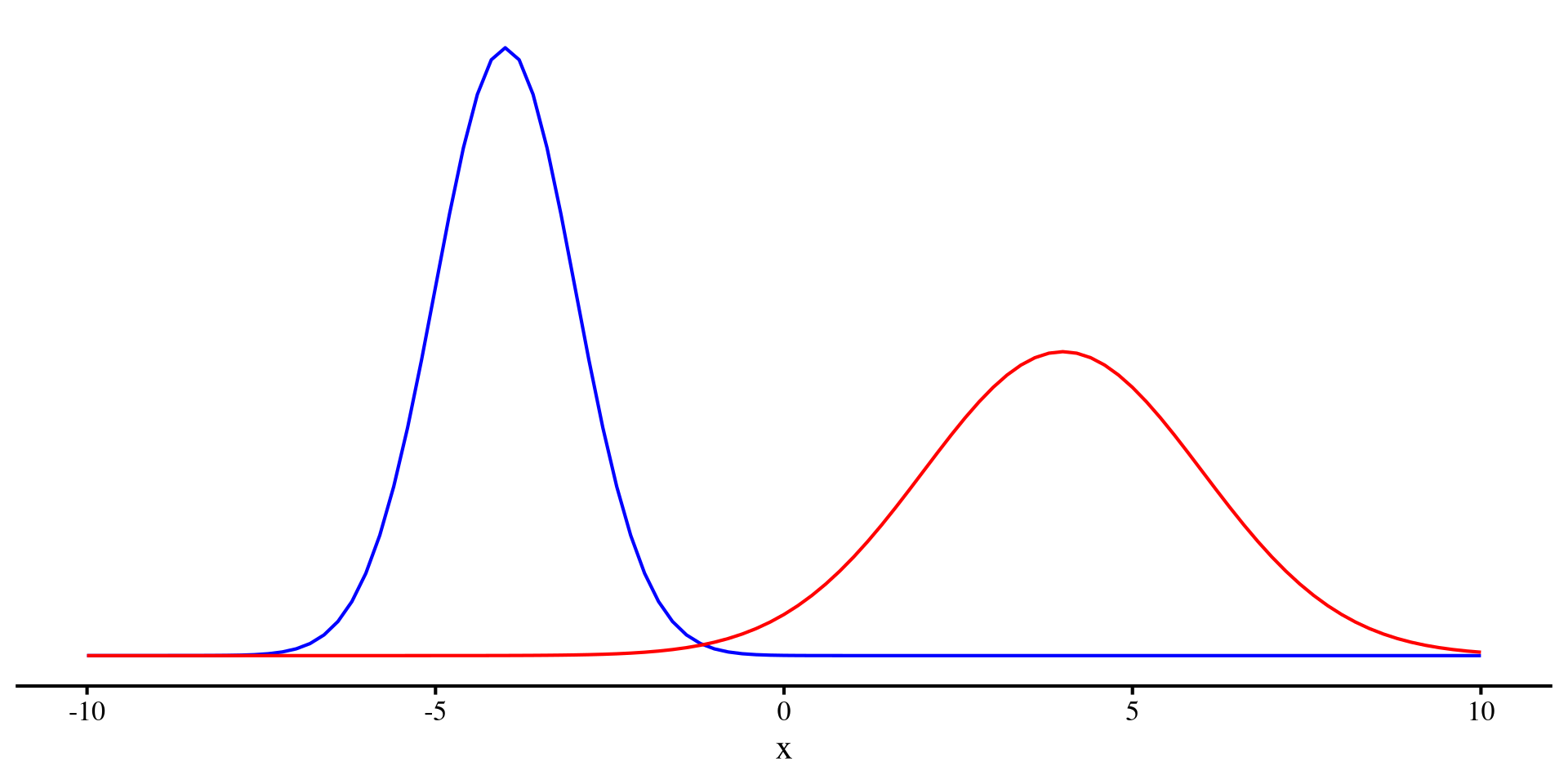
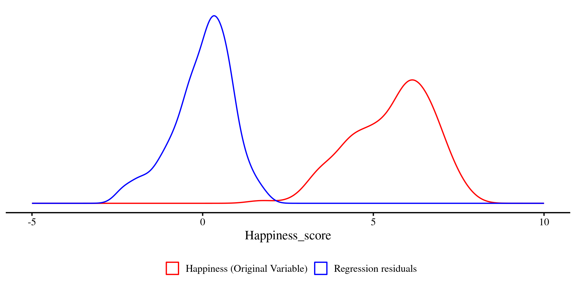
A graphical look at R2
We can plot the density of Happiness and the residuals just like we plotted the two distributions a few slides ago.
Just as before, you can see that the two distributions visibly differ in variance. The residuals (blue density) have less variance, \(47.5\%\) less to be precise.
Question: What would it mean if the residuals had no variance at all? 🤔
Plot code
ggplot(dat) +
  geom_density(
    aes(x = Happiness_score, color = "Happiness (Original Variable)")
  ) +
  geom_density(
    aes(x = reg_multi$resid, color = "Regression residuals")
  ) +
  scale_color_manual(
    name = "",
    values = c(
      "Happiness (Original Variable)" = "red",
      "Regression residuals" = "blue"
    )
  ) +
  theme(
    axis.title.y = element_blank(),
    axis.text.y  = element_blank(),
    axis.ticks.y = element_blank(),
    axis.line.y  = element_blank(),
    legend.position = "bottom"
  ) +
  xlim(c(-5, 10))