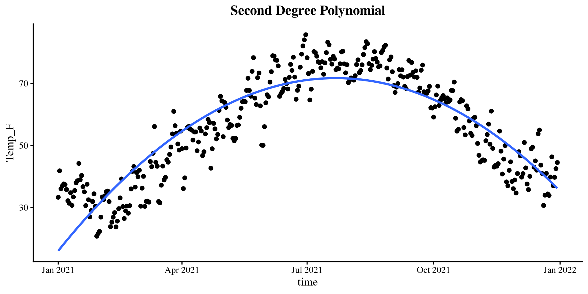
Lab 8: Quadratic regression and non-linear alternatives
PSYC 7804 - Regression with Lab
Plot The Data
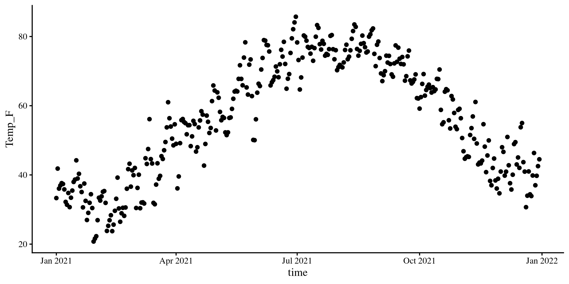
Let’s see what is the temperature trend in NY for the year 2021.
ggplot(Temp_avg_2021,
       aes(x = time, y = Temp_F)) +
geom_point() +
geom_smooth(method = "lm",
formula = y ~ poly(x, 2),
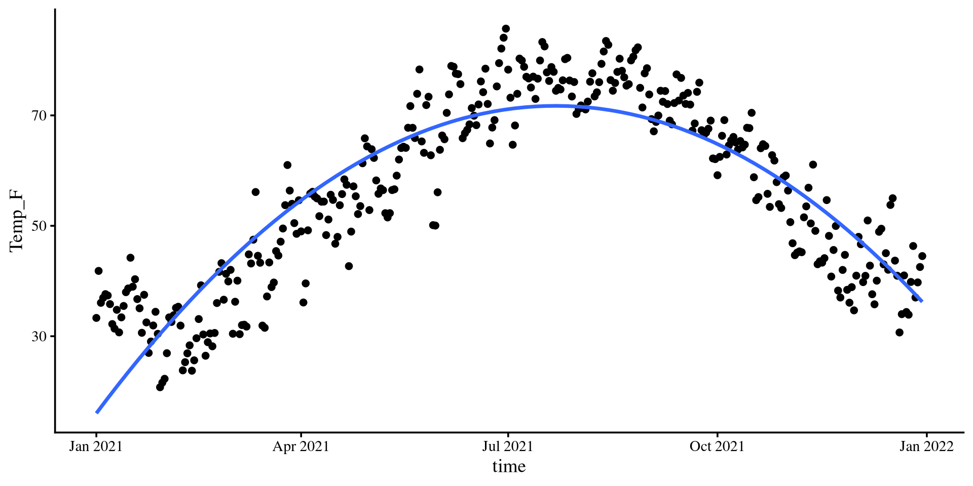
se = FALSE)The quadratic line fits very well. Let’s see if the loess line agrees.
Plot The Data
Let’s see what is the temperature trend in NY for the year 2021.
ggplot(Temp_avg_2021,
       aes(x = time, y = Temp_F)) +
        geom_point() +
geom_smooth(method = "lm",
            formula = y ~ poly(x, 2),
se = FALSE) +
geom_smooth(method = "loess",
col = "red",
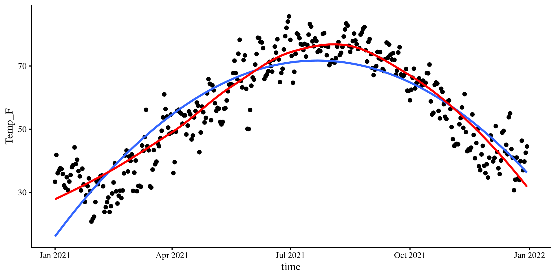
se = FALSE)The loess line is pretty close to the quadratic one!
Let’s run a quadratic regression with time as the predictor…
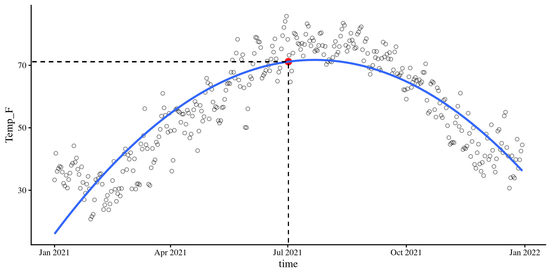
\(b_0\) in Quadratic Regression
Plot code
ggplot(Temp_avg_2021,
       aes(x = time, y = Temp_F)) +
        geom_point(alpha = .5, shape = 1)  +
  geom_point( aes(y = coef(quad_reg)[1],
                  x = mean(Temp_avg_2021$time)),
              size = 3.5,
              col = "red") +
geom_smooth(method = "lm",
           formula = y ~ poly(x, 2),
           se = FALSE) +
geom_segment(x = 0,
               xend = mean(Temp_avg_2021$time),
               y = coef(quad_reg)[1],
               yend = coef(quad_reg)[1],
               linetype = 2) +
geom_segment(x = mean(Temp_avg_2021$time),
             xend = mean(Temp_avg_2021$time),
             y = 0,
             yend = coef(quad_reg)[1],
             linetype = 2)
\[b_0 = 71.16\]
Given that the time variable was centered, 0 corresponds to the middle of the year, July 2nd.
time = 0) given the quadratic regression equation is indeed 71.16 degrees Fahrenheit.
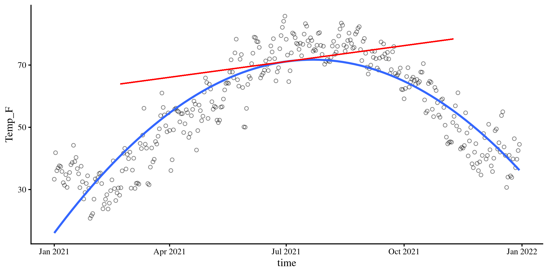
\(b_1\) in Quadratic Regression
Plot code
ggplot(Temp_avg_2021,
       aes(x = time, y = Temp_F)) +
        geom_point(alpha = .5, shape = 1)  +
geom_smooth(method = "lm",
            formula = y ~ poly(x, 2),
            se = FALSE) +
geom_segment(x = mean(Temp_avg_2021$time) - 130,
             xend = mean(Temp_avg_2021$time) + 130,
             y = coef(quad_reg)[1] - coef(quad_reg)[2]*130,
             yend = coef(quad_reg)[1] + coef(quad_reg)[2]*130,
             linetype = 1,
             linewidth = .7,
             col = "red")
\[b_1 = 0.06\]
The slope of the tangent line when time is at 0. The tangent line is the red line in the plot on the right.
Slope-ception 🤔
If you think about it, in linear regression, the slope, \(b_1\), is also the slope of the tangent line to the regression line.
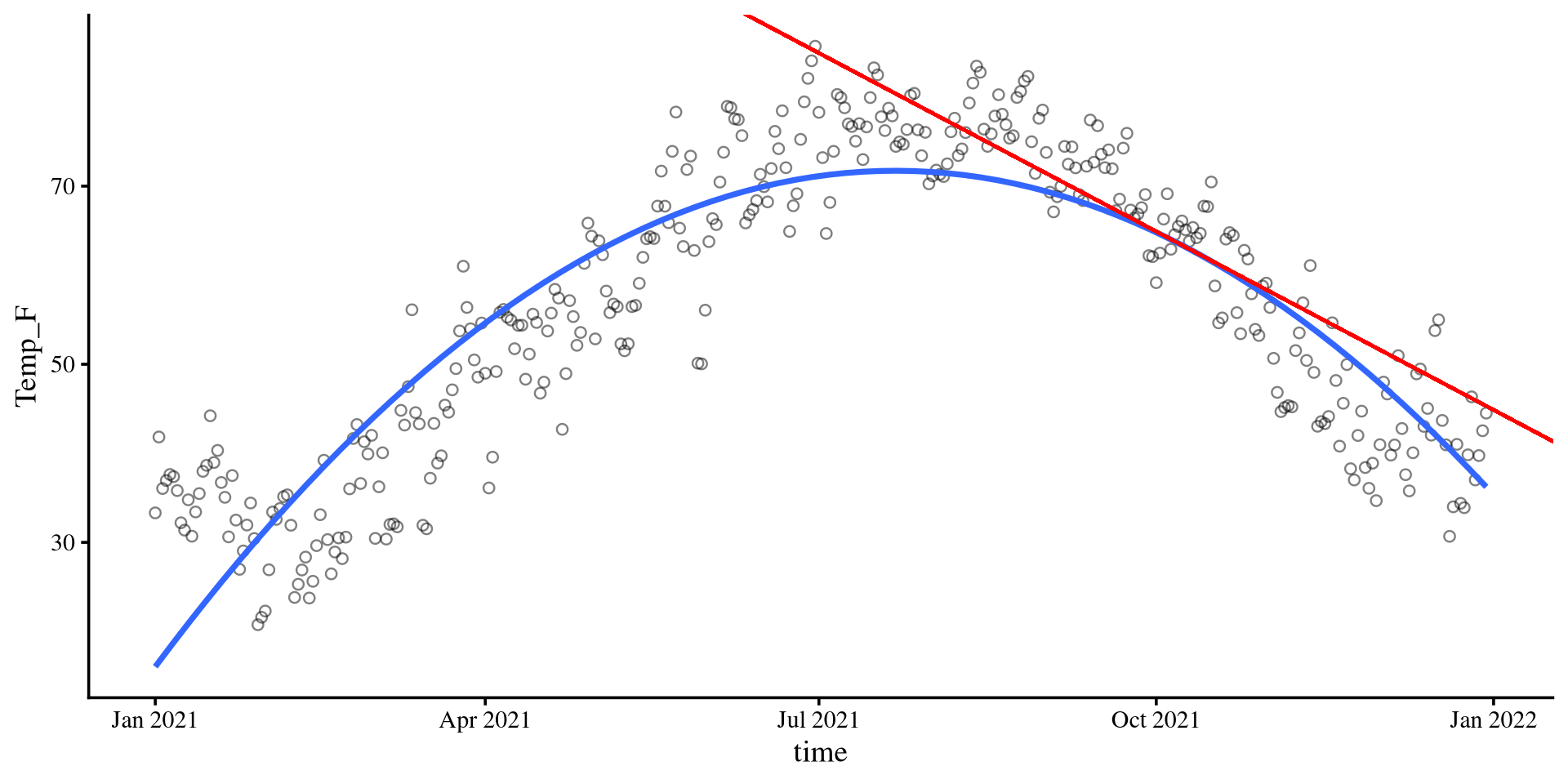
\(b_2\) in Quadratic Regression
Plot code
x_val <- 100

# accurate calculations, there is rounding error in the equation on the slides
slope_new <- coef(quad_reg)[2] + 2*coef(quad_reg)[3]*x_val

ggplot(Temp_avg_2021,
       aes(x = time, y = Temp_F)) +
        geom_point(alpha = .5, shape = 1)  +
geom_smooth(method = "lm",
            formula = y ~ poly(x, 2),
            se = FALSE) +
geom_segment(x = (mean(Temp_avg_2021$time) + x_val) - 130,
             xend = (mean(Temp_avg_2021$time) + x_val) + 130,
             y =  (coef(quad_reg)[1] + coef(quad_reg)[2]*x_val + coef(quad_reg)[3]*x_val^2) - (slope_new*130),
             yend = (coef(quad_reg)[1] + coef(quad_reg)[2]*x_val + coef(quad_reg)[3]*x_val^2) + (slope_new*130),
             linetype = 1,
             linewidth = .7,
             col = "red")
\[b_2 = - 0.001\]
\(b_2\) lets us calculate the slope of the tangent line at any point of the curve. The value of \(b_2\), describes the change of the slope of the tangent line per 1-unit change in time. More formally,
For example, if
time = 100, then the slope of the tangent line is given by \(b_{\mathrm{tang}} = .06 + 2\times -.001 \times100 = -.14\). Indeed, the tangent line goes downwards, as its slope suggests.
Climbing to the top ☝️ (or bottom 👇)
Plot code
# accurate calculations, there is rounding error in the equation on the slides
top <- -1*(coef(quad_reg)[2]/(2*coef(quad_reg)[3]))

Y_val <- (coef(quad_reg)[1] + coef(quad_reg)[2]*top + coef(quad_reg)[3]*top^2)

# this is the formula for the tangent slope. if you print this, you will see that it equals exactly 0. This means that the X value provided is the top of the curve, which is the only point where the tangent slope is exactly 0

slope_new <- coef(quad_reg)[2] + 2*coef(quad_reg)[3]*top


ggplot(Temp_avg_2021,
       aes(x = time, y = Temp_F)) +
        geom_point(alpha = .5, shape = 1)  +
  geom_point(aes(y = Y_val,
                x = mean(Temp_avg_2021$time) + top),
              size = 3.5,
              col = "red") +
geom_smooth(method = "lm",
           formula = y ~ poly(x, 2),
           se = FALSE) +
geom_segment(x = 0,
               xend = mean(Temp_avg_2021$time) + top,
               y = Y_val,
               yend = Y_val,
               linetype = 2) +
geom_segment(x = mean(Temp_avg_2021$time) + top,
             xend = mean(Temp_avg_2021$time) + top,
             y = 0,
             yend = Y_val,
             linetype = 2) +
geom_segment(x = mean(Temp_avg_2021$time) -130,
             xend = mean(Temp_avg_2021$time) + 130,
             y =  Y_val,
             yend = Y_val,
             linetype = 1,
             linewidth = .7,
             col = "red")
Last but not least, we can find the top (or bottom if \(b_2 > 0\)) of our curve (which is also the turning point). The formula is \(\mathrm{top} = -\frac{b_1}{2b_2}\).
For us that would mean that the predicted highest average temperature is around:
# accurate calculations, there is rounding error in slide regression coefficients
-1*(coef(quad_reg)[2]/(2*coef(quad_reg)[3]))
time_cent
20.34353 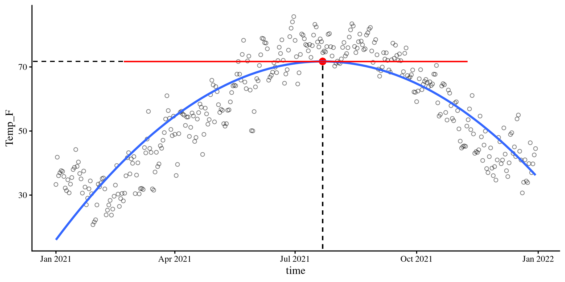
Why does \(-\frac{b_1}{2b_2}\) always finds the top/bottom? Turns out that \(-\frac{b_1}{2b_2}\) finds the \(X\) point where the slopes of the tangent line is exactly 0. That means that the tangent line is perfectly flat, which happens only at the top/bottom of a quadratic function.
This concept of “finding the top (or bottom)” happens to be the foundation of almost all estimation algorithms in statistics.
Bootsrap CI for Maximum/Minimum point
We can create a 95% CI for the time value at which we expect the maximum temperature with bootstrapping.
First we create the bootstrapped regression:
boot_quad <- car::Boot(quad_reg, R = 1000)
Then we need to calculate \(-\frac{b_1}{2b_2}\) for all our 1000 bootstrap samples (very easy actually!). The bootstrap samples are saved in the
t element of boot_quad:
# View(boot_quad$t)
# we can compute -b1/(2*b2) for all sample at once with this

top_boot <- -boot_quad$t[,2]/(2*boot_quad$t[,3])
The 95% CI for the
time value at which we expect the highest temperatures is:
quantile(top_boot, c(.025, .975)) 2.5% 97.5%
17.52118 23.30733
And the full distribution
plot(density(top_boot))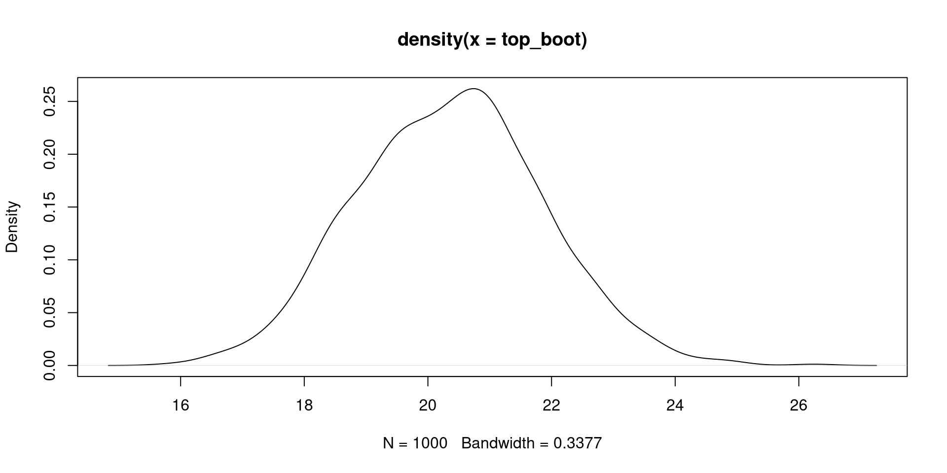
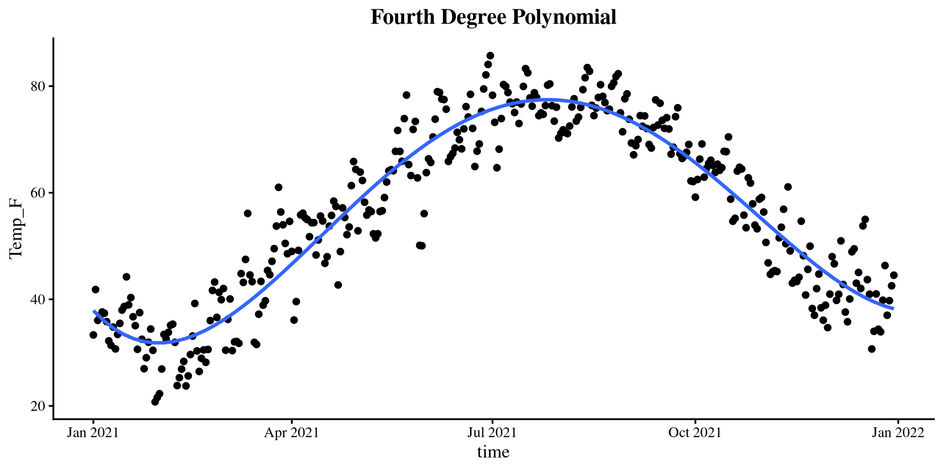
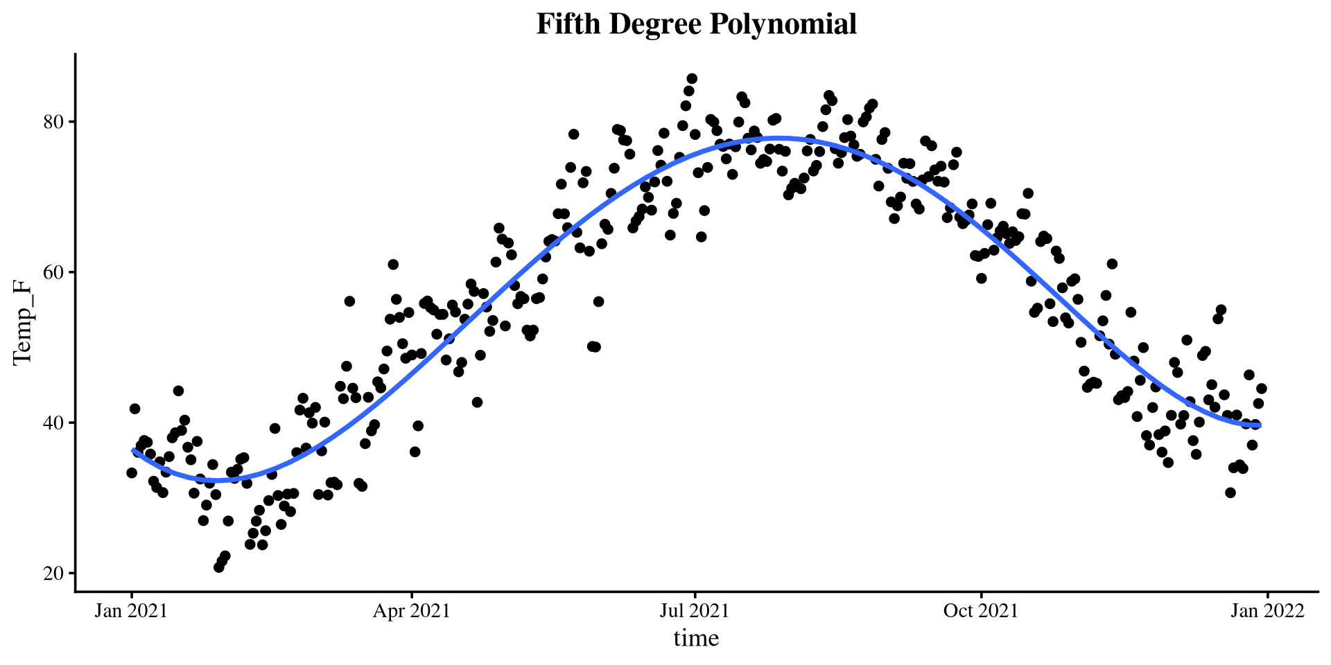
Plotting polynomials
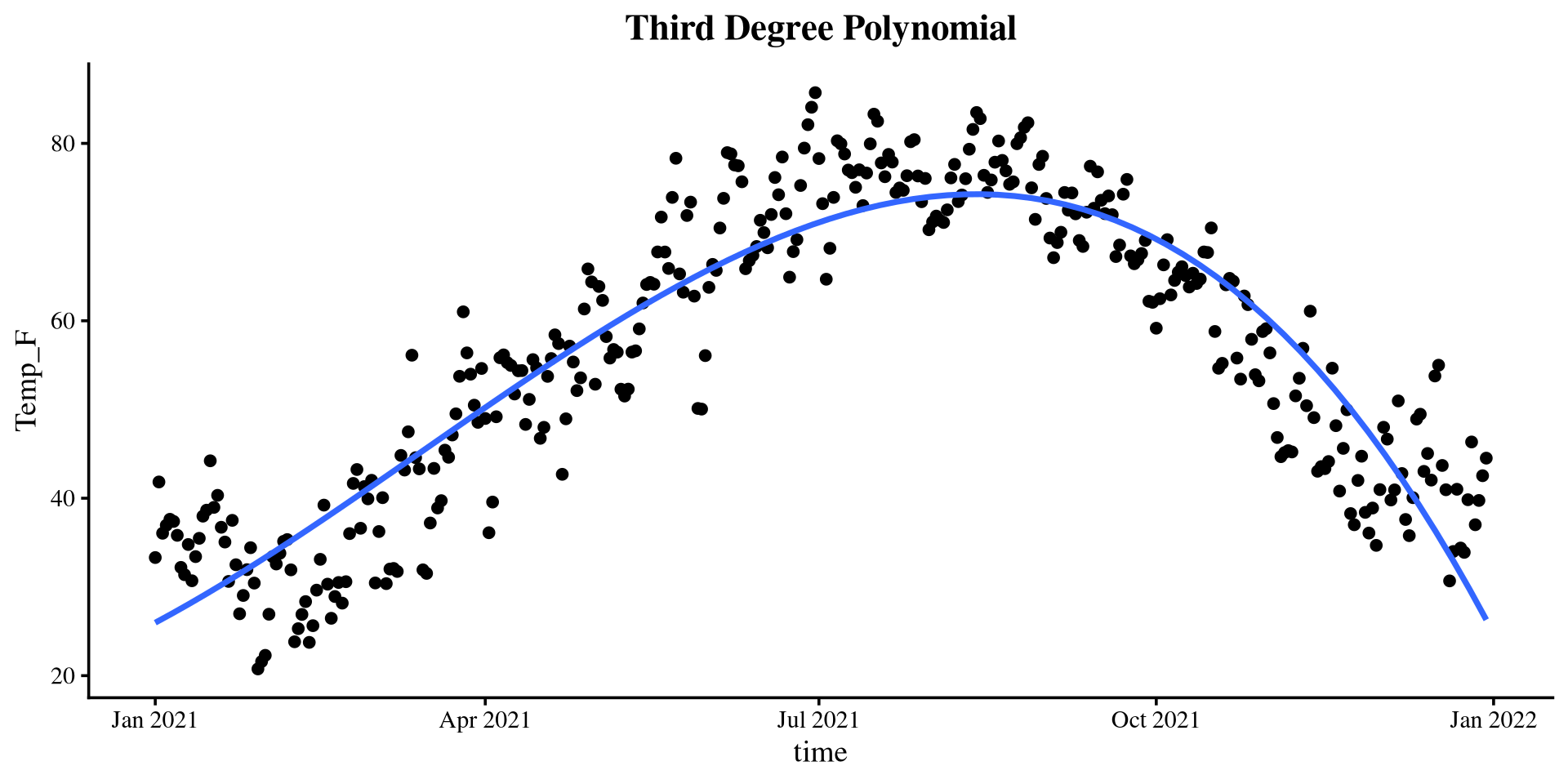
Piecewise Regression
In piecewise regression we effectively divide our data into sections that we run separate regression on. You can divide your data in however many sections you want, but usually you should not need more than 2 separate segments.
But how do we divide the data? You have to decide it based on what you know about your data/theory 😀
In the case of this data, I think that a good cut-point is the top of the quadratic regression from before!
- Why? Because we know that the top is the turning point of the quadratic line. If I need to fit two lines to the data, that is probably my best option given what I know.
The plot on the right shows the segments if we divide the data in this way.
Plot code
# split data with cut-point (cleaner code in 2 slides, can't be bothered to change it)

Temp_avg_2021$D1 <- ifelse(Temp_avg_2021$time_cent >= 20.34353, 0*Temp_avg_2021$time_cent, 1*Temp_avg_2021$time_cent)
Temp_avg_2021$D2 <- ifelse(Temp_avg_2021$time_cent < 20.34353, 0*Temp_avg_2021$time_cent, 1*Temp_avg_2021$time_cent)


reg_piece <- lm(Temp_F ~ D1 + D2, data = Temp_avg_2021)

intercept <- coef(reg_piece)[1]
D1 <- coef(reg_piece)[2]
D2 <- coef(reg_piece)[3]


ggplot(Temp_avg_2021,
       aes(x = time, y = Temp_F)) +
        geom_point() +
geom_segment(x = min(Temp_avg_2021$time_cent) + mean(Temp_avg_2021$time),
             xend = 20.34353 + mean(Temp_avg_2021$time),
             y = intercept + min(Temp_avg_2021$time_cent)*D1 ,
             yend = intercept,
             linetype = 1,
             linewidth = .7,
             col = "red") +
geom_segment(xend = max(Temp_avg_2021$time_cent) + mean(Temp_avg_2021$time),
             x = 20.34353 + mean(Temp_avg_2021$time),
             yend = intercept + max(Temp_avg_2021$time_cent)*D2 ,
             y = intercept,
             linetype = 1,
             linewidth = .7,
             col = "red") +
  theme(plot.title = element_text(hjust = 0.5, face = "bold"))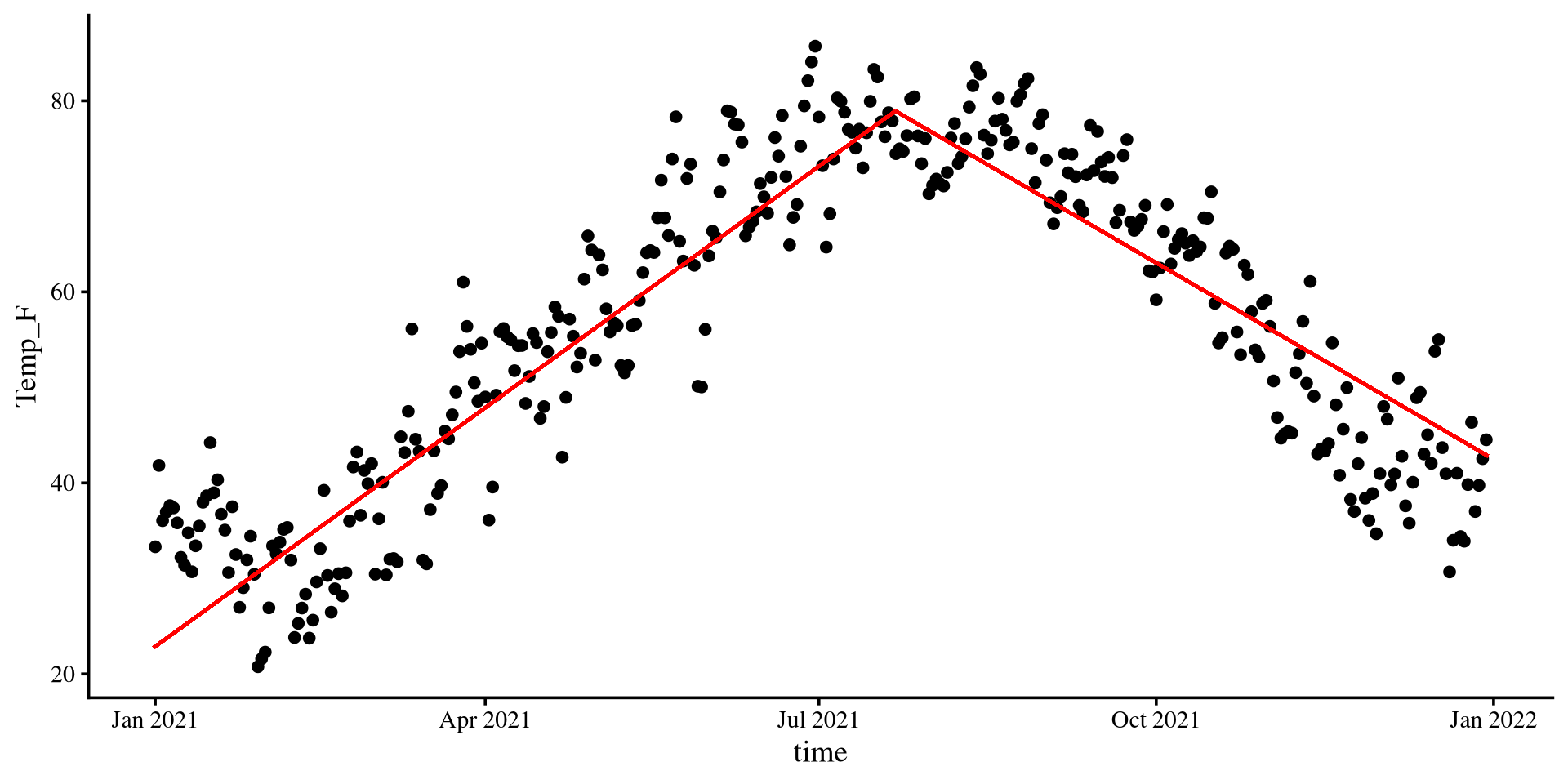
Visulizing Spline Regression
The visualization for spline regression requires you calculate the predictions from the regression model (unless I decide to make a function at some point):
pred_data <- seq(min(Temp_avg_2021$time_cent),
                 max(Temp_avg_2021$time_cent))

pred <- predict(spline_fit,
                newdata = list(time_cent = pred_data))

# The code to generate the plot is in the drop down menu
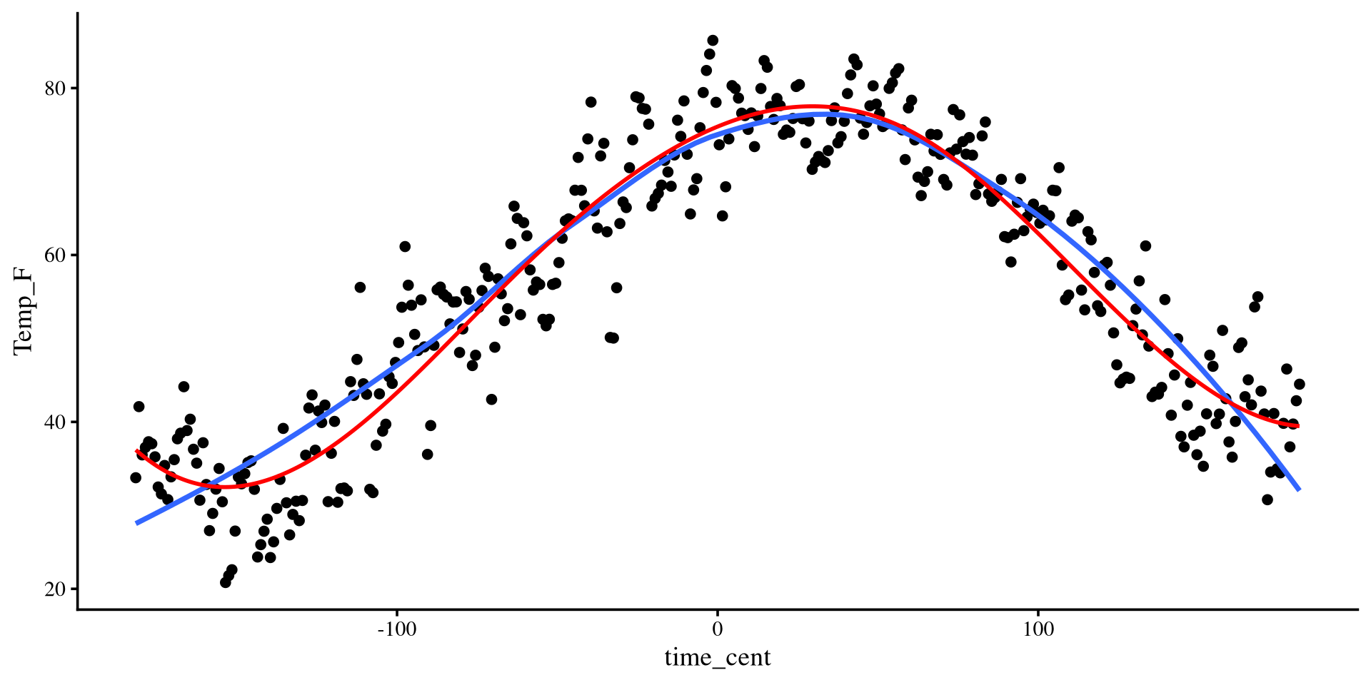
You can see that the spline regression line (red) is very similar to the loess regression line (blue). The two methods are quite similar.
Also note that the spline regression line is smooth. This is because by default the
slpine2 package uses 3rd degree polynomial segments. (see help(bsp))
plot-code
ggplot(Temp_avg_2021,
       aes(x = time_cent, y = Temp_F)) +
        geom_point() +
  geom_smooth(method = "loess",
              formula = y ~ x,
              se = FALSE) +
  geom_line(aes(x = pred_data,
                y = pred),
            col = "red",
            size = 1)