
Lab 14: Regression Diagnostics
PSYC 7804 - Regression with Lab
Simulating some Data
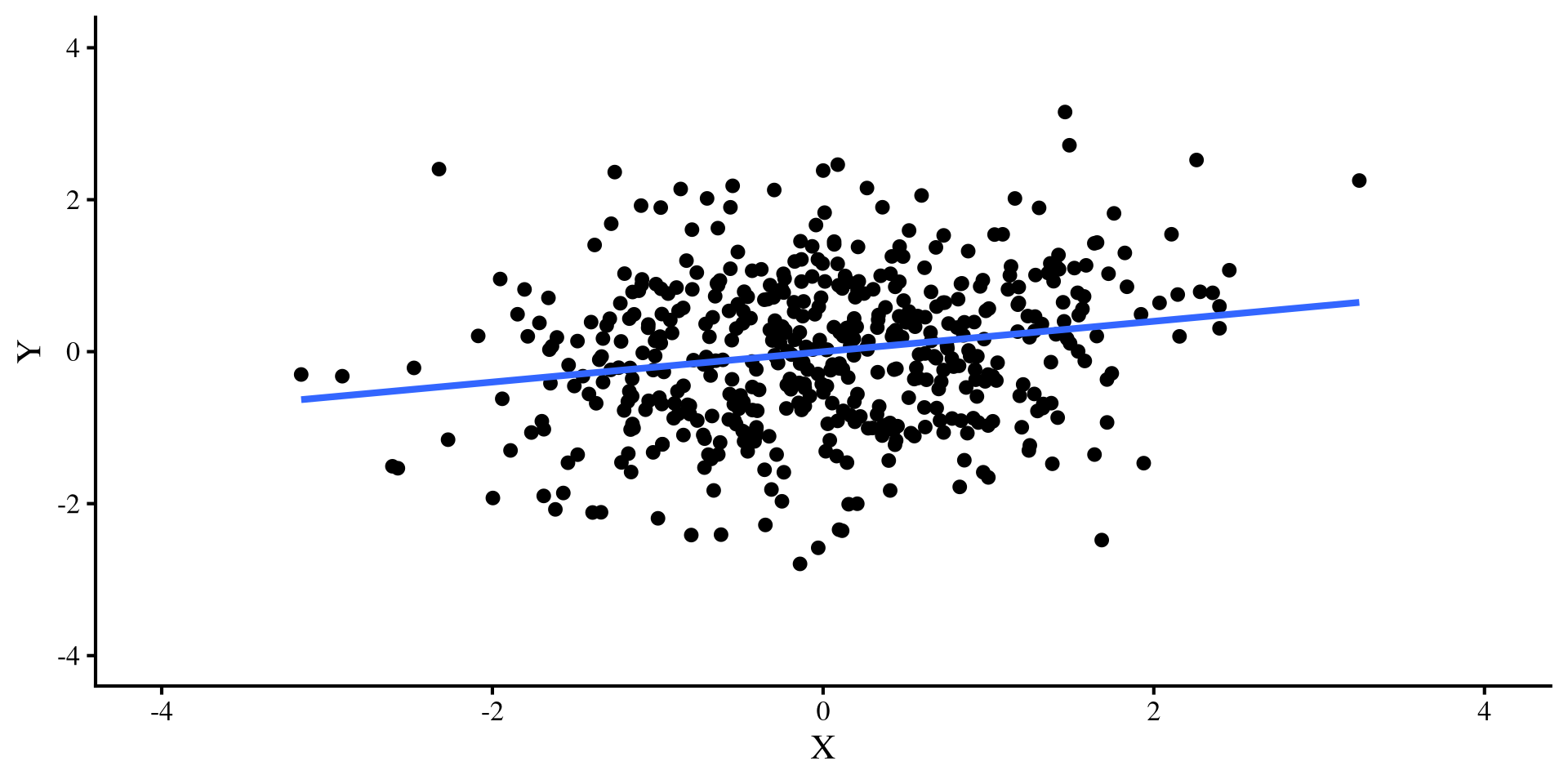
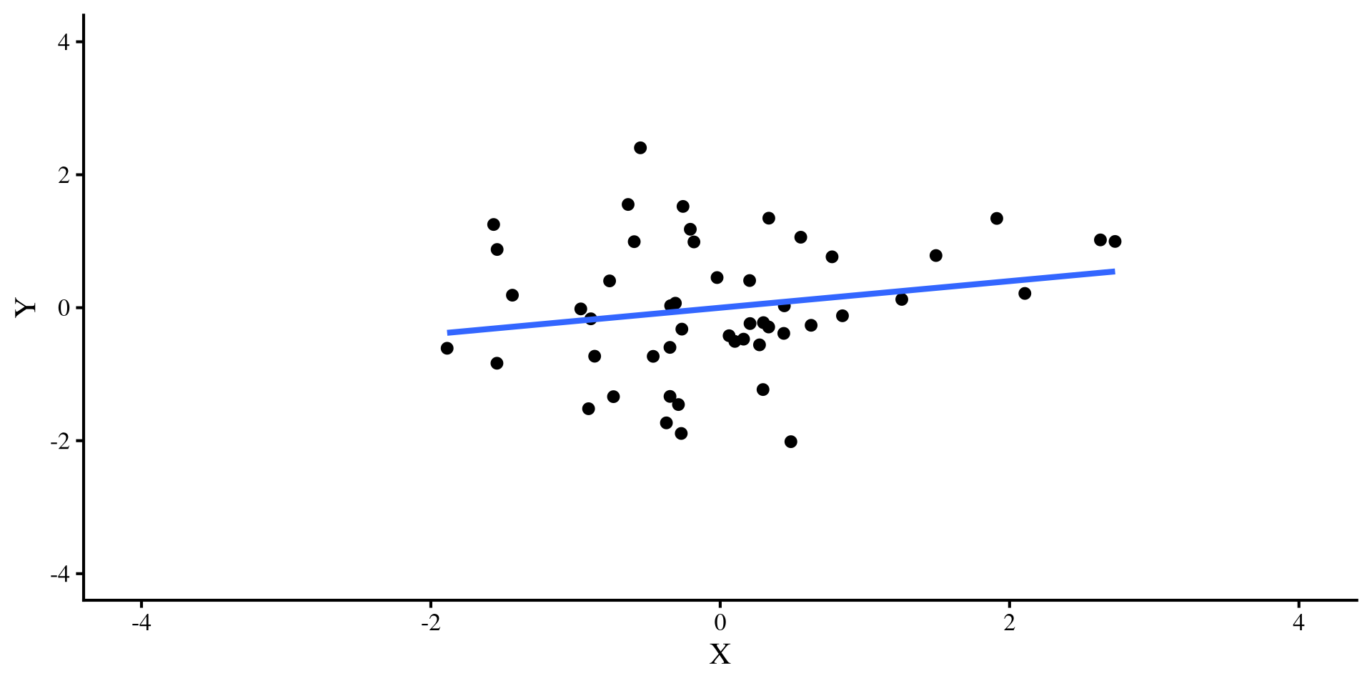
Let’s say that I simulate some \(Y\) and \(X\) variables that have a correlation of \(r = .2\). I do this for both a sample size of \(N = 50\) and \(N = 500\) and plot the regression lines:
simulate data
set.seed(28567)

cor_mat <- rbind(c(1, .2),
                 c(.2, 1))

sim_dat_50 <- data.frame(MASS::mvrnorm(n = 50, c(0, 0), Sigma = cor_mat, empirical = TRUE))
colnames(sim_dat_50) <- c("Y", "X")

sim_dat_500 <- data.frame(MASS::mvrnorm(n = 500, c(0, 0), Sigma = cor_mat, empirical = TRUE))
colnames(sim_dat_500) <- c("Y", "X")
The regression line is the exact same for both plots, bet let’s see what happens once we add a pesky outlier…
Adding a Single Outlier
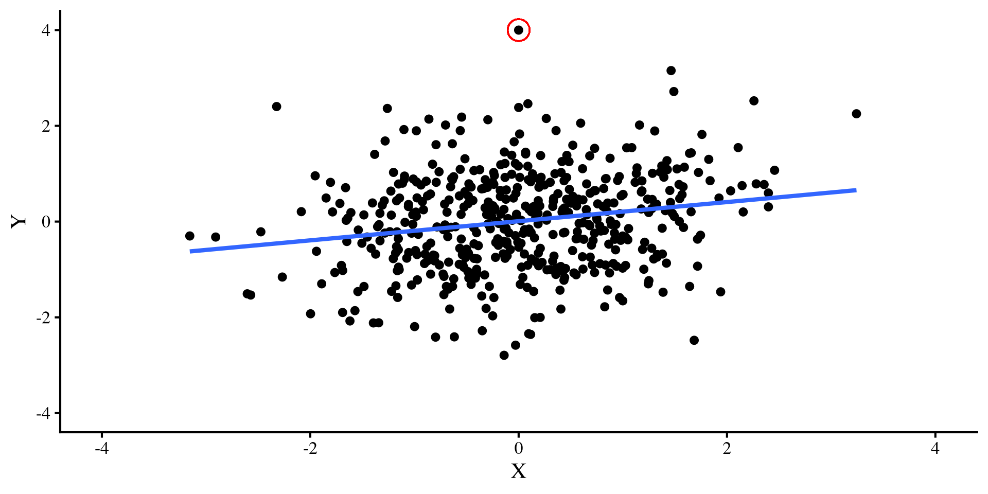
Now, let’s introduce a single outlier point that has extreme values on both variable, \(Y = 4\) and \(X = -4\). Check out what happens to the two regression lines:
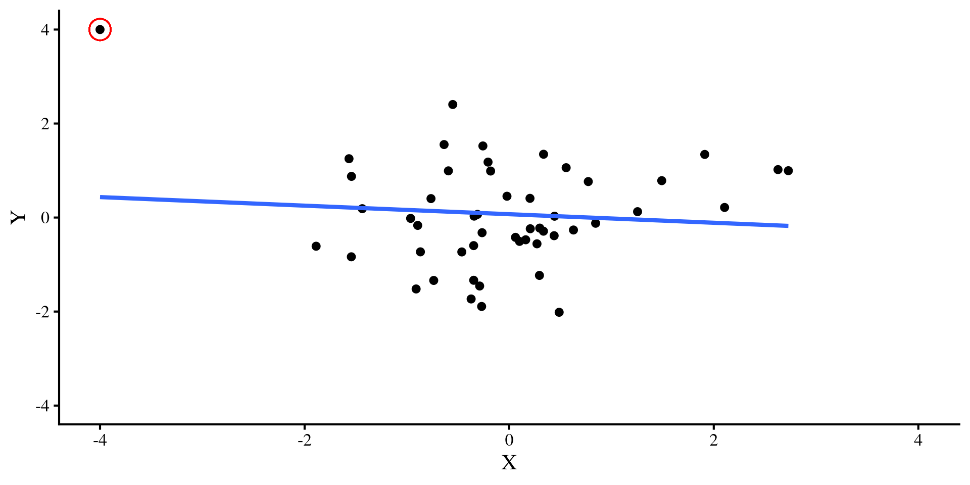

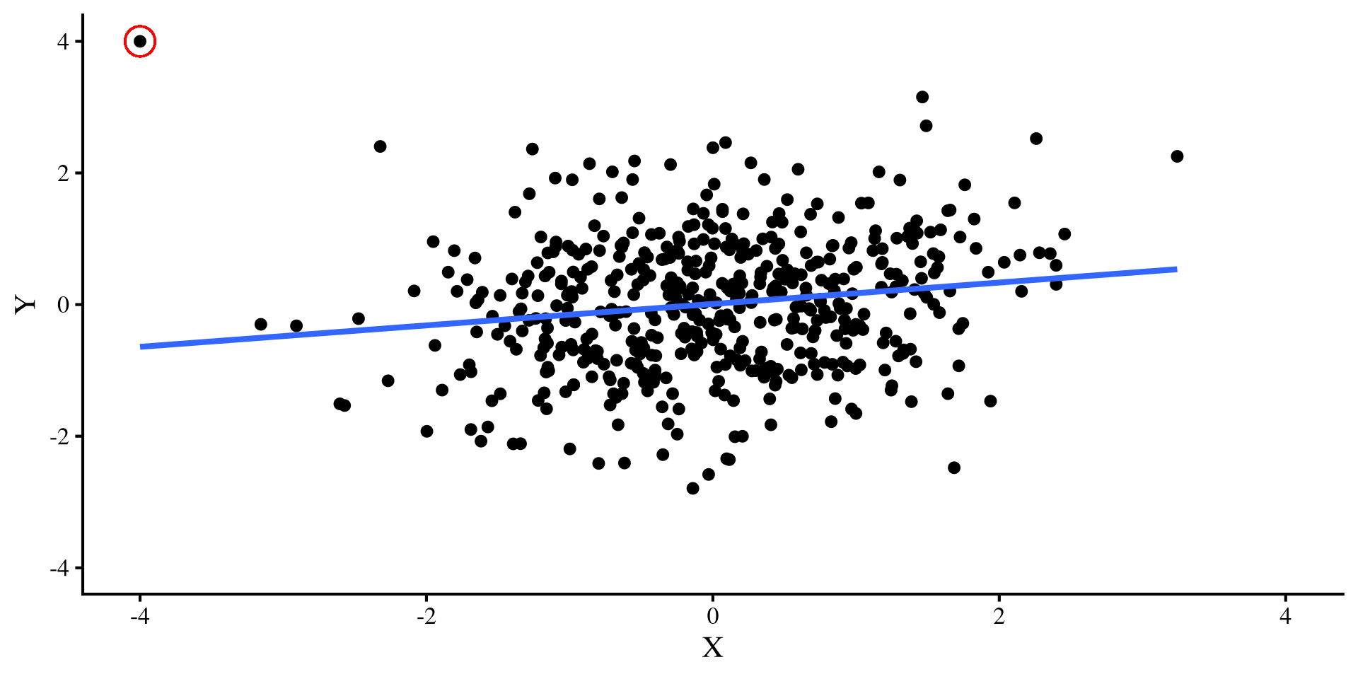
A single outlier flips the relation between \(X\) and \(Y\) when \(N = 50\) 😱 but it doesn’t do much when \(N = 500\) 😇
Moral of the story?
So, what’s the moral of the story?
Small sample sizes: In small sample sizes, you should always check regression diagnostics, and carefully evaluate how extreme points may be influencing your results. If leaving or removing a single extreme point changes your results significantly, I would not have much faith in the robustness of the results.
Large sample sizes: The larger the sample size, the less influential extreme points will be. you still want to check residual plots, but you (usually) don’t need to be as concerned about the impact that extreme points may have on your results (assuming you don’t have that many extreme points).


But wait! Not All Outliers Ruin your fun
Let’s try a different outlier, that has values of \(Y = 4\) and \(X = 0\). Check out what happens to the two regression lines now:
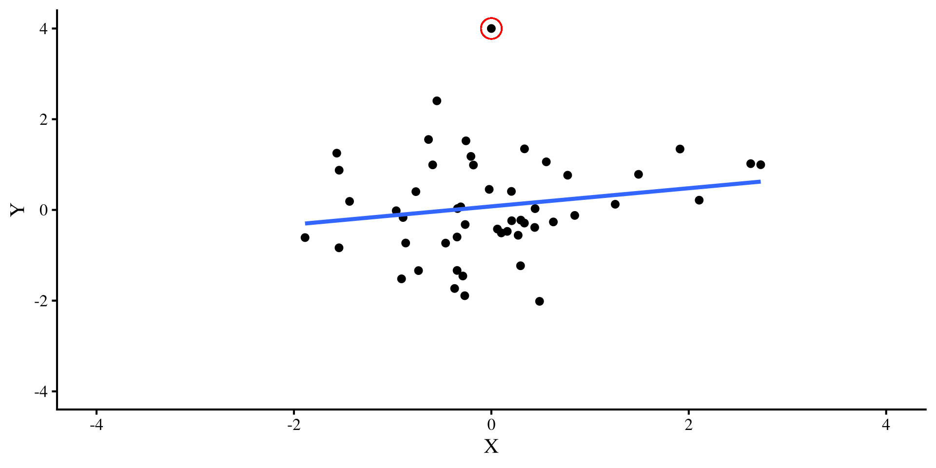

Ah, this outlier doesn’t do much to either regression 🤔 Actually, the only thing it does is slightly change the intercept, which is not a big deal usually.
Quick Regression Diagnostics Summary
Here is a quick summary of the regression diagnostics that we will look at today. In general, influence measures are more useful, because, for each data point, they tell you what would happen to your results if you deleted that data point.
- Hat values: measure how unusual an observation is compared to the average observation. (leverage)
- Studentized Residuals: For each data point, it measures how large the residual is on a standardized scale (distance).
- DFFITS: For each data point, it measures how large the change in the predictions, \(\hat{Y}\), would be if that data point was removed (influence).
- Cook’s D: This is very similar to DFFITS, because it also measures how large the change in the predictions, \(\hat{Y}\), would be if a data point was removed (influence).
- COVRATIO: For each data point, it measures how large the average change in all the standard errors of the regression coefficients would be if that data point was removed (influence).
- DFBETAS: For each data point, it measures how much each individuals regression coefficient will change if that data point would be if that data point was removed (influence).
DFBETAS ( ) is my favorite measure because for each data point, it tells you how much each regression coefficient will change if that data point is removed. Other measures give some average, which, for most purposes, is not as informative in my opinion.
) is my favorite measure because for each data point, it tells you how much each regression coefficient will change if that data point is removed. Other measures give some average, which, for most purposes, is not as informative in my opinion.
Our model
Let’s say that we want to look at how log_GDP and Social_support predict Happiness_score for each country. Let’s look at the added variables plots directly:
reg <- lm(Happiness_score ~ Log_GDP + Social_support, WH_2024)
avPlots(reg)
Graphical inspection is always a good start, and often is all you need to see that something may be off. Both variables positively predict Happiness, but there are some extreme points.
As mentioned all the way back in Lab 5, the
avPlots() function also identifies the 2 points with the largest residuals and the largest leverage (for the single plot).

Studentized Residuals? QQplot them
Studentized residuals are just the values of the standardized residuals. Some large residuals are expected and are usually not that big of a deal. The car package has a quick function to create a QQplot of studentized residuals
car::qqPlot(reg)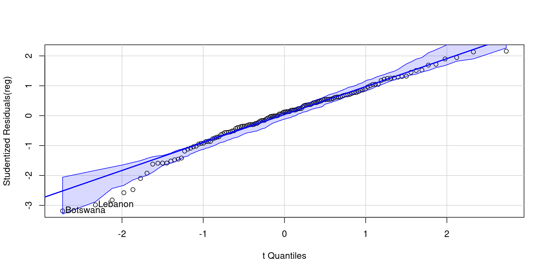
Botswana and Lebanon have somewhat low residuals, but there aren’t many residuals outside the confidence band.
The lower end of the residuals is a bit suspicious, but I wouldn’t be super concerned just by looking at this.
Influence plot with car
The influencePlot function from the car package also offers a nice visualization for studentized residuals, hat values, and Cook’s D at the same time
car::influencePlot(reg)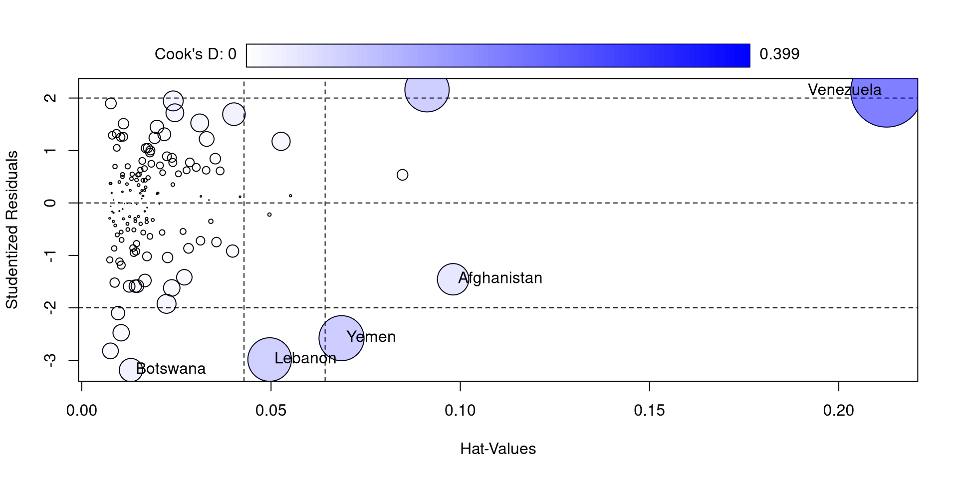
So, compared to the other countries, Venezuela is really high in all of these measures. If you look at the log_GDP and Happiness_score values for Venezuela you may find something a bit strange (maybe proof that money is not needed for happiness)
I also feel like the function is not very aptly named because only Cook’s D is a measure of influence 🫣
Another Neat car Plot
The influenceIndexPlot function offers a visualization of a bunch of regression diagnostics. This helps visualizing what observations are extreme relative to other observations
influenceIndexPlot(reg)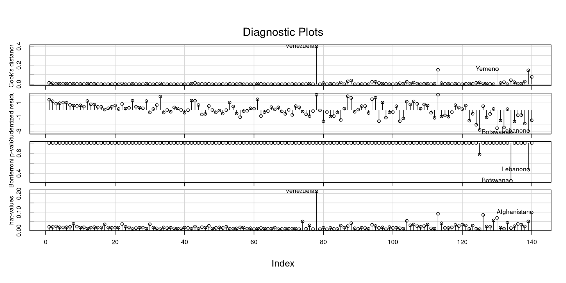
With a good deal of these measures, I would not look at “suggested cutoffs”. Following cutoffs blindly (1) leads you to not think about what you are doing, and (2) leads you to make bad decisions and mistakes in many scenarios.
Especially for some of these measures, you want to look at how large they are relative to all other observations.